Real design homework that landed the job.
I’ve been at Product Designer Job at GitHub for about half a year now, and I figured I’d make this a tradition. GitHub’s assignment was slightly different in scope. DigitalOcean asked for an actual redesign of a module, and I decided to take it the extra mile to impress them. GitHub, on the other hand, asked for a quick critique. It took considerably less time and the output wasn’t as impressive, but I think it spoke to my current priorities as a designer. GitHub’s hiring process has since changed.
The following is exactly what I sent in.
GitHub Pull Requests
Could they be better? Let’s find out!
The prompt was to critique the interfaces and flow for creating a new pull request on GitHub. The following was done in an hour or two, so expect some stream-of-consciousness and typos. It was also done without much context beyond personal experience. Were this a real project, I’d make sure to build that context before diving in. For instance:
- Which user types do we need to account for on these pages? Are we focusing on seasoned developers who are familiar with git and GitHub, or do we care about adoption by people just getting started?
- From which pages do people generally submit PRs? Is it most often from master, or from their own branches? Where should we expect this flow to start from?
- Should this account for various workflows such as rebasing? Does that look different?
- Do we need to account for both tiny PRs and monster PRs? What’s the difference between the two? How does this function at scale?
- etc, forever.
I’ll ask more specific questions related to each of the three main pages as we go through them.
Nomenclature
First off, let’s talk about naming.
Considering GitHub’s wide adoption, and the amount of places PRs are documented, I doubt that a change in terminology is feasible. Nonetheless, I think it’s worth noting that “Pull Request” isn’t the most intuitive term.
You aren’t requesting to pull code, you’re requesting to push it.
I suppose merging into master can count as having code “pulled” from you, but it’s a stretch. When I’ve taught people how to use GitHub in the past, it’s always been a point of confusion. It seems the name originated from Git functionality and I think it’s a shame it stuck.
Perhaps the largest (if unrealistic) impact could come not from a change in interface, but clearer nomenclature.
Step 1: Repo Overview
The first page in this flow is the main repo overview. A developer lands on master, before proceeding to create a PR for their branch.
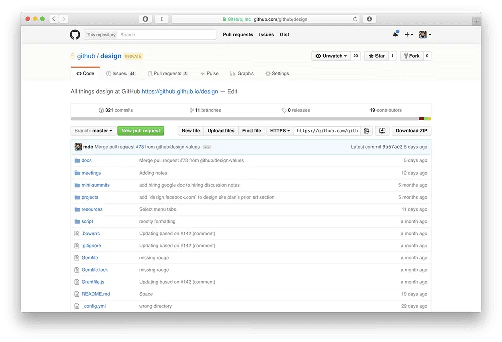
Action Overload
The first thing that strikes me about this page is how many different actions I can take. There’s one clear CTA—creating a PR. I assume this was the most important one as defined by GitHub. That CTA is then flanked by a ton of secondary buttons, various link styles for navigation, and more links for the files and folders contained in the repo. The main action is obvious, but otherwise it’s a kitchen sink—everything seems to hold the same importance.
Curiously, more recent designs prioritize cloning and downloading as their most important actions, rather than PRs. I imagine this reflects either a shift in GitHub’s priorities, or new knowledge around how people tend to use this page.
This design does a better job at communicating hierarchy and providing a bit more focus.
Anyway, let’s click New Pull Request.
Step 2: Branch Selection
The second page in the flow has a developer select the branch from which they want to merge changes. Once developers select their branches, they’re presented with a commit history and an overview of changes.
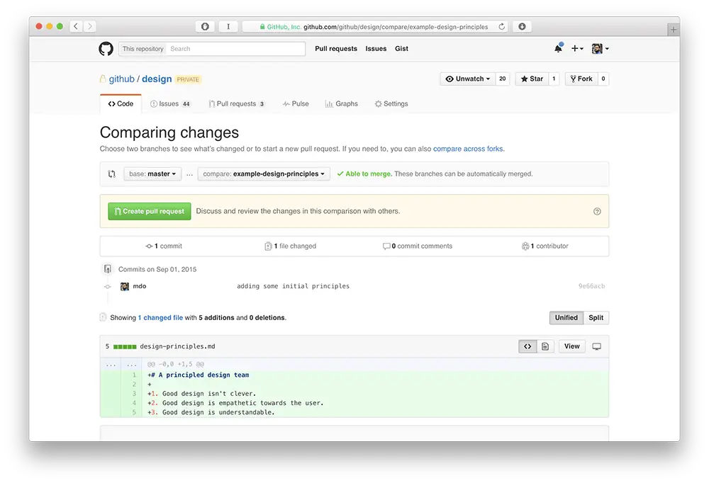
In terms of hierarchy, this page has a few layers, and they aren’t clearly broken up. From top to bottom:
- Navigation / sub-navigation
- Page header / description
- Branch selection / merge status
- PR creation
- Change comparison (overview, commit history, granular change comparison)
There are a lot of wildly different elements on the page, and no clear reason why. The different colored boxes on the top seem arbitrary and don’t clearly denote the different functions on the page. The change comparison section feels a bit disjointed due to the lack of boundaries around the commit history.
It also includes the full header, including all repo actions. I wonder how many of these are necessary when creating a PR. It might be worth exploring creating a more focused version of this interface.
Select The Branch
The first action on this page is branch selection. It’s perhaps the most important step in this flow. If you pick the wrong branch, or if you merge into the wrong branch, you’re in for some frustration in your near future.
So why isn’t this widget clearer?

It seems like some assumptions are being made. A PR is asking to merge code from one branch into another, but the only indication of which is which is:
- An ellipses icon between them
- The words “base:” and “compare:”
To anyone getting started with GitHub, this could be confusing.
Even a simple change like this could potentially make the widget more intuitive:
Review Changes
For developers who want to confirm their PR’s validity. It feels like there are several levels of granulariy presented in the same UI, ranging from a change overview, to a commit history, to more specific additions and deletions. I wonder which of these are important, and whether users need to see them all at once. Perhaps by separating them temporarily, we could gather data on what information people care about reviewing when submitting PRs.
As I mentioned earlier, the sections here feel a bit disjointed. For instance, there’s no clear boundary between the commit history and the header for additions and deletions. With a clearer boundary, it would be clearer that the view toggle on the right related to all the content below it.
Overall, this step appears optional and unimportant, as that the PR creation section is placed above it and highlighted. Are we making the assumption that developers already know what’s in their branches and which changes will be included when they create the PR? If so, why include these in the same page at all vs. giving access to a separate page that contains the changes?
Create The Pull Request
The clear next step on this page is to create the PR. It’s right on the top, with a light yellow background to highlight it. I’m not entirely sure what this color represents within GitHub’s design system, but yellow often strikes me as a warning that something might be wrong, rather than emphasis.
There’s also a short description. “Discuss and review changes in this comparison with others.” I’m going to go on a limb here and guess that this doesn’t mean much to someone who doesn’t already know what a PR is. Maybe the question mark will provide additional details, but I’d work on the copy here. What is a PR?
Anyway, let’s click the button and create our PR.
Step 3: Pull Request Creation (For Real!)
Surprise! The PR hasn’t been created yet. Even though you’ve clicked a bright green button that says “Create Pull Request” twice now. This page focuses on adding a title and description to your PR, which is arguably extremely important, considering PRs are mostly about collaboration.
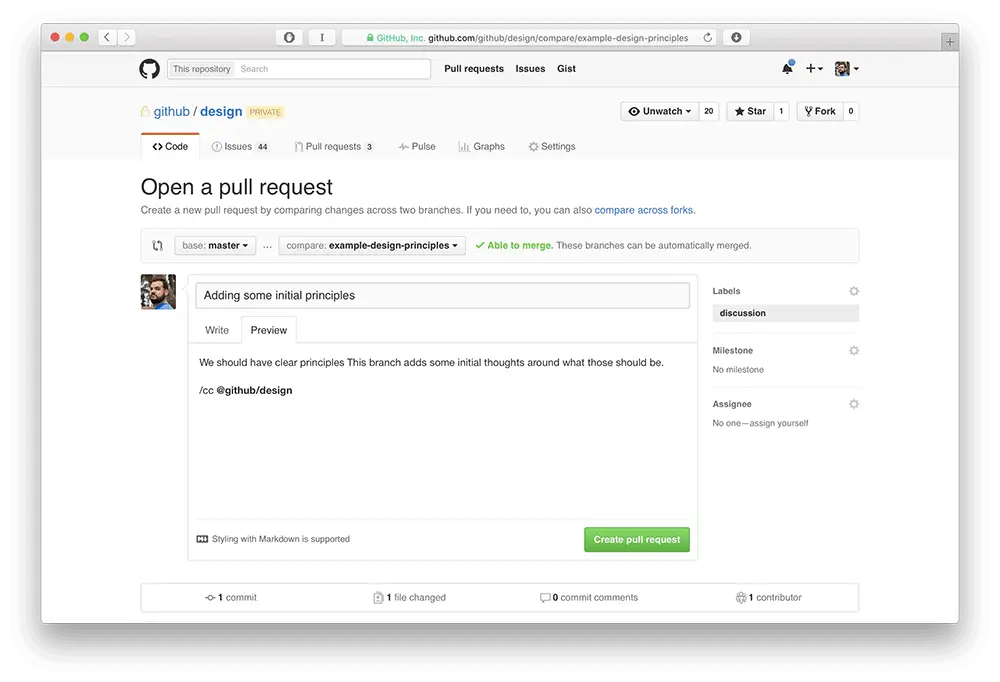
Even if it’s necessary, is it a welcome surprise? My biggest question for this page is: why does it exist? This step in the flow could easily be integrated into the previous page. Right now the flow is:
- Decide to create PR
- Select a branch
- Optional: Make sure the changes are right.
- Add a description and notes for the PR
These four steps are divided across three pages. Each page includes a “Create Pull Request” button, which means users have to click the same button three times to actually create one.
Now, if branch selection and change review can live on the same page, description entry might fit as well. I think condensing the flow down to two pages might result in a more efficient and enjoyable experience.
Before making a serious change like this, I’d first test with users to ensure that it wouldn’t overload the page and dillute focus (and, of course, make sure a similar flow hadn’t been implemented and invalidated in the past).
More Specific Notes
- If the previous page’s role was to review your PR and confirm it, why can you still see the branch widget on this page? Yes, it’s important for any system to confirm a user’s choices, but this widget indicates that you can still change the branches on this step. If so, what was the point of the previous step?
- Why does this step still point users to comparing across forks? Aren’t we passed that?
- Does Markdown have wide enough adoption to justify the separation Write and Preview? Could it be clearer to name these Markdown and WYSIWYG and add styling functionality to the Preview pane? Would people use that?
- If the system is confirming the branch selection on the top, why is it confirming the changes on the bottom? Seems like those two sections should be together.
Next Steps
As you noted in your email, the PR is one of GitHub’s most important building blocks. You can’t make changes to something that crucial to a system without doing a lot of due diligence. Often, and especially with technical products such as this, power users get used to interfaces and grow efficient in using them. What that means is that they’re usually very averse to change (I’ve witnessed this first hand at DigitalOcean). That doesn’t mean you can’t introduce that change, though. I believe in continuous improvement, and I don’t think I’ve ever seen a perfect design.
If this were a feature I was tasked with improving, I would make sure to get answers to all of the various questions that have popped up so far, and then ask a couple hundred more. I’d also look for more clarity into what we’re trying to accomplish. I can put any interface through a basic heuristic evaluation, but what are we trying to solve? What kind of improvement will result the biggest impact for our users and business? How can we best make something awesome?
GitHub is a product that’s very close to my heart. I’m a paying customer and I’ve used it for years. I’m incredibly excited about the opportunity to make it better ????
Joel Califa – Twitter Sign up to Joel’s Newsletter at joelcalifa.com