When it comes to finance, most people picture numbers, spreadsheets, and maybe a suit or two. But let’s be honest—none of that screams creativity. That’s where a modern, well-designed logo can make all the difference. A great finance logo isn’t just about looking professional; it’s about standing out and telling your story in a way that feels fresh and approachable.
I’ve noticed that the best finance logos today are breaking away from the old-school, overly corporate vibe. They’re sleek, creative, and designed to connect with a modern audience. Whether it’s bold typography, clever symbols, or unexpected color palettes, these designs show that finance can be innovative and forward-thinking.
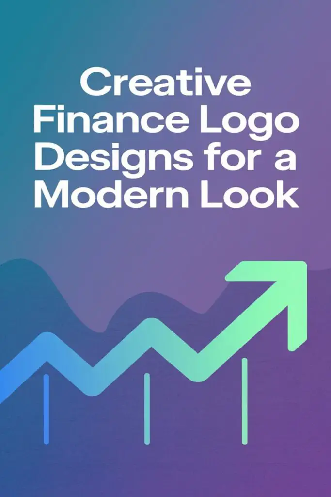
Explore the Essence of Creative Finance Logo Designs
Creative finance logo designs are where functionality meets innovation. They reflect the dynamic nature of the finance industry while connecting with today’s audiences.
Why Logo Design Matters in the Finance Industry
A logo is the face of a company, and in finance, it’s even more critical. People associate financial brands with trust, reliability, and expertise. A well-designed logo communicates these qualities instantly. For example, a clean, structured design conveys stability, while innovative elements can show adaptability. In a crowded market, a distinctive logo can set a business apart and make it more memorable to clients.
Characteristics of Modern Finance Logos
Modern finance logos embrace bold, versatile design elements that break away from tradition. Minimalist layouts with clean lines and geometric symmetry provide a sense of clarity. Unique typography, like custom sans-serif fonts, adds personality without overcomplicating the design. Vibrant or unexpected color schemes—think teal over navy or gold accents—make logos stand out while staying sophisticated. Many designs also include subtle icons, such as abstract arrows or bar graphs, to hint at growth and progress. These elements together balance professionalism with creativity, ensuring the logo resonates with modern audiences.
Incorporate Minimalist Elements for a Sleek Appeal
Minimalism creates clarity and sophistication, which is perfect for modern finance logos. A clean, streamlined design ensures the logo remains professional yet memorable.
Using Simple Shapes and Lines
I love how simple shapes and clean lines can add structure to a design, making it instantly recognizable. Circles, squares, or triangles, for example, can represent concepts like unity, stability, or growth. Thin, geometric lines also give a sleek and professional look while avoiding unnecessary clutter. Keeping the design straightforward ensures the logo looks sharp across different sizes and mediums.
Leveraging Negative Space in Design
Negative space is one of my favorite tools for creating visually striking logos. It adds depth and cleverness by using the empty spaces around or within shapes to form hidden symbols. For instance, a finance firm could incorporate an arrow in the space between two letters to subtly suggest growth or progress. This approach not only enhances visual appeal but also keeps the design simple and impactful.
Blend Colors Strategically for a Modern Look
Colors can make or break a logo’s impact. For finance logos, using the right colors ensures a modern and approachable aesthetic that leaves a lasting impression.
Popular Color Palettes for Finance Logos
I’ve noticed blues and greens are go-to choices for financial businesses. Blue conveys trust and stability, while green represents growth and wealth. Pairing these with neutrals like gray or white adds balance and sophistication. For a bolder approach, using gold or metallic shades signals luxury and success without compromising professionalism. Combining muted tones with pops of brighter colors also helps establish a modern vibe.
Incorporating Gradients for a Contemporary Touch
Gradients give finance logos a sleek, fresh appeal. I often see subtle transitions between two shades of blue or green to create depth and dimension. Adding gradients to icons or backgrounds can add a dynamic twist, making the logo feel more vibrant and engaging. For example, blending navy blue into teal or emerald green gives a polished, innovative look that stands out from flat, traditional designs.
Choose Typography That Speaks Confidence
Typography is a powerful tool in logo design, especially for finance brands looking to exude trust and professionalism. The right font can instantly communicate stability while aligning with a fresh, modern style.
Modern Serif Fonts for a Trustworthy Image
I always turn to modern serif fonts when I want to create a feeling of tradition and dependability. These fonts, with their small decorative strokes, combine the classic look of traditional serif typefaces with updated, streamlined details. For example, fonts like “Merriweather” or “Playfair Display” provide balance—they feel authoritative but aren’t stuck in the past. A modern serif works perfectly for finance brands that want to convey trustworthiness without appearing outdated.
Sans-Serif Fonts for a Contemporary Edge
Sans-serif fonts are my go-to when I want to give logos a clean, minimalistic vibe. They feel approachable and modern, making them ideal for innovative finance companies. Fonts like “Roboto,” “Montserrat,” or “Lato” give off a crisp and effortless look that’s easy to pair with bold layouts or vibrant color palettes. These fonts work wonders when you’re aiming to reflect progress and accessibility, two key traits for appealing to today’s audience.
Embrace Symbolism to Reflect Financial Themes
Symbolism can transform a finance logo into something memorable and meaningful. By incorporating elements tied to the industry, a logo not only resonates with the audience but also conveys trust and expertise.
Incorporating Icons like Coins, Arrows, or Graphs
Using icons like coins, arrows, or graphs can instantly link your logo to financial themes. Coins suggest wealth and prosperity, making them ideal for savings or investment brands. Arrows can imply growth or forward-thinking, perfect for a company focused on innovation. Graphs highlight data-driven approaches and financial precision, appealing to audiences who value analytics. Mixing these icons creatively within your design adds depth while keeping it recognizable.
Abstract Symbols for a Unique Identity
Abstract symbols give a logo a modern, distinctive edge. A swooping line might represent a fluctuating market, while geometric shapes can signal structure and dependability. By avoiding literal representations, these elements open creative possibilities while staying aligned with financial themes. For example, intertwining shapes could hint at collaboration or networks in the finance industry. Abstract designs stand out in a competitive market, ensuring your brand feels fresh and forward-thinking.
Utilize Custom Illustrations for a Personal Touch
Incorporating custom illustrations into finance logo designs adds character and sets your brand apart. A personalized approach creates a connection with clients while maintaining a modern, professional appeal.
Hand-Drawn Elements for Creativity
Adding hand-drawn elements can inject creativity and warmth into a finance logo. It’s a great way to break away from rigid, corporate templates and create something unique. For example, sketched arrows or lines can highlight growth while soft, imperfect details make your logo feel more approachable. I’ve noticed it works particularly well for boutique firms or startups that want to portray a friendly yet professional image.
Custom Icons for Brand Recognition
Using custom icons allows you to create a distinct identity tied to your brand’s values. Instead of generic symbols like a dollar sign or graph, design bespoke icons that resonate with your specific services; for example, a stylized tree to represent investment growth or a modern safe to symbolize security. It ensures your logo is memorable while aligning with your business’s ethos, standing out in a competitive market.
Ensure Versatility Across All Platforms
Versatility is a must for finance logo designs, ensuring they look great no matter where they’re displayed. A modern logo should adapt seamlessly across digital screens, print materials, and everything in between.
Designing a Scalable Logo for Digital and Print Use
Creating a scalable logo means designing one that looks sharp and professional no matter the size. I make sure the logo is vector-based, so it doesn’t lose quality when resized for business cards, billboards, or website headers. I also focus on keeping the design clean and avoiding overly intricate details that might blur or crowd smaller prints. For example, using simple symbols and bold fonts ensures the logo remains crisp for both large-format posters and tiny email footers alike.
Optimizing Logos for Social Media and Mobile Viewing
Social media and mobile devices play a huge role in brand visibility, so I always check how logos look on smaller screens. Square or circular formats work best for profile pictures on platforms like LinkedIn and Instagram. I also test simplified versions of the logo—for example, using just an icon or lettermark—so it stays recognizable even in tight spaces like app icons. Pairing this with bold contrast and legible typography ensures the design remains attractive and accessible on any screen, from desktops to smartphones.
Conclusion
A modern finance logo is more than just a design—it’s a powerful tool to communicate trust, innovation, and professionalism. By blending creativity with functionality, it’s possible to craft a logo that not only stands out but also resonates with today’s audience.
From thoughtful typography to strategic color choices and clever symbolism, every detail plays a role in shaping a brand’s identity. A well-designed logo reflects a company’s values while staying adaptable for various platforms and formats.
At the end of the day, a great finance logo isn’t just about looking good—it’s about building connections, inspiring confidence, and leaving a lasting impression.
Frequently Asked Questions
Why are modern logos important in the finance industry?
Modern logos are crucial in the finance industry because they enhance professionalism, build trust, and help companies stand out. A well-designed logo communicates stability, innovation, and expertise, making the brand relatable and accessible to contemporary audiences.
What are the key elements of a modern finance logo?
Key elements include bold typography, minimalist designs, unique color palettes, and subtle symbols that convey growth, trust, and progress. Using clean layouts, vibrant colors, and clever negative space also ensures a professional yet innovative design.
How should colors be used in finance logos?
Colors in finance logos should convey trust and growth. Common combinations include blues and greens for reliability and progress, paired with neutrals for balance. Gradients can be used to add depth and a modern touch, setting the brand apart.
What typography works best for finance logos?
Modern serif fonts like “Merriweather” or “Playfair Display” communicate tradition and stability, while sans-serif fonts like “Roboto” and “Montserrat” offer a clean, innovative appeal. Typography should reflect professionalism and accessibility to resonate with audiences.
Why is negative space effective in finance logo design?
Negative space can create hidden symbols or suggest concepts like growth and progress, adding visual interest while maintaining simplicity. This technique helps make logos memorable and striking without overcrowding the design.
How does symbolism enhance finance logos?
Symbolism adds meaning and relevance to finance logos. Icons like coins, arrows, and graphs represent themes like wealth, growth, and precision. Abstract symbols can also provide a modern, distinctive touch while maintaining financial connections.
Are custom illustrations useful for finance logos?
Yes, custom illustrations can add character and warmth to finance logos, making the brand more approachable. Hand-drawn elements or bespoke icons are especially beneficial for boutique firms or startups looking to stand out with a personal touch.
What makes a finance logo versatile?
A versatile finance logo works across different platforms, from websites to social media and print. It should be scalable, maintaining quality at any size, with clean designs, bold contrast, and legible typography for accessibility on all devices.
What role does minimalism play in finance logo design?
Minimalism ensures a sleek, professional look by focusing on simple shapes, clean lines, and structured layouts. It avoids clutter, making logos instantly recognizable and reflective of modern sophistication.
How can a finance logo reflect both professionalism and innovation?
Combining structured, clean designs with creative elements like bold colors, unexpected typography, or clever symbols creates a balance of professionalism and innovation. This ensures the logo appeals to both traditional and contemporary audiences while conveying trust and adaptability.