When it comes to YouTube, thumbnails are everything. They’re the first thing viewers see, and let’s be honest, a great thumbnail can make or break whether someone clicks on your video. If you’re in the finance niche, creating eye-catching thumbnails that balance professionalism with intrigue is key to standing out in a crowded space.
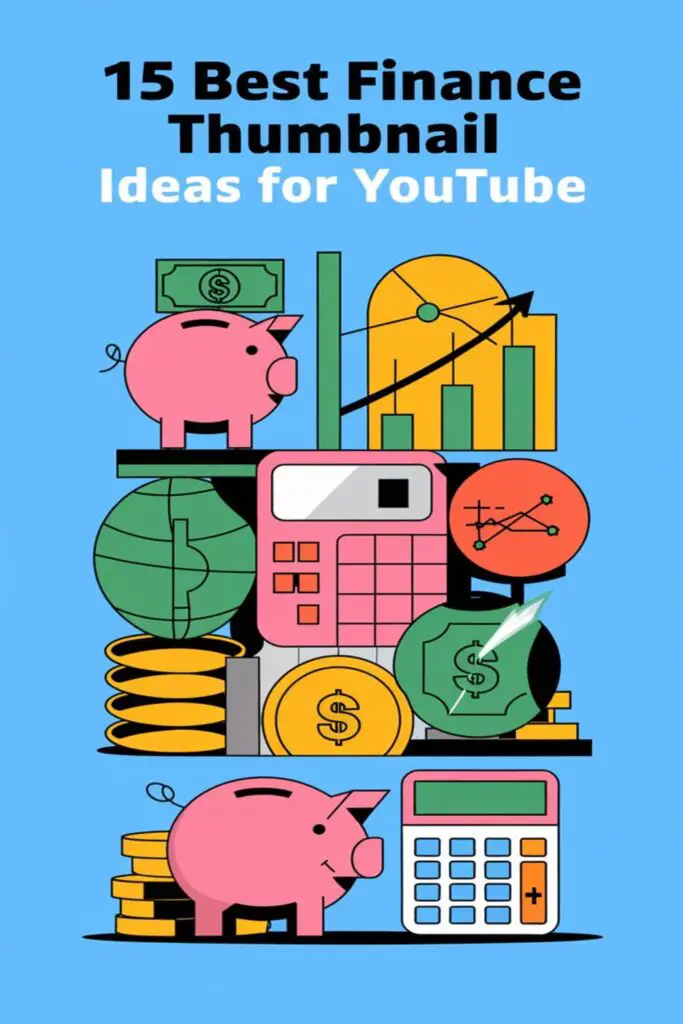
I’ve spent hours studying what works and what doesn’t, and I’ve noticed that finance thumbnails have their own unique style. It’s all about combining bold visuals with clear messaging to grab attention while still looking credible. Whether you’re sharing budgeting tips, investment strategies, or breaking down complex topics, the right thumbnail can help you grow your audience and boost your channel’s success.
Showcase Compelling Graphics
When it comes to finance thumbnails, visuals are everything. Using eye-catching graphics can instantly connect with viewers and highlight your video’s topic.
Use Dollar Signs and Cash Imagery
I always find that dollar signs and images of cash can create an immediate association with money and finance. For example, you can include icons of stacked bills, shiny coins, or floating dollar signs to give the thumbnail a money-centric vibe. Pair these with contrasting colors like green and gold to make them stand out. These elements visually scream “finance” and help your thumbnail grab attention in a split second.
Incorporate Bold Financial Symbols
Symbols like upward-trending arrows, stock market graphs, and percentage signs are powerful tools I use to convey financial growth or economic trends. For instance, an upward arrow on a stock chart can imply success or profit, making it ideal for investment-related content. Bright colors such as red for “losses” or green for “gains” add extra impact. These bold symbols immediately tell viewers they’re about to learn something valuable about money or markets.
Highlight Key Statistics and Numbers
Including key statistics in finance thumbnails can instantly grab attention by showcasing intriguing data. Numbers and percentages bring credibility and give viewers a reason to click.
Feature Eye-Catching Percentages
Adding bold percentages, like “50% Off” or “200% ROI”, captures curiosity right away. I often include these figures in large, clear fonts to make them pop. For instance, if my video discusses investment returns, I’ll highlight a number like “10x Growth” to emphasize potential gains. Percentages like “80% Saving Tips” also perform well because they promise specific value to the audience.
Use Contrasting Colors for Emphasis
Using contrasting colors, like white text on a dark background or bright yellow against black, makes numbers stand out. I prefer pairing greens and reds when showcasing gains or losses—they’re instantly recognizable in financial contexts. For example, highlighting a 15% decrease in expenses with a bright green percentage grabs attention without overwhelming viewers. Contrasts like this amplify clarity and make thumbnails visually engaging.
Employ Minimalist Aesthetics
I’ve found minimalist designs can make finance thumbnails stand out, especially in a crowded YouTube space. They can look professional, modern, and appealing while keeping the focus on the video’s main message.
Stick to Simple Backgrounds
I always stick to plain or subtly textured backgrounds for a clean look. Solid colors like white, gray, or light blue work great since they don’t distract from text or visuals. For added depth, I sometimes use gradients or soft shadows but avoid anything too busy like complex patterns or detailed images.
Use Clean Fonts for Readability
Choosing easy-to-read fonts is one of my top priorities. Sans-serif fonts like Arial, Helvetica, or Montserrat are my go-to because they’re clean and modern. I also keep the font size large enough to ensure text is readable even on small screens. Using bold or uppercase letters helps emphasize key messages but I avoid using more than two font styles to maintain consistency.
Leverage Faces and Emotions
Human faces can make your finance thumbnails instantly more relatable and engaging. Adding genuine emotions can connect viewers to your content on a personal level.
Include Reaction Shots
I’ve noticed that reaction shots, like a surprised expression or someone gasping, work wonders in grabbing attention. For example, a shocked face beside a bold “$1,000,000 Net Worth” headline creates curiosity about the story behind the thumbnail. Make sure the reactions are exaggerated enough to stand out in smaller thumbnail previews but still align with the overall tone of your channel. Reaction moments can be drawn from your video or staged for maximum impact.
Use Expressions That Convey Financial Success
Using happy, confident expressions can inspire a feeling of achievement or wealth. A smiling face paired with text like “Debt-Free in 2 Years!” sends a strong, positive message. You could also include someone holding cash or pointing at a stock graph with a proud look—it subconsciously signals financial triumph. Choose expressions that mirror the content’s promise, like satisfaction for budgeting tips or excitement for investment wins, to build trust with viewers.
Focus on Financial Goals
Thumbnails that highlight financial goals can resonate deeply with viewers striving to improve their finances. By visually representing achievements, you can inspire and motivate your audience.
Visualize Achievements Like Savings Jars
Adding images of savings jars or progress trackers can effectively show the journey toward financial goals. For example, a jar filling up with coins or cash can symbolize saving for a vacation, emergency fund, or a new home. I recommend using bright, contrasting colors like green and gold to make the visual pop. You can also add text, such as “$10K Saved!” or “50% Complete,” to make the goal tangible. This approach creates an emotional connection with viewers who aspire to similar achievements.
Show Milestones Like Graphs or Charts
Graphs or charts can visually communicate financial progress in an accessible way. For instance, a bar chart rising or a line graph trending upward can highlight investment growth or debt reduction. Pair it with bold labels like “Debt-Free by 2025!” or “100% ROI Achieved” to reinforce the thumbnail’s message. I always use simple, clean designs with distinct colors—like blue for gains or red for goals yet to be reached—so the graphics stay clear and engaging. These visuals make financial milestones feel actionable and attainable to the audience.
Use Vibrant Color Schemes
Using bold, attention-grabbing colors can make finance thumbnails pop and instantly catch a viewer’s eye. I always find that pairing the right color combinations not only boosts visibility but also sets the tone for the video’s financial themes.
Experiment with Green and Gold Shades
Green and gold are my go-to colors for finance thumbnails since they immediately evoke thoughts of money, growth, and success. I like using green to symbolize profits, investments, or positive outcomes, while gold gives a sense of wealth and aspiration. For example, I’ll use a glowing gold dollar sign on a rich green background to create a luxurious vibe. Mixing these shades with contrasting text or icons makes the thumbnail feel professional yet appealing.
Add Splashes of Red for Urgency
Red is perfect for creating urgency or highlighting potential losses. Whenever I want to emphasize a critical moment—like a stock market dip or a financial warning—I’ll add bold red arrows or text. Pairing red with contrasting colors like white or black makes it stand out even more. For instance, adding a sharp red triangle with “Limited Time Offer!” immediately grabs attention. It creates an emotional impact, which is key for driving clicks.
Include Relatable Visuals
Using visuals that resonate with everyday life makes finance thumbnails more engaging. Relatable imagery helps viewers connect with the content before they even click.
Display Everyday Money Situations
Highlighting common money scenarios can make your thumbnails feel authentic. I like to include visuals of people paying bills, shopping with a wallet in hand, or counting cash. These everyday moments create a sense of familiarity, encouraging viewers to dive into your video. Adding visuals of piggy banks or grocery receipts also works well to illustrate routine financial tasks.
Show Desk Setups with Financial Tools
Featuring desk setups can instantly convey a professional vibe. I recommend adding visuals of laptops displaying spreadsheets, calculators, or spread-out financial documents. Showing tools like notebooks with handwritten budget plans or coffee mugs next to charts adds a realistic, relatable touch. It’s an easy way to emphasize that valuable financial insights are coming from real, actionable strategies.
Highlight Popular Finance Topics
Focusing on widely recognized finance topics ensures your thumbnails appeal to a broad audience. Covering relatable content helps viewers instantly connect with your video and recognize its value.
Showcase Saving Hacks
Featuring saving hacks is a great way to grab attention. Use visuals like piggy banks, coupon clippings, or jars full of coins to hint at frugality. Add text overlays like “Save $500 This Month!” or “Budgeting Made Easy” in bold, contrasting fonts to highlight achievable goals. Simple icons like percent signs or shopping carts can also reinforce the main idea while keeping the design clean and focused.
Include Investments and Stock Market Themes
Highlighting investments in thumbnails appeals to finance enthusiasts. Use stock market graphs, upward-trending arrows, or tickers with figures to build credibility. For text, go for phrases like “Best Stocks 2023” or “Invest Like a Pro” to draw clicks. Try incorporating bold financial symbols, such as a bull or bear, alongside dynamic visuals like green bills or cryptocurrency logos for extra impact.
Add Call-To-Action Text
Adding call-to-action (CTA) text to finance thumbnails can motivate viewers to click instantly. It’s a proven way to emphasize the value of your content while guiding their focus effectively.
Use Phrases Like “Save More” or “Earn Faster”
Using phrases like “Save More” or “Earn Faster” makes your thumbnails actionable. Short, impactful phrases tap into viewers’ goals, like growing savings or boosting income. I suggest bolding these phrases and pairing them with relatable visuals, such as a piggy bank or cash stack. CTAs like “Retire Early!” or “Invest Smarter!” give a glimpse of your video’s key benefit, pushing curiosity even further.
Incorporate Arrows and Highlights
Incorporating arrows and highlights helps direct attention to specific thumbnail elements. For example, I use arrows to point at bold text like “$1,000 Saved” or “3x Returns!” to emphasize key takeaways. Highlights, such as glowing outlines or colored circles, boost visual clarity, making the CTA stand out. Adding these design touches can make your message impossible to miss and more click-worthy.
Testify with Real Results
Nothing builds trust like showing real success. Finance thumbnails that demonstrate tangible outcomes can captivate your audience and add a layer of credibility.
Include Before-and-After Financial Stories
Showcasing transformations works wonders in finance thumbnails. Use side-by-side visuals to highlight progress, like an empty savings jar next to a full one or a “Before” credit score screenshot paired with an “After” improved score. Pair these with clear, bold text like “From $0 to $10,000!” to emphasize the journey. This storytelling approach creates an emotional connection and inspires viewers to click to learn how they can achieve similar success.
Highlight Real Income Proof Graphics
Displaying actual income figures can solidify your authority. Use screenshots of earnings, such as a bank deposit notification or a completed profit spreadsheet, to provide proof of financial achievements. Overlay with punchy text like “$5,000 Passive Income” or “Made $1,200 in 1 Week!” for maximum impact. Ensure the graphics are visually clean and easy to read, using bright colors to highlight key numbers and enhance credibility without overwhelming the design.
Emphasize Luxury and Aspiration
Thumbnails that radiate luxury and ambition can instantly grab attention. Showcasing elements associated with wealth can inspire viewers to click, curious about how to achieve financial success.
Add Elements Like Cars or Mansions
Including high-end cars or lavish mansions in thumbnails can create a visual dream for viewers. A sleek sports car, like a Lamborghini or Tesla, signals financial milestones and aspirations. Mansions with sprawling lawns and grand entrances scream luxury and elevate the YouTube video’s perceived value. Pair these visuals with bold text like “7-Figure Secrets” to promise actionable steps towards wealth while sparking curiosity.
Use Images of Exotic Vacations
Exotic vacation shots, such as beaches in the Maldives or luxurious cabanas in Bora Bora, evoke feelings of escape and accomplishment. These images help viewers associate financial success with the freedom to explore the world. Placing visuals of crystal-clear waters or private jets alongside phrases like “Retire Early” or “Travel Rich” can strengthen the aspirational vibe. Use bright, sunny color schemes to emphasize the appeal of these dream destinations.
Capitalize on Trending Topics
Riding the wave of trending topics can skyrocket your video views. Finance thumbnails that tap into hot-button issues grab attention and build curiosity instantly.
Incorporate Cryptocurrency Graphics
Using bold cryptocurrency imagery makes thumbnails stand out in the finance space. I’d recommend featuring Bitcoin logos, Ethereum symbols, or rising digital coin values to capture crypto enthusiasts. Including graphics like glowing coins or charts with dramatic spikes can emphasize volatility and opportunity. Pair these visuals with text like “Crypto Boom” or “Next 10X Coin” to intrigue viewers.
Use Visuals Related to Inflation and Economy
Highlighting current economic concerns resonates with viewers. Adding graphics of rising prices, shrinking piggy banks, or stacks of cash can convey inflation’s impact instantly. I often use buzzwords like “Recession Alert” or “Beating Inflation” to drive home relevance. Pairing these with visuals like grocery bills or plummeting stock charts connects the thumbnail to real-world concerns while sparking interest in solutions.
Push Curiosity with Mystery
Sometimes, a little mystery is all it takes to reel viewers in. By hinting at secrets or surprises, finance thumbnails can pull an audience toward clicking just to uncover the full story.
Blur Out Part of the Thumbnail
Leaving parts of a thumbnail blurred builds intrigue. For example, blurring out a large dollar amount or an essential graph detail teases viewers with just enough to make them curious. I like pairing this with clear text, like “Insane ROI!” or “The Exact Amount I Saved,” so the audience feels compelled to click and uncover the hidden details. Blurred visuals keep things vague while promising answers in the video.
Use Teasing Questions for the Audience
Questions spark curiosity instantly. Adding phrases like “How Did I Save $10K in 6 Months?” or “Is This the Best Investment Right Now?” in bold text makes viewers pause and think. I’ve seen that combining these with exciting visuals, like a piggy bank or a stock arrow pointing up, works wonders. These questions create a sense of mystery and a desire for answers only the video can provide.
Customize Thumbnails for Each Video
Every finance video has its unique message, so it’s important to design thumbnails that align perfectly with what’s inside. A personalized approach ensures your content stands out and grabs the right audience’s attention.
Tailor Designs to Niche Content
I always craft thumbnails to highlight the specifics of each video’s topic. For example, if I’m discussing budgeting tips, I’ll include visuals like a calculator or a pie chart. For investment strategies, I might feature stock market tickers or upward-trending arrows. Matching the design to the niche makes it easier for viewers to instantly understand the content’s value. Using text overlays like “Save $100 Weekly!” or “Top 5 Stocks” emphasizes the exact takeaway, increasing click appeal.
Ensure Branding Consistency with Logos
To make my channel instantly recognizable, I incorporate my logo or a unique element, like a signature color scheme, in every thumbnail. For instance, I always place my logo in the corner to maintain visibility without overshadowing the visuals. This consistency builds trust and makes my brand memorable, even when scrolling. Matching font styles and colors across videos also helps reinforce my channel’s professional image and keeps everything visually cohesive.
Test and Adjust Thumbnails Over Time
Thumbnails aren’t a one-size-fits-all deal, especially in the fast-paced finance niche. I make it a habit to test and tweak my designs regularly to see what resonates best with my audience.
Analyze Click-Through Rates
I rely heavily on YouTube analytics to track my thumbnails’ performance. Click-through rates (CTR) tell me if my designs are actually driving views. If a particular thumbnail has a low CTR, I revisit it to identify what went wrong—maybe the colors aren’t eye-catching enough, or the text is hard to read. A spike in CTR after edits often confirms I’m on the right track.
Experiment with Different Designs
I like trying out multiple thumbnail styles to see which one clicks—literally. Sometimes, I’ll swap between bold text overlays and imagery-heavy designs or test variations in color schemes. For example, I’ll use green to symbolize profit in one thumbnail and gold in another to see which performs better. These comparisons help me fine-tune my visuals and understand viewer preferences over time.
Conclusion
Crafting the perfect finance thumbnail is like creating a visual handshake with your audience. It’s your first chance to grab attention and spark curiosity. By blending creativity with strategy, you can design thumbnails that not only look great but also drive clicks and build trust.
Remember, it’s all about experimenting and finding what resonates with your audience. Keep testing, tweaking, and refining your approach. With the right combination of visuals, text, and emotion, your finance thumbnails can become a powerful tool for growing your channel and sharing your expertise.
Frequently Asked Questions
Why are thumbnails important for YouTube videos in the finance niche?
Thumbnails are crucial because they work as the first impression of your video and can significantly impact click-through rates (CTR). In the finance niche, a well-designed thumbnail attracts viewers by conveying professionalism and trust while sparking curiosity about financial topics like budgeting, investments, or saving strategies.
What elements should a finance thumbnail include to grab attention?
Effective finance thumbnails should feature bold visuals like dollar signs, stock market graphs, and bold text overlays. Use vibrant colors such as green and gold to evoke money and success, alongside contrasting shades to ensure visibility. Including key stats like “200% ROI” can further engage your audience.
How does minimalist design enhance finance thumbnails?
Minimalist design helps finance thumbnails stand out by ensuring clarity and professionalism. Use plain backgrounds, clean fonts like Arial or Helvetica, and simple design elements. Limit distractions while emphasizing key messages through bold or uppercase text for better readability and viewer appeal.
Can human faces improve the performance of finance thumbnails?
Yes, using human faces with expressive emotions can make finance thumbnails relatable and engaging. Expressions like surprise or happiness convey financial success and generate curiosity. Pair these visuals with strong messages like “Debt-Free in 2 Years!” to inspire trust and interest in your content.
What role do color schemes play in finance thumbnails?
Color schemes greatly impact attention and emotion. Green and gold shades evoke thoughts of money and prosperity, red indicates urgency or losses, and contrasting colors enhance visibility. These combinations make thumbnails visually striking and help signal the financial content effectively.
Should finance thumbnails include statistics or figures?
Yes, incorporating bold figures like percentages or savings (“50% Off” or “Save $5,000”) adds credibility and triggers curiosity. Use contrasting text and backgrounds to make these numbers stand out, ensuring they are clear and easy to read on small screens.
How can relatable visuals boost viewer engagement?
Relatable visuals like people managing money, paying bills, or using financial tools create familiarity and connection. Combining these with professional elements, like desks with laptops and calculators, adds a trustworthy and actionable vibe to the thumbnail’s presentation.
Why is branding consistency important in finance thumbnails?
Branding consistency builds recognition and trust among viewers. Use recurring elements like logos, signature color schemes, or text styles across thumbnails. This helps create a cohesive look for your channel, making your videos easily identifiable and fostering audience loyalty.
How can testing and optimizing thumbnails improve performance?
Testing thumbnails using YouTube analytics lets you measure click-through rates (CTR). By experimenting with designs, colors, and text styles, you can determine what resonates most with your audience. Regular optimization ensures that thumbnails remain effective over time.
What types of visuals convey financial aspirations in thumbnails?
Visuals like luxury cars, mansions, or high-end vacations evoke success and ambition, inspiring viewers to take actionable steps toward financial goals. These elements create a sense of aspiration and can make your video content more appealing and motivating.
How can call-to-action (CTA) elements improve finance thumbnails?
Using CTAs like “Save More” or “Earn Faster” in finance thumbnails encourages viewers to click by conveying actionable benefits. Pair these phrases with arrows or highlights to draw attention to specific elements, enhancing visual clarity and engagement.