Color wheel for artists
“Color is a power which directly influences the soul.”
– Wassily Kandinsky
Artists possess the gift of creativity and imagination and ideas that they turn into some visually appealing artwork. Artists play with the colors majorly to bring out the emotional sense to their creations. They know how to mix and match the color levels to portray the emotional value through their work.
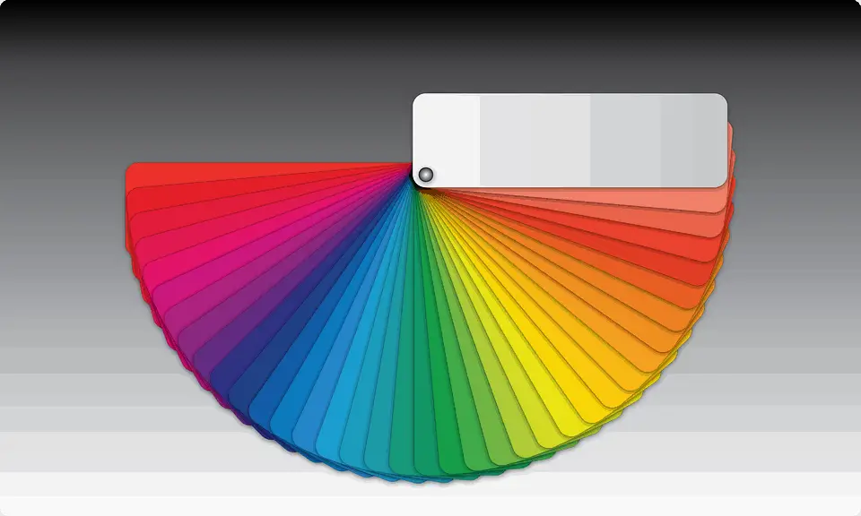
These artworks involve a deep understanding of the colors, their practical combinations, and the science that’s behind determining the sets of colors that look good together and guarantees color harmony within the artwork. This is in technical terms known as color theory and Color Wheel is one of the most important tools for an artist to possess. It is a wheel-like organization of colors or illustration that shows the relationships the Primary colors, secondary colors, and tertiary colors have amongst themselves.
Color wheel definition in Art
Color Wheel was invented by Sir Isaac Newton in 1666 by mapping colors and organizing them in a circle. It is the visualization of the color theory in a circular illustration.
Let’s understand the Color and Color theory which is the basis of the creation of the Color Wheel.
Sir Isaac Newton had gotten the understanding that the colors are human perceptions and not the actual qualities. They are just varying wavelengths of light. The colors can be categorized into 3 different groups:
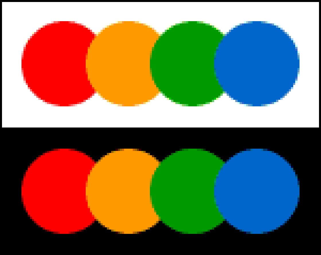
- Primary Colors The colors that add up to create white light come under primary colors. These colors are Red, Green, and Blue.
- Secondary Colors When two primary colors are mixed, the resultant color is the secondary color. The colors are cyan, magenta, and yellow.
Red and Green together create Yellow, Green and Blue creates Cyan, and Blue and red create magenta.
- Tertiary Colors When a primary color is mixed with a secondary color, the resultant is the tertiary color. There are six such tertiary colors. These colors are Orange, Chartreuse green, spring green, azure, violet, and rose.
The color theory is the interpretation of the fact that the colors are our eyes adjusting to the different wavelengths they possess and that the red color has a longer wavelength than the blues. The Color wheel can also be categorized into warm and Cold colors. The intensity of the warmth in the colors determines the color temperature. They are organized on the color wheel to maintain the balance between the warm and cool colors. As per color psychology, the color temperature plays a significant role in invoking emotions. Where warm colors bring to us the feeling of energy and brightness, the cool colors bring calmness, peace, and serenity. Gray and Brown are unavailable on most of the color wheels simply because they are considered to be neutral and dull and hold not much of any emotional value. That’s the reason why these two colors are categorized as Neutral colors but a little hint of these colors add pop to the dull and flat artworks.
Knowing the concepts of color and color wheel, a designer can camouflage the bad points of a structure or paintings or any design to make it look good. For instance, using warm colors like yellow and red, on the short end wall of a room and other walls painted light, tend to make the wall look closer than it actually is and also shorter. Similarly, painting the same walls of the room in pale colors would make the room look more spacious, and painting the floor and ceiling in a similar color and walls in a lighter color would make the room look wider.
Different colors have different personalities like some can be exciting and some can be relaxing for the same color by just playing with the intensity. Intensity simply means how strong the color is.
Each color has different levels of intensities:
- Full Intensity
- Two-Thirds intensity
- Two-Thirds neutral
- Neutral
The two color-mixing models used intensively are RGB and CMYK. Let’s have a look at them in detail.
RGB ( Red, Green, and Blue ) also known as the Additive color mixing model
This model is used for digital artworks. Anything that is being created to be viewed on screens uses this additive color mixing model. Since the light source within the devices can create any color by mixing the three hues ( red, blue, and green ) and varying their intensities, this model is known as the Additive Color Mixing model. If the design project is about Web and Application design or Online Branding or Social Media or some visual content like videos, digital graphics, infographics or photographs for websites, social media or applications, etc. The best file formats for such files are JPEG, PSD, PNG, and GIF. The file formats that must be avoided are TIFF, EPS, PDF, and BMP.
CMYK ( Cyan, Magenta, Yellow, and Key/Black ) – Subtractive color mixing model
These file formats are for the artworks or the materials to be printed out. Since the images are created on paper by combining Cyan, Magenta, Yellow, and Key/Black colored physical inks in different quantities, this method is known as the Subtractive Color Mixing Model. When all the colors are mixed, the resultant is black. The designers turn to the CMYK model when they create projects that involve Branding ( Business Cards, Stationery, Stickers, signs, and storefronts, etc. ) or Advertising ( Billboards, Posters, Flyers, Vehicle Wraps, Brochures, etc. ) or Merchandise ( t-shirts, hats, promotional merchandise, etc. ) or Essentials ( Product Packaging or Restaurant menus ). . The best file formats for such files are PDF, AI, and EPS.
Pantone (PMS) Spot Color – This is another mixing method used for printing. There is a large list of specially mixed colors that have been made by the Pantone Corporation which is also known as PMS i.e. Pantone Matching System.
HSB (Hue, Lightness, and Saturation) – This model uses the three components of the color i.e. Hue, Lightness/Brightness, and Saturation. Hue refers to the color available on the color wheel itself, saturation the intensity of the color, and brightness refers to the lightness or the darkness of the color.
L*a*b model – This model is based on how the human eye perceives colors. L here stands for Luminance (lightness) and 2 chromatic components ‘a’ and ‘b’ where a stands for green to red and b stands for blue to yellow.
Lets now Understand some terms related to the color and Color Wheel
Hue – It is the color available on the Color wheel and the hues are considered to be the base for creating any shade, tints, tones, etc.
Saturation – The intensity of the color or its purity is known as saturation.
Luminance – The brightness of the color or lightness is known as Luminance.
Shade – When the base hue is mixed with different intensities of black, it makes the color darker. These intensities of the color created are known as the shade of that particular color.
Tints – When the base hue is mixed with the white, it lightens the color creating the tints of that particular color. This is very useful when trying to balance a wide range of colors together.
Tones – When the base hue is mixed with the Black and white ( or grey color ), creates the tones.
Now let’s go through the traditional color schemes available for us to help in our design tasks. These color schemes are derived from the basic color wheel and are now used in almost all industries for their products. Here’s the list of the color schemes
Monochromatic – This Color scheme is made up of one base hue and its different shades, tints, and tones. This is the simplest color scheme that can be created. This can become boring if not created with intention. Including enough amounts and intensities of shades and tints can give a pop in the colors.

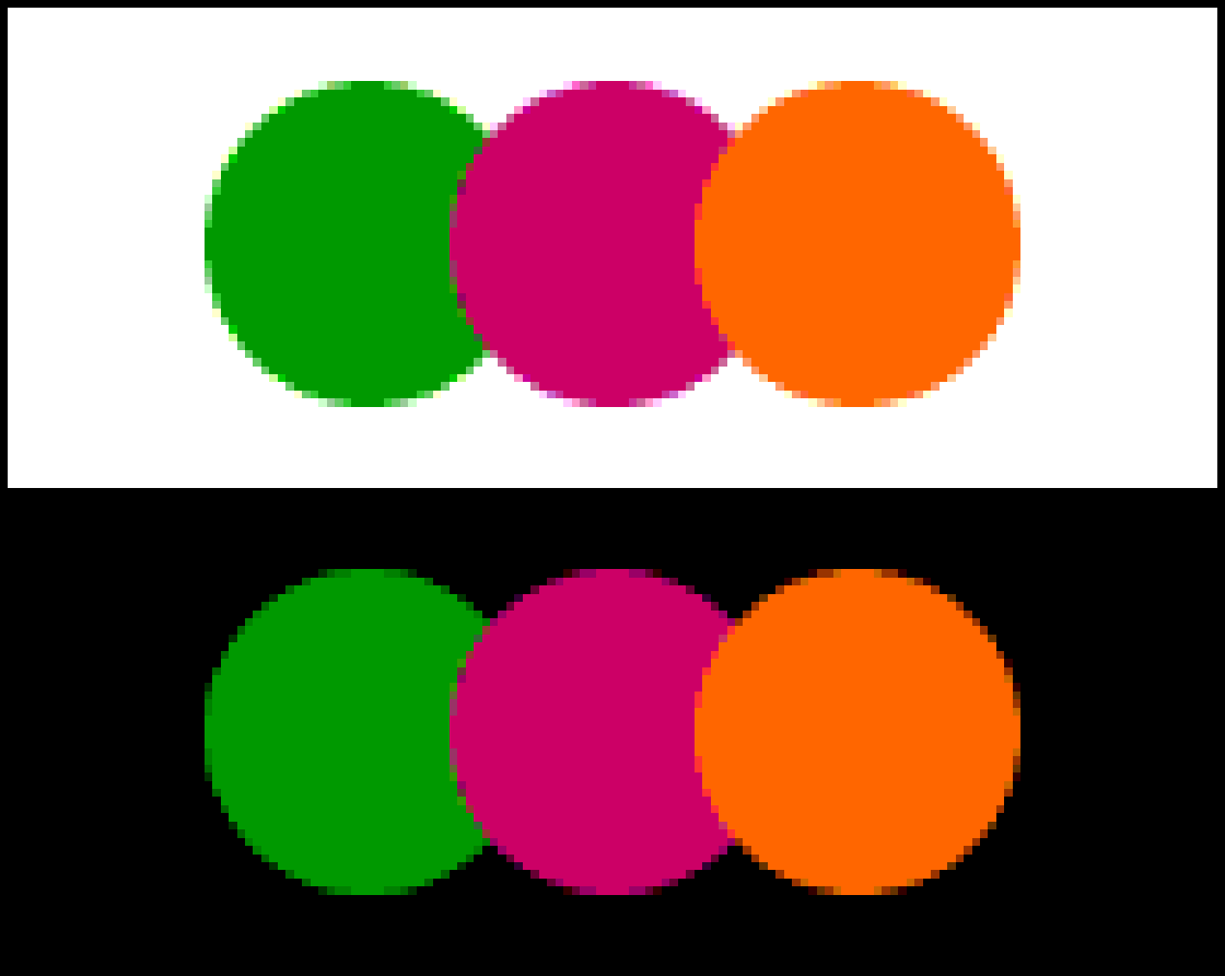
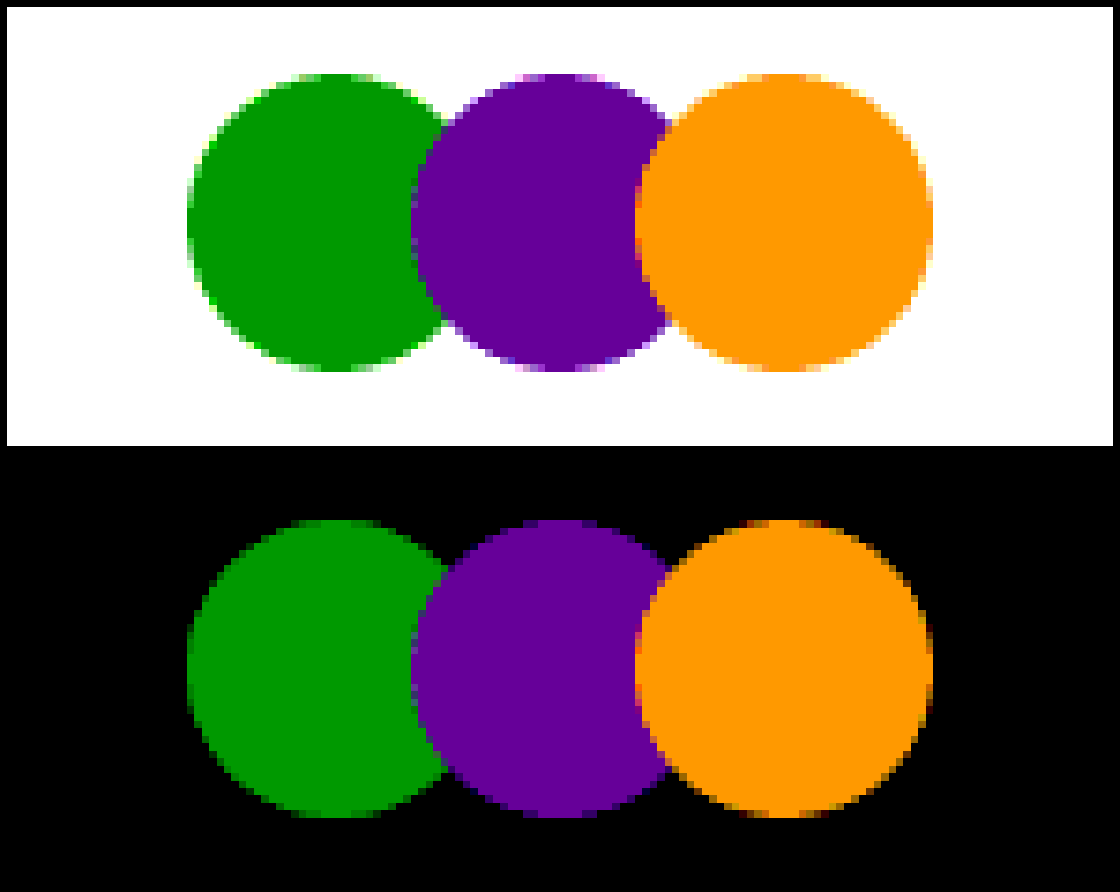
Analogous – This color scheme can be created by using three colors next to each other on the color wheel.

Complimentary – This color scheme is created by combining the colors that are opposite to each other on the color wheel. This scheme consists of only two colors but to add some interest to the work, the shades, tints, and tones of the hues can be used.


Split Complimentary – This color scheme is created by using a base hue and the colors next to the opposite base hue on the color wheel.

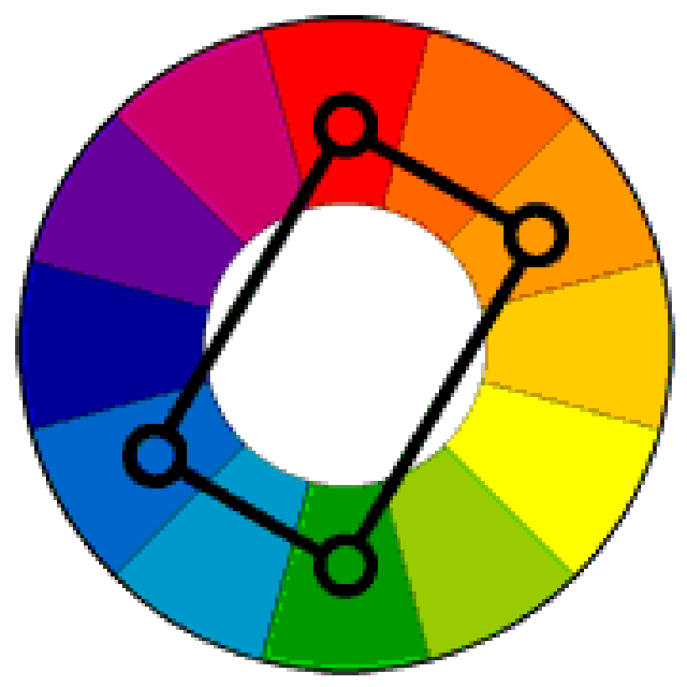
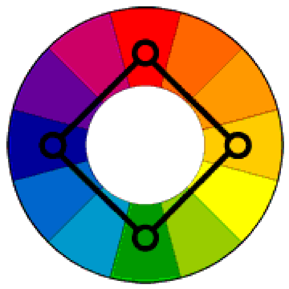
Triadic – This color scheme is created by using the hues equally spaced on the color wheel.
Double Complimentary ( Tetradic ) – This color scheme uses 4 colors of 2 different complementary pairs. They work best if one of the colors is used as the dominant one. This color scheme can also be called the Rectangle color scheme.
Square – this color scheme is the same as the rectangle color scheme but the only difference is the 4 colors are evenly spaced That is 90 degrees apart on the color wheel.

Custom – This color scheme is created by using properties like chroma, value, and saturation, and one of the hardest schemes to create.
Multicolor – This color scheme uses the matching values for each color on the color wheel.
Neutral color – this color scheme uses the shades of browns and tans. These are neutralized by mixing with their complementary colors.
Dual Complimentary – This color scheme is made up of the two colors side by side and two opposite colors opposite to them on the color wheel.
Near Complimentary – This color scheme combining the starting color with the color right or left to the complementary color which produces a much more interesting two-color combination.
Modified Triads – These color schemes are created by choosing three colors on the wheel, each with only one space separating them instead of two spaces used to create complimentary triads.
Achromatic – This color scheme uses no color and just the shades of Gray, black, and white which is also known as grayscale.
Since we have now discussed the basics of Color and the Color wheel for designers to know, let’s understand how to use them in design projects.
As mentioned earlier, the colors hold the power to influence the mood of the people who are looking at it and hence can also influence the actions that a user takes. Here’s more detail on the colors and the emotions attached to them.
Red – This color generates a feeling of passion, love, confidence, strength, and aggression. It can be an indicator of the good and bad state of mind. This color can be used to draw a user’s attention but if not used correctly can also invoke negative effects.
Orange – This color reflects the energy and the feeling of excitement. This color is a combination of red and yellow that brings the feeling of power, motivation, enthusiasm, love, and friendliness together. Designers can prefer this color if they want to add a hint of creativity and adventure to their designs.
Yellow – This color is the symbol of sunlight, happiness, joy, and warmth. Proper use of yellow can bring the feeling of inspiration and confidence but extreme usage of these colors can invoke the feeling of anxiety and fear.
Green – This is very often called the color of nature and harmony. This brings a very calming feel. It can also mean a sign of growth. This color is widely used for project designs that are somehow connected with nature like ayurvedic products, herbals, etc.
Blue – This is considered the color of trust. This can also be a sign of reliability. If not used in a controlled manner, it can also symbolize distance or sadness to some degree.
Purple – From ancient times purple color has been a symbol of royalty and wealth. this also symbolizes mystery and magic but excess use of this color may divert the viewer’s attention from the main object. since the purple color is a combination of red and blue it also symbolizes power and stability.
Pink – This color symbolizes hope, sensitivity, or romance. This color is also strongly related to the feminine society, so this color can be considered where young women are the target audience. It reflects unconditional love as well.
Brown – This is the color that symbolizes security, warmth, experience, reassurance, and comfort.
Black – This is one color that can have multiple meanings and associations. This also one color that the designers prefer to use as background since it matches and looks good with all the other colors. It could sometimes symbolize tragic situations or death or a mystery. Designers often use it to create contrasts in their artworks.
White – this is also the color that is used for backgrounds where readability is more important. This is the color of purity, innocence, wholeness, and clarity. However, if the color is not used in control it can also give the feeling of isolation and emptiness.
Designers not only need to understand the emotions but also the people’s perception of these colors in different parts of the world. For Example, White is a symbol of happiness and purity in Western countries whereas in Asian countries the same color is the symbol of death.
Being a designer, there are a few points that need to be considered during the creation of any project.
- Colors are chosen wisely so that they have maximum impact on the user viewing that
- Color combinations are made in such a way that it matches or is liked by the maximum of the people.
- To make sure, that the design created is conveying the correct and the intended message.
- Making sure that the colors are chosen as per the perspectives of the target audiences.
- Learn about the target audience, their color preferences, their meanings, their age group, gender, and culture.
- Avoid having text, images, and different elements all cluttered in a design.
- Do not go overboard with gradients
- Make sure that the design of the artwork works for all mediums.
How – to for designers to select the color scheme for their project
- Ensure that the color you are choosing matches the context of the project.
- Referring to the Color wheel, identify the analogous colors.
- Again refer to the color wheel to identify the relevant complimentary colors.
- Identify the monochromatic colors for the same color/hue.
- Try to create a high contrast using the triadic color scheme.
- identify a split complementary color scheme.
- From all these identified schemes, choose what looks the most relevant and pleasing.
- Start with one base color.
There are various tools for designers with Color Wheel and the color schemes that make their job a bit easier. Few tools are listed below
- Adobe Color
- Illustrator Color Guide
- Canva
- Khroma
- Paletton
- Ambiance
- Coolors
How to create an artist’s Color Wheel
Step 1: Create an outline of the simple color wheel on some surface.
Step 2: Paint in the primary colors ( red, blue, and yellow ) – these colors should be the highest chroma primary colors.
Step 3:Mix in primary colors to get the secondary colors.
Step 4: Mix in primary and secondary colors to get the tertiary colors and fill in the remaining spaces.