Email marketing in the finance world can feel a bit tricky, right? It’s not just about numbers and charts—it’s about building trust and keeping things clear while still being engaging. The right email design can make all the difference in grabbing attention and driving action.
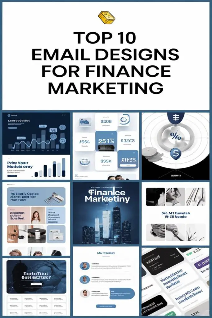
I’ve come across some seriously impressive email designs that strike the perfect balance between professionalism and creativity. Whether you’re promoting a new service, sharing market insights, or just trying to connect with clients, these designs can inspire your next campaign. Let’s dive into the top picks that’ll make your emails stand out.
Clean And Professional Design
A clean and professional design is essential for finance marketing emails. It builds credibility and ensures your message resonates with clarity and purpose.
Best Practices For Layout And Content
Keeping the layout well-structured is key. I stick to a single-column format to maintain readability across devices. Using a clear hierarchy with a bold headline, concise supporting text, and a prominent call-to-action (CTA) helps guide the reader seamlessly. I avoid clutter by sticking to a minimalist aesthetic with ample white space. For content, I use straightforward language that’s actionable and avoids jargon. Including trust signals like secure icons or customer testimonials adds reassurance.
Examples Of Clean Finance Emails
One great example is a bank account promotion email with a simple “Unlock Your Benefits” header, followed by three bullet points outlining key features like low fees, high-interest rates, and rewards. Another example is an investment platform email showcasing a graph visual with a bold “Start Investing Today” CTA, followed by a brief explanation of how to begin. A credit card offer email from a major provider stands out with a sleek design, clean typeface, and a clear benefits breakdown under an attention-grabbing headline.
Personalization In Email Design
When it comes to finance marketing, personalization isn’t just a trend—it’s a game-changer. Tailoring emails to individual needs can turn a generic message into a meaningful connection.
Using Customer Data To Personalize
I rely on customer data to craft emails that feel personal and relevant. For example, using a person’s name in the subject line or addressing their recent financial activity—like showing investment growth or offering tailored credit options—immediately catches attention. Transaction history, preferences, or account milestones can inspire content that feels uniquely theirs. A fintech platform might send birthday discounts or customized loan options based on prior interactions. It’s all about showing that we know and care about their specific needs.
Impact Of Personalization On Engagement
I’ve seen personalized emails significantly boost engagement. Including tailored recommendations or reminders leads to higher open rates and click-throughs. For example, a targeted email about pre-approved mortgage rates often gets more interaction than a generic loan promo. It’s because people are more likely to act on offers that directly solve their problems. Personalization builds trust and makes it easier for customers to take action, whether it’s scheduling an appointment or exploring new financial products.
Minimalist Design For Clarity
When it comes to finance marketing, less is often more. A minimalist email design ensures clarity, making it easier for readers to process key information quickly.
Benefits Of Keeping It Simple
Simplifying your email design improves readability and focus. By avoiding clutter and distractions, you can highlight the most important details—like your offer or CTA. Minimalist designs also feel more professional, which builds trust in the finance sector. A clean layout with just a few sections helps keep the spotlight on your messaging and prevents overwhelming the reader. Plus, streamlined designs tend to load faster, ensuring compatibility across devices.
Example Of Minimalist Finance Emails
I’ve seen great examples of minimalist emails that fully embody this concept. One memorable design came from a mortgage lender, featuring a single-column layout, a bold headline reading “Lock In Your Low Rate Today”, a short paragraph explaining the benefits, and a clear CTA button labeled “Apply Now”. Another excellent example is an investment app email with plenty of white space, a soft color palette, and a focus on a single graph showing potential gains, accompanied by a simple “Learn More” button. These designs prove that you don’t need excess to make an impact.
Interactive Email Designs
Interactive email designs turn static content into dynamic experiences, keeping readers engaged while simplifying complex financial information. By incorporating interactive elements, I can make finance emails more memorable and actionable.
Features That Increase Interaction
Using clickable elements like buttons or sliders enhances user engagement. For example, I’ve incorporated drop-down menus that let users explore specific financial services without leaving the email. Calculators, like one for estimating loan payments, give readers immediate value by solving an issue right within the email.
Animations and hover effects, such as highlighting interest rates or flashing discounts, ensure recipients focus on key information. Additionally, progress trackers guide users through steps like signing up for a savings plan or accessing account insights.
Examples Of Interactive Finance Emails
I’ve noticed incredible results with finance emails that utilize these engaging features. One example is a credit card rewards email, where users could toggle between cashback and travel points calculations. Another memorable design was a savings goal tracker, showing users their progress toward a personal milestone with interactive graphs.
Another example I loved is from an investment platform that used an interactive quiz to recommend portfolio options. Click-to-reveal elements also shined in a bank promotion, letting users uncover their personalized benefits like waived fees or bonus interest rates. By creating these seamless interactions, finance brands make emails both informative and fun.
Mobile-Optimized Email Design
With more people checking emails on their phones, it’s crucial to design emails that look great on smaller screens. Mobile-optimized emails ensure readers have a seamless experience, no matter the device they’re using.
Importance Of Mobile Responsiveness
I can’t stress enough how important mobile responsiveness is for finance marketing emails. Around 85% of users access emails on mobile devices, and poorly optimized designs often lead to high bounce rates. When an email doesn’t load properly—think misplaced text, broken images, or endless scrolling—it instantly reduces trust and engagement. In finance especially, where professionalism matters, a mobile-friendly design can make or break the effectiveness of a campaign. Ensuring a polished and responsive layout across all devices demonstrates your brand’s attention to detail and credibility.
Key Mobile Optimization Tips
I always stick to a few key strategies when optimizing emails for mobile. First, I use a single-column layout because it’s easier to read on smaller screens. Fonts need to be legible, so I make sure text is at least 14pt for body content and larger for headings. Images should auto-scale, and I compress them to avoid long load times. Short subject lines are a must, as mobile inboxes often cut them off early.
I also prioritize clickable CTAs that are easy to tap without those frustrating misclicks. Buttons need enough spacing around them, with a size of at least 44×44 pixels as a guideline. Finally, I preview emails on various devices to catch any design issues before hitting “send”. These simple adjustments can make all the difference in creating a professional, user-friendly experience for mobile readers.
Trust-Building Visuals And Copy
In finance marketing, trust is everything. A great email design combines visuals and messaging to create confidence in your brand and offerings.
Creating Transparency Through Design
Using design to build transparency is key. I always recommend clear, professional layouts with straightforward visuals like graphs, simplified charts, or step-by-step illustrations. For example, showing a breakdown of a loan repayment schedule or visualizing investment growth with clean, easy-to-read designs reassures readers by making complex data accessible. Add trust signals, like secure payment icons or mentions of regulatory compliance, to emphasize your credibility. Remember, transparency is not just visual—it’s also in your words. Stick to concise, jargon-free copy that explains benefits clearly without confusion.
Examples Of Trust-Centric Emails
Some of my favorite trust-building emails in finance focus on clarity and customer-centric benefits. For instance, I saw a personal finance app send a beautifully designed email featuring a graph that displayed how users could save $500 over six months with their budgeting tool. Another great example was a retirement advisory firm’s email that outlined a step-by-step process on how to start saving for retirement, paired with testimonials from satisfied clients. Even a bank’s email promoting their new checking account stood out, with its clean design, a bold header stating “No Hidden Fees—Ever,” and a quick bulleted list of transparent perks. Using approaches like these ensures your audience feels secure and valued.
Segmented Audience Email Designs
Segmenting your audience allows you to send targeted messages that resonate with specific groups. By tailoring email designs to different segments, you can boost engagement and drive better results.
Customizing Emails For Different Groups
Understanding your audience segments is key. For example, I create emails for new customers that highlight financial literacy tools, while longtime clients receive updates on premium benefits or account insights. When targeting small business owners, I frame messages around business loans or cash flow tips. For a younger demographic like students, I emphasize budgeting tools and low-fee credit card offers, using vibrant, relatable visuals.
I also make design adjustments to suit each group. Emails for professionals often feature a sleek, minimalist design with clear CTAs and trustworthy statistics. On the other hand, emails aimed at families might include friendlier graphics and a conversational tone to make financial products feel approachable. Matching the design to the audience ensures relevance and impact.
Case Studies Demonstrating Effectiveness
A major online bank segmented their audience into savers, investors, and credit card users. They sent personalized emails to savers promoting higher-interest accounts, with visuals of projected earnings over time. Investors received emails with bespoke portfolio recommendations, each linked to interactive reports. Credit card users got targeted upgrade offers, complete with cashback scenarios tailored to their spending habits. Open rates jumped by 36%, and conversions rose by 24%.
I recently saw a credit union tailor their emails by region, suggesting local branch events or mortgage rates based on location. Their regional emails featured vibrant city-centric imagery and local testimonials, boosting trust and engagement. This approach led to a significant increase in click-through rates—up 42% compared to their generic campaigns.
Segmented designs don’t just personalize; they perform.
Engaging Call-To-Action Designs
Crafting the perfect Call-To-Action (CTA) is essential in finance emails. It’s where design meets strategy, guiding readers toward their next step effectively.
How To Craft Compelling CTAs
Start with clarity and brevity. A CTA should clearly tell recipients what action to take, like “View Your Statement” or “Start Saving Now”. Always use action verbs to create a sense of urgency or motivation.
Design for visibility. Place CTAs prominently with contrasting colors and bold fonts. A button format works best since it’s easily tappable on both desktop and mobile devices.
Align CTAs with user intent. For example, if the email highlights lower loan rates, the CTA should say “Check Your Rates Today.” Personalizing CTAs by including the recipient’s first name (“Hello [Name], Boost Your Credit Today!”) can also boost effectiveness.
Examples Of Action-Oriented Finance Emails
I’ve seen some great finance emails that nailed their CTAs. One example is a personal loan offer email that featured a bold button saying, “Get Pre-Approved in 5 Minutes,” making the process feel quick and effortless.
Another standout is a retirement savings email showing a progress graph with the CTA “See Your Full Plan” right below it. The visual and CTA work together seamlessly to drive engagement.
A final example I admire is a credit score improvement email. It used a dynamic button that read, “Raise Your Score Now,” paired with a brief explanation of the benefits. Simple, direct, and action-focused.
Informational And Educational Designs
Informational and educational email designs are perfect for sharing value while building trust. These designs focus on simplifying complex financial topics through engaging, accessible content.
Delivering Value Through Educational Content
Providing actionable insights in finance emails makes readers feel informed and empowered. I ensure these emails break down topics like budgeting, saving, or investing into digestible segments using numbered tips or FAQs. Adding infographics or simple charts can turn otherwise dull subjects into visually compelling content. For example, a “How to Start Saving for Retirement” email might include a step-by-step guide alongside a projected savings growth chart.
Including a link to a detailed guide or a short video enhances the learning experience, no matter how complex the topic. I also use headers to divide sections clearly and include a crisp CTA like “Learn More About Budgeting Tools” to direct readers toward additional resources. Educational finance emails not only build credibility but also keep subscribers engaged with helpful, relevant insights.
Examples Of Informative Finance Emails
Some of the most effective finance emails I’ve seen provide clarity and value upfront. One standout example is a tax-planning email offering a checklist for end-of-year tax tips. It featured a downloadable PDF, making it practical and useful for recipients during tax season.
Another strong example is an investment email explaining compound interest with a simple graph showing its long-term benefits. The email included a breakdown of numbers specific to different saving levels, paired with a CTA like “Start Your Plan Today” that tied directly to the content.
Finally, I love emails that highlight financial literacy content, such as introductory courses on stock market basics. These emails often use clean visuals, short sentences, and approachable language to reduce the intimidation factor.
Use Of Visuals And Infographics
In the finance world, visuals can make a huge difference in how information is received and understood. Infographics and clean graphics simplify complex topics and keep readers engaged.
Making Email More Digestible With Graphics
Adding visuals, like charts, icons, and infographics, breaks down heavy financial data into easy-to-read pieces. For example, a bar graph showing investment growth over time or a pie chart illustrating spending categories can visually clarify concepts that might be confusing in text alone. Graphics also create flow, guiding readers through the email naturally. By combining text with images strategically, marketers can make emails both useful and visually appealing.
Examples Of Visual-Heavy Finance Emails
I’ve seen finance emails that successfully lean on visuals to deliver their message. A credit card rewards email once included an icon-based summary of perks—cash back percentages, travel credits, and zero annual fee—all represented with bold, colorful visuals. Another great example is a savings app email featuring a dynamic progress tracker in chart form; it made hitting financial milestones feel real and achievable. Even something as simple as a personal finance email showcasing a monthly budget breakdown with color-coded charts can make an ordinary message more engaging and effective.
Conclusion
Crafting effective email designs for finance marketing is all about balance. It’s not just about looking polished but also about building trust, simplifying complex information, and driving action. Whether it’s through personalization, minimalism, or interactive features, every element should serve a purpose.
By focusing on clarity, relevance, and user experience, you can create emails that resonate with your audience and inspire them to engage. Don’t underestimate the power of strong visuals, mobile optimization, and tailored messaging—they can make all the difference in standing out in a crowded inbox.
Frequently Asked Questions
What are the key challenges of email marketing in the finance sector?
The key challenges include building trust, ensuring clarity, and maintaining engagement. Financial data can be complex, so creating clear, concise messaging while appearing professional and credible is essential.
How can effective email design improve engagement for finance brands?
Effective email design grabs attention and encourages action through clean layouts, bold headlines, concise content, and clear call-to-actions. Using trust signals like secure icons and testimonials also builds credibility and fosters engagement.
Why is personalization important in finance email marketing?
Personalization helps tailor emails to individual needs, making them more relevant and engaging. Personalized emails boost open rates, click-throughs, and foster trust by addressing specific user behaviors or preferences.
What is the importance of minimalist design in finance emails?
Minimalist design ensures clarity by avoiding clutter. It simplifies information, highlights key details like offers or CTAs, and improves readability, creating a streamlined, professional impression for recipients.
How can interactive elements enhance finance email designs?
Interactive features like toggling options, calculators, or quizzes engage readers while simplifying complex information. They make emails more dynamic, improving user experience and delivering immediate value.
Why is mobile optimization crucial for finance email campaigns?
With 85% of users accessing emails via mobile, poorly optimized designs can lead to a loss of trust and higher bounce rates. Mobile-friendly layouts ensure emails are effective and professional across all devices.
What role do visuals play in building trust through finance emails?
Visuals like graphs, charts, and infographics simplify complex data, making it more accessible. Trust-centric designs with clear layouts reinforce credibility and help users better understand financial concepts.
How do segmented audience strategies enhance finance email effectiveness?
Segmented email designs tailor messages to specific audience groups, improving relevance and engagement. Personalizing emails for segments like new customers or small businesses leads to better open and click-through rates.
What makes a strong call-to-action (CTA) in finance email marketing?
A strong CTA is clear, concise, and visually prominent. Using bold fonts, contrasting colors, and aligning the message with user intent encourages readers to take desired actions like signing up or making a purchase.
How can finance brands create educational emails to build trust?
Educational emails simplify complex financial topics with clear headers, visual aids, and actionable insights. Value-driven content, such as tax tips or investment guides, informs and empowers recipients.
Why are infographics effective in finance email designs?
Infographics break down complex data into simple visuals, enhancing readability and engagement. They make financial information more digestible, helping brands communicate effectively and build lasting trust with audiences.