When it comes to making a lasting impression in the finance world, a well-designed visiting card can do wonders. It’s not just a piece of paper with your contact details—it’s a reflection of your professionalism and personal brand. Whether you’re a financial advisor, accountant, or investment banker, your card should speak volumes about who you are and what you stand for.
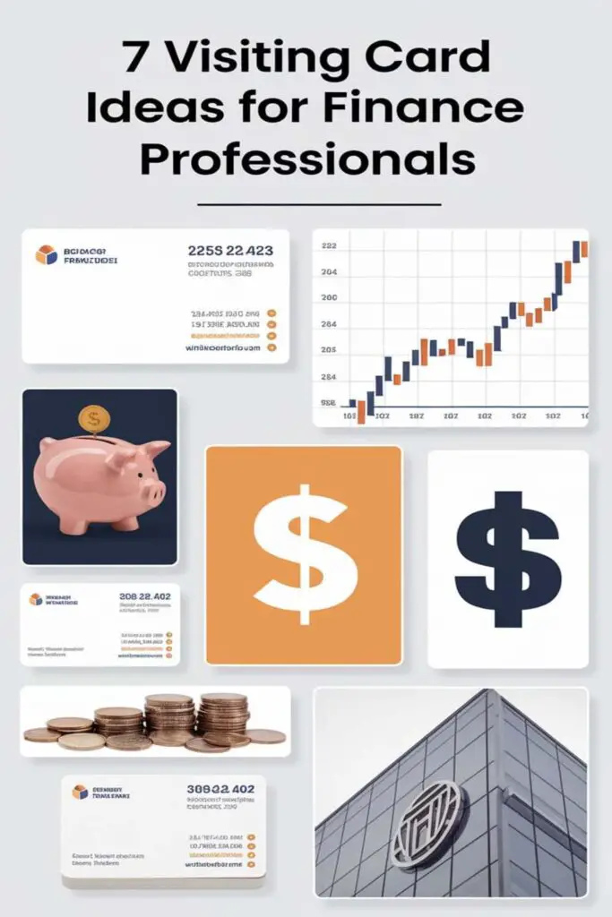
I’ve seen how a thoughtful design can turn a simple introduction into a meaningful connection. From sleek minimalism to bold, creative layouts, there are countless ways to make your card stand out while keeping it professional. Let’s explore some ideas that’ll help you leave a mark and showcase your expertise in style.
Minimalistic Card Designs
Minimalistic designs are perfect for finance professionals who want their cards to feel polished and professional without being overwhelming. They focus on clean layouts and precise details, leaving a lasting impression through simplicity.
Emphasizing Simplicity and Elegance
Keeping the design simple enhances its overall sophistication. I’d recommend using straightforward fonts like Helvetica or Futura and avoiding cluttered layouts. Instead of overloading the card with information, I focus on highlighting key elements like my name, title, and contact details. Clean lines and balanced spacing ensure the card doesn’t feel crowded, creating a sleek and refined appearance.
Using Limited Color Palette
Pairing two or three neutral tones works wonders for minimalism. I go for muted colors like navy blue, gray, or white, avoiding flashy combinations that could distract from the professionalism. For a subtle touch of personality, I might add a metallic foil or embossed detail in gold or silver. This approach keeps the design simple while conveying a sense of authority and trust.
Bold Typography for Impact
When it comes to making a statement, bold typography can do wonders on a visiting card. For finance professionals, it’s an opportunity to stand out while exuding confidence and clarity.
Highlighting Key Information
I recommend using bold typography to draw attention to the most critical details, like your name, job title, or business name. For example, design your name in bold and slightly larger text than the rest, creating a clear visual hierarchy. This makes it easy for someone to instantly recognize who you are and what you do. Pair bold headers with smaller, lighter font for secondary elements like contact details to maintain balance.
Using Professional Fonts
Choosing professional fonts is crucial for maintaining a polished appearance. Fonts like Times New Roman, Garamond, or Montserrat strike the right balance between style and professionalism. Avoid overly decorative styles that might diminish your credibility. Stick with clean, strong lines that reinforce clarity, authority, and trustworthiness—even when using bold text. A mix of serif and sans-serif fonts can also add variety without sacrificing the card’s sharp, professional look.
Incorporating Financial Symbols
Adding financial symbols to a visiting card can immediately communicate expertise and help establish industry relevance. Here’s how you can use them effectively.
Utilizing Stock Market Icons
Using icons like bull and bear symbols easily ties your card to the finance world. A subtle bull silhouette can represent optimism or growth, while a bear might signal resilience during downturns. Incorporating candlestick chart icons can hint at investment expertise. Keep these elements minimal and placed near your name or title to maintain professionalism.
Including Currency Symbols
Adding symbols like the dollar ($), euro (€), or yen (¥) can reflect your global financial knowledge. For instance, placing a sleek currency symbol next to your name or firm’s name creates a connection to international markets. Make sure the symbols blend with the overall card design by matching fonts or using metallic finishes for a polished appearance.
Adding QR Codes for Digital Connectivity
Embedding QR codes on visiting cards is a smart way for finance professionals to bridge the gap between paper and digital interactions. It enhances accessibility while keeping the card clean and uncluttered.
Linking to Online Portfolios
I love how QR codes can direct people to a professional online portfolio. Whether it’s my LinkedIn profile, a personal website, or an online resume, it offers a seamless way to show my experience and achievements. Including a QR code saves space by eliminating the need for lengthy URLs on the card. I make sure the landing page is mobile-friendly and updated with my latest projects or certifications to leave a great impression.
Offering Easy Contact Sharing
Adding a QR code for instant contact sharing is a game-changer. With a quick scan, people can save my name, phone number, and email directly to their phones. I find this especially useful during networking events where convenience is key. For a polished touch, I create a vCard QR code and test it to ensure all the details load correctly. It’s practical, modern, and eliminates the hassle of manual data entry.
Eco-Friendly Material Choices
Eco-conscious visiting cards aren’t just great for the planet—they also make a strong statement about your values as a finance professional. Choosing sustainable materials can showcase your commitment to responsibility and innovation.
Using Recycled Paper
Using recycled paper for visiting cards reduces waste and gives them a unique texture. I’ve noticed that cards made from recycled paper often have a natural, understated look that aligns well with a finance professional’s polished image. To keep it professional, you can still have options for smooth finishes or subtle embossing. Plus, using recycled paper sends a message of sustainability, which resonates with many clients today.
Opting for Biodegradable Alternatives
Opting for biodegradable alternatives like seed paper adds a creative and eco-friendly twist. These cards can be planted into soil, growing into flowers or herbs—a memorable way to leave a lasting impression. I’ve seen this approach work for professionals who want to stand out while maintaining a responsible edge. Make sure the design matches the biodegradable material’s natural aesthetic to reinforce your attention to detail and innovation.
Monogrammed Designs for Branding
Monogrammed designs are a timeless way to create a strong personal brand while adding a touch of sophistication to visiting cards. They combine simplicity and elegance, making them perfect for finance professionals who want to exude professionalism effortlessly.
Custom Initials and Logos
Using custom initials or logos on a visiting card immediately establishes your identity and makes it easy for contacts to remember you. I recommend designing a monogram using your first and last initials, blending them into a sleek, cohesive symbol. Choose a minimalistic font like Baskerville or Lora for a classic look, or go modern with clean lines using fonts like Helvetica Sans or Proxima Nova. Pairing these initials with a small, finance-related icon, like a subtle dollar sign or stock chart pattern, can further tie the design to the industry. Metallic accents, like gold or silver foiling, can make the monogram pop without feeling overdone.
Representing Personal Style
A monogrammed design should reflect your personal style while staying professional. If your work focuses on traditional finance, choose a classic design with serif fonts and neutral colors like navy or charcoal. For professionals in innovative sectors like fintech, I suggest experimenting with bold geometric patterns or vibrant accent colors such as teal or burgundy to give the monogram a contemporary twist. Consider embossing or debossing the monogram for added texture, creating a tactile element that looks high-end and leaves an impression. By tailoring your monogram to your style, you can make your card a perfect representation of who you are.
Double-Sided Cards for Information
Double-sided visiting cards are a smart way to share more details without cluttering the design. They help create a clean, organized impression that’s perfect for finance professionals.
Separating Personal and Professional Details
I use one side of the card to showcase my professional credentials, like my name, title, company, and contact details. The second side can focus on more personal elements, such as a QR code leading to my LinkedIn profile or a favorite finance-related quote. This separation keeps the card visually balanced while allowing me to share everything relevant in an orderly fashion.
Using One Side for Visual Appeal
I dedicate one side entirely to aesthetics. For instance, I might use the back for a bold logo, a textured finish, or subtle financial symbols like candlestick icons or currency signs. This creates a polished, striking design that grabs attention without overwhelming the practical information on the other side. A clean font and aligned visual elements bring everything together seamlessly.
Conclusion
A visiting card isn’t just a piece of paper—it’s a snapshot of who you are as a finance professional. The right design can set you apart, leaving a lasting impression that speaks to your expertise and style. Whether you lean toward minimalism, bold statements, or eco-friendly materials, your card should reflect your unique brand and values.
Remember, it’s all about balancing aesthetics with functionality. A well-thought-out visiting card can open doors to meaningful connections and opportunities, so don’t underestimate its impact.
Frequently Asked Questions
Why is a well-designed visiting card important in the finance industry?
A well-designed visiting card reflects professionalism and personal branding. It helps financial professionals create meaningful connections and leaves a lasting impression, showcasing authority, trustworthiness, and expertise.
What are the benefits of minimalistic visiting card designs?
Minimalistic designs focus on simplicity and elegance. They use clean fonts, limited color palettes, and subtle details like embossing to convey professionalism, ensuring the card looks polished and uncluttered.
How can bold typography enhance a visiting card?
Bold typography creates a clear hierarchy, emphasizing key details like name and title. It ensures readability while exuding confidence and professionalism, especially when paired with balanced secondary fonts.
Why include financial symbols on visiting cards?
Financial symbols, like bull and bear icons or currency signs, establish industry relevance and expertise. Used sparingly, they add a thoughtful touch while maintaining professionalism.
What are the advantages of using QR codes on visiting cards?
QR codes provide instant digital connectivity by linking to online portfolios or contact details. They save space and enhance networking by allowing users to quickly access additional information.
What eco-friendly materials are ideal for visiting cards?
Recycled paper and biodegradable options like seed paper are excellent eco-friendly choices. These materials reduce waste, promote sustainability, and pair well with elegant minimalist designs.
How do monogrammed designs add value to visiting cards?
Monogrammed designs create a personal and sophisticated brand identity. They can feature custom initials or logos, enhanced with metallic or embossed details, to reflect style and professionalism.
Why consider double-sided visiting cards?
Double-sided cards provide space for more information without cluttering the design. One side can showcase credentials while the other includes personal touches like a QR code or a finance-related symbol.
What color palettes work best for finance visiting cards?
Neutral tones like navy blue, gray, and white exude professionalism and trust. A limited color palette combined with subtle metallic accents enhances the card’s polished appearance.
How can visiting card designs reflect innovation in fintech?
Innovative designs, such as bold monograms or tech-inspired symbols, paired with modern materials like metal or textured finishes, effectively represent a fintech professional’s forward-thinking brand.