Creating the perfect flyer for a finance business can feel like a challenge, but it doesn’t have to be. A well-designed flyer isn’t just about looking good—it’s about grabbing attention and making a lasting impression. Whether you’re promoting financial services, a new product, or an upcoming event, the right design can make all the difference.
I’ve come across some truly stunning finance flyer designs that blend creativity with professionalism. These designs don’t just communicate information—they tell a story, build trust, and spark interest. If you’re looking for inspiration to elevate your business promotions, you’re in the right place. Let’s dive into some eye-catching designs that can help your brand stand out.
Minimalist Finance Flyer Designs
Minimalist designs are perfect for finance flyers, blending simplicity with professionalism. They let the message stand out while maintaining a clean, modern look.
Clean Layouts for Professional Appeal
Focusing on clean layouts makes flyers look polished and easy to read. I’ve seen designs with plenty of whitespace, structured sections, and consistent alignment that elevate professionalism. For example, a flyer divided into neat columns for services, testimonials, and contact details instantly feels organized. Using a single bold font for headings and a lighter font for the body text creates clear hierarchy and enhances readability.
Simple Color Schemes That Communicate Trust
Choosing the right colors sets the tone for trust and reliability. Minimalist finance designs often feature muted blues, grays, and whites—classic shades that exude stability. I’ve noticed some use a light accent color, like gold or teal, to highlight important details, such as a call-to-action or company logo. Limiting the palette to 2-3 colors ensures the flyer looks cohesive and uncluttered, which is key for minimalist styling.
Modern Finance Flyer Designs
Modern designs bring a fresh and dynamic feel to finance flyers. They combine style and innovation to grab attention and convey professionalism.
Sleek Designs with Vibrant Colors
Bright, vibrant colors make a flyer pop. I love how these designs use bold shades like teal, orange, or gold to highlight key details, such as services or promotions. They often pair striking gradients and geometric patterns to create a polished, high-energy look. For instance, a finance flyer promoting a brokerage could use a gradient background transitioning from turquoise to navy, drawing the reader’s focus while staying professional.
Incorporating Bold Typography for Impact
Bold typography commands attention. I’ve seen flyers that use oversized, modern fonts to emphasize offers, like “No Fees” or “Low Rates.” Pairing bold headers with crisp sans-serif subtext ensures readability without overwhelming the viewer. For example, a “Tax Season Promo” flyer could feature an all-caps font with a shadow effect to make the message pop, keeping the tone confident and impactful.
Corporate Finance Flyer Designs
When it comes to corporate finance, a professional, polished flyer can set the tone for your brand. These designs are ideal for targeting business professionals and showcasing services with sophistication.
Elegant Themes for Business Professionals
Using elegant themes elevates a flyer’s appeal for the corporate audience. I’ve seen flyers with sleek black-and-white palettes, paired with metallic accents like gold or silver, that scream professionalism. Geometric shapes, like sharp lines and clean boxes, can help organize content while projecting a refined look. For example, a flyer highlighting investment portfolios might use this style to communicate both trust and exclusivity. Typography matters too—thin serif fonts combined with bold headers make the design stand out without being overwhelming.
Mockups Featuring Key Financial Statistics
Incorporating financial statistics grabs attention and builds credibility instantly. I’ve noticed effective flyers using infographic-style layouts for stats like ROI percentages, profit growth trends, or market forecasts. For instance, a chart showing a company’s impressive stock performance within the last quarter adds a tangible edge. Pair these visuals with corporate colors—blue and gray work great—to project trust and authority. Minimal text, alongside these insights, ensures the designs feel modern and engaging while still focusing on the numbers that matter.
Creative Finance Flyer Designs
Creative flyer designs can transform your financial promotions by making your materials visually striking and memorable. Here are some innovative ideas to consider for truly standout designs.
Unique Graphics to Stand Out
Incorporating unique graphics instantly grabs attention and sets your flyer apart. I’ve seen flyers that use custom illustrations like dollar bills morphing into trees or coins forming a city skyline, and they’re hard to forget. Icons like piggy banks, charts, or calculators can also help reinforce financial concepts. Just make sure the graphics align with your message to avoid confusion.
The Use of Abstract Shapes for an Artistic Touch
Abstract shapes can give your flyer an artistic and modern edge. For example, layered circles or irregular polygons can guide the reader’s eye while adding depth to the layout. I like to use shapes in gradients or overlapping patterns to create movement and intrigue. They also work great as subtle background elements that don’t overshadow the content.
Informative Finance Flyer Designs
Informative finance flyers focus on delivering detailed yet easy-to-digest content, making them ideal for promoting financial insights or services. These designs use visuals and structure to present complex data in a way that’s both engaging and understandable.
Highlighting Financial Services with Charts and Graphs
Adding charts and graphs can instantly make a flyer more informative and visually appealing. I like using bar graphs or pie charts to break down financial services, such as investment plans or savings options, because they simplify complex numbers. For example, a flyer showcasing loan options could use comparison charts to highlight interest rates or repayment terms. These elements help your audience process data quickly while reinforcing transparency and professionalism.
Effective Use of Infographics for Quick Comprehension
Infographics make financial data simple and engaging by combining visuals with short, precise text. I think timeline infographics are perfect for explaining steps in financial processes, like mortgage applications or retirement planning. Icons, percentages, and flowcharts can also be grouped to summarize benefits or compare products, keeping the design clean and reader-friendly. When paired with consistent colors, they ensure the flyer grabs attention and tells a compelling story without overwhelming the reader.
Traditional Finance Flyer Designs
Sometimes, sticking with classic design principles creates a sense of trust and reliability. Traditional finance flyers rely on timeless elements that exude professionalism and authority.
Classic Fonts for Timeless Appeal
Using serif fonts like Times New Roman or Georgia instantly gives a flyer a sophisticated look. I prefer these fonts because they communicate stability and dependability—key values in finance. Pairing classic fonts with subtle section headers or italicized subtext can enhance readability without losing the formal tone. Keep font sizes consistent for a polished presentation.
Neutral Color Palettes for Conservative Style
Neutral tones like beige, navy, and gray are perfect for conveying professionalism. I’ve found that these colors create a calm, balanced aesthetic, ideal for established financial firms. For example, a navy blue background with white text looks clean and authoritative. Adding subtle gold or silver accents can give a flyer a touch of elegance without being overwhelming.
Innovative Finance Flyer Designs
Innovation can make finance flyers stand out, leaving a lasting impression. By incorporating modern elements and tech-savvy features, you can create designs that captivate and engage your audience effortlessly.
Interactive QR Code Integration
Adding QR codes instantly boosts engagement. I love how they allow readers to access additional information, like detailed service pages or exclusive offers, with a quick scan. For example, placing a QR code prominently in the corner of your flyer can encourage users to connect with your website, schedule a consultation, or view a special promotion. Just make sure the QR code design aligns seamlessly with your flyer’s overall theme—use colors that complement the layout rather than clash with it. This small touch combines convenience with creativity.
Dynamic Layouts with Eye-Catching Details
Dynamic layouts turn ordinary into extraordinary. I’ve found that breaking away from rigid grids and incorporating asymmetric designs works wonders for grabbing attention. For instance, use a bold diagonal banner or overlapping elements to guide the reader’s eye toward vital content. Mix and match vibrant accents, like gradient overlays or subtle shadow effects, to add depth without overwhelming the design. Pair these with bold imagery or standout icons to highlight key services or promotions. This approach keeps the design fresh and visually inviting, making your flyer hard to ignore.
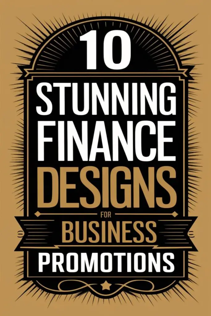
Luxury Finance Flyer Designs
When it’s time to make a grand impression, luxury finance flyer designs can add a touch of sophistication and prestige. These designs exude elegance and exclusivity while effectively promoting financial services.
Gold and Black Color Themes for Opulence
Pairing gold with black creates an immediate feeling of luxury and authority. Gold accents, whether in borders or typography, can highlight key information like exclusive offers or high-profile events. Using a deep black background emphasizes the golden details and makes them stand out. For example, I’ve seen flyers for premium wealth management services use this combination with clean sans-serif fonts to give a modern yet upscale vibe.
Luxurious Textures and Finishes
Adding textures and upscale finishes can make flyers feel as premium as they look. Embossed details, gold foil lettering, or even velvet-like finishes transform an ordinary flyer into something truly remarkable. Textures resembling marble or brushed metal are popular for creating a refined aesthetic. Whenever I include these elements, I notice they instantly elevate the perceived value of the service being promoted, often making a bold, lasting statement.
Eco-Friendly Finance Flyer Designs
Eco-friendly finance flyers combine sustainability with eye-catching designs, creating a ripple effect of environmental consciousness and professional impact. They show that promoting financial services and protecting the planet can go hand in hand.
Sustainable Design Features
I love flyers that prioritize sustainability by using recyclable materials and eco-friendly printing methods. Soy-based inks and recycled paper not only reduce environmental impact but also add a unique texture to the flyer, making it stand out. Minimalist layouts are also practical here since they require fewer resources to print while still keeping the design sharp and professional.
Digital versions are another great approach, reducing paper waste entirely. Interactive PDFs or animated flyers can provide an engaging yet eco-conscious solution. Features like easy sharing options and clickable links make these designs both versatile and sustainable, aligning perfectly with modern green standards.
Nature-Inspired Graphics and Colors
Using nature-inspired elements, like leaf patterns or eco-themed icons, gives these flyers a refreshing and approachable vibe. I find that incorporating visuals such as trees, water droplets, or even subtle floral designs communicates a commitment to sustainability. These elements naturally draw attention without overwhelming the content.
Soft green tones, earthy browns, and sky blues are perfect for this type of flyer. They evoke trust and positivity while supporting the eco-friendly narrative. Adding contrast with darker greens or muted grays can emphasize key points, creating a harmonious yet professional aesthetic that feels fresh and genuine.
High-Tech Finance Flyer Designs
Tech-driven finance flyer designs merge innovation and functionality, delivering a cutting-edge look that grabs attention instantly. These designs feature advanced visual elements that project a sense of modernity and expertise in financial technology.
Futuristic Aesthetic with Digital Elements
I love how futuristic flyers use sleek, digital-inspired visuals to create a tech-forward vibe. Incorporating gradients, holographic effects, and metallic finishes gives these designs a sci-fi aesthetic that’s perfect for fintech firms or crypto promotions. Abstract data patterns, like binary codes or grid-like designs, can also help convey a sense of innovation. Adding subtle tech visuals, such as digital icons or 3D geometric figures, is a great way to reinforce the cutting-edge theme without overwhelming the primary message.
Designs That Emphasize Technological Expertise
Showcasing technological expertise through flyer designs is all about leveraging bold, tech-savvy layouts. I often see dynamic infographics and diagrams integrated seamlessly to highlight data-driven services or insights. Using sharp lines, neon highlights, and colors like electric blue or sleek silver creates a contemporary, tech-oriented look. Flyers with interactive features, like scannable QR codes or augmented reality previews, can enhance engagement and demonstrate your firm’s commitment to using advanced tools. These details elevate any design and make your business stand out as a tech leader.
Conclusion
Designing the perfect finance flyer is all about finding the right balance between creativity, professionalism, and functionality. Whether you’re aiming for a sleek corporate vibe, a bold modern look, or an eco-friendly approach, there’s a design style to match your goals and audience.
The key is to stay intentional with every element—colors, typography, layouts, and even materials. A well-thought-out flyer doesn’t just promote your business; it tells a story, builds trust, and leaves a lasting impression. So get inspired, experiment with ideas, and create something that truly stands out.
Frequently Asked Questions
What is the purpose of a finance flyer design?
Finance flyer designs aim to promote financial services, products, or events through visually appealing and professional layouts. They capture attention, build trust, and effectively communicate key messages to the target audience.
Why are minimalist finance flyer designs effective?
Minimalist finance flyer designs focus on clean, modern layouts with simple elements and muted color schemes. They enhance readability and professionalism, allowing the message to stand out while maintaining a polished, cohesive look.
How can modern flyer designs benefit financial promotions?
Modern flyer designs use vibrant colors, bold typography, and dynamic layouts to grab attention. They convey a sense of innovation and professionalism, making promotional messages impactful and fresh.
What features are ideal for corporate finance flyers?
Corporate finance flyers benefit from elegant designs with sleek color palettes, refined typography, and structured layouts. The use of infographics and financial statistics enhances credibility and appeals to business professionals.
How do creative flyer designs make an impact?
Creative flyer designs incorporate custom illustrations, unique graphics, and abstract shapes to make materials visually striking and memorable. These elements enhance engagement while maintaining the flyer’s focus on the message.
What should an informative finance flyer include?
Informative finance flyers should use structured layouts, visuals, and concise text to present complex data engagingly. Charts, graphs, and infographics simplify financial concepts while maintaining clarity and transparency.
Why are traditional finance flyer designs reliable?
Traditional flyer designs use classic elements like serif fonts and neutral color palettes to convey trust and stability. Subtle accents like gold or silver add sophistication, appealing to established financial firms.
What elements make a flyer design luxurious?
Luxury finance flyer designs utilize gold and black color themes, embossed details, and premium finishes like gold foil lettering. These elements signify elegance and prestige, making a bold statement.
How can eco-friendly flyers promote financial services?
Eco-friendly flyers use recyclable materials, sustainable printing, and digital alternatives like interactive PDFs to reduce waste. Nature-inspired graphics and soft greens evoke trust while aligning with modern environmental values.
What are high-tech finance flyer designs?
High-tech designs blend cutting-edge visuals, such as gradients, holographic effects, and interactive QR codes, with bold layouts and sleek elements. They highlight innovation and are perfect for fintech or cryptocurrency promotions.
Why is color important in finance flyer designs?
Color influences perception, with blues and muted tones conveying trust, while vibrant hues grab attention. Proper color schemes ensure cohesion and enhance the flyer’s professionalism and visual appeal.
How can bold typography improve finance flyers?
Bold typography makes key messages stand out, ensuring readability and creating a confident, impactful design. Oversized fonts are particularly effective in modern flyer layouts to grab attention instantly.
What role do infographics play in finance flyers?
Infographics simplify complex data into visual formats like charts or icons, making financial information accessible and engaging. They enhance clarity and build credibility, especially for promoting financial insights.
Are digital finance flyers a good alternative to print?
Yes, digital flyers are sustainable and interactive, offering features like clickable links, videos, and animations. They reduce environmental impact while broadening the reach of your financial promotions.