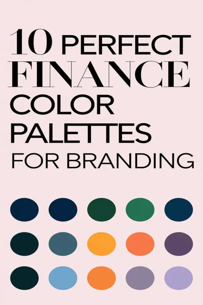
When it comes to branding in the finance world, colors do more than just make things look pretty—they set the tone for trust, professionalism, and confidence. The right color palette can instantly communicate stability and reliability, which are key to winning over clients in this industry. It’s amazing how much power a few shades can hold.
I’ve always found it fascinating how different colors evoke specific emotions. Blues and greens often dominate finance branding, but there’s so much more to explore. Whether you’re building a brand from scratch or refreshing an existing one, picking the perfect palette is a game-changer. Let’s dive into some inspiring combinations that’ll make your brand stand out while still feeling solid and approachable.
The Importance Of Choosing The Right Finance Color Palette
Choosing the right finance color palette isn’t just about making things look appealing—it’s about building trust and credibility. Colors send powerful messages, especially in the finance world where clients seek stability and security. I’ve noticed that small details, like the shades or tones used, can completely shift how people perceive a brand.
Using calming colors like blue or green is a tried-and-true strategy in finance. Blue conveys trust and professionalism, while green often represents growth and prosperity. Pairing these with neutral accents like gray or white enhances the clean, confident look financial brands need to project. But sticking only to tradition can make a brand blend in rather than stand out.
Incorporating unique secondary colors is one way to balance tradition with innovation. For example, adding gold or teal touches can inject energy without losing the professional vibe. When I design or pick a palette, I always keep versatility in mind. The chosen colors should work as well on a website as they do in a logo or printed materials. Harmony across all platforms is key.
How To Select A Finance Color Palette For Branding
Choosing the right finance color palette can feel overwhelming, but it doesn’t have to be. I like to break it down into a few simple steps to make the process easier and more effective.
Consider Your Brand’s Personality
Start by reflecting on your brand’s personality traits. Is it trustworthy and professional, innovative and dynamic, or approachable and friendly? For instance, if my brand emphasizes tradition and reliability, I’d lean heavily toward classic shades like navy blue or deep green. On the other hand, a more modern and tech-driven finance brand might benefit from sleek colors like teal or a bold slate gray. Matching the palette to your personality ensures consistency in how people perceive your brand.
Focus On Emotional Impact
Think about the feelings your colors evoke. Blues often feel secure and trustworthy, while greens suggest growth and prosperity. When I want to incorporate energy or optimism, I might add subtle accents like gold or orange. These choices aren’t just about what looks good—they’re about creating an emotional connection with your audience. I always recommend testing how each color makes people feel when they interact with your brand materials.
Evaluate Competitor Palettes
Finally, analyze what your competitors are doing. I like to study their palettes to identify trends, like the heavy use of blues in traditional financial institutions. This helps me avoid blending in too much while still aligning with industry expectations. If everyone’s using muted tones, adding a vibrant pop of color like teal or coral can give my brand a unique edge without straying too far from the norm. The goal is to stand out while staying credible.
Palette 1: Modern Greens And Grays
This palette blends nature-inspired greens with calming grays, creating a fresh yet professional look. It’s perfect for finance brands that want to appear trustworthy and growth-oriented.
Color Codes And Combinations
I’d recommend starting with a deep forest green (#2E4620) as the primary color to symbolize growth and stability. Pair it with a soft gray (#BFC5C2) for a clean, neutral balance. Add a touch of mint green (#B4D9A6) to introduce an approachable energy. To round it out, use charcoal gray (#3A3A3A) for text or subtle details, preserving a sense of professionalism.
Best Uses For This Palette
This palette works best for modern financial firms or eco-conscious investment platforms. I see it shining in website designs, corporate logos, and business cards. The greens reinforce trust and innovation, while the grays ground the brand in professionalism. It also adapts seamlessly across digital and print media, staying versatile yet distinct.
Palette 2: Classic Blues And Whites
This timeless combination conveys trust, professionalism, and clarity—exactly what financial brands need. Perfect for businesses wanting an approachable yet authoritative image.
Color Codes And Combinations
I recommend navy blue (#012A52) as the anchor color for its dependability, paired with crisp white (#FFFFFF) to emphasize clarity and simplicity. Add a lighter sky blue (#68A4D9) for a fresh accent or background element. To keep things grounded, use deep steel gray (#4A4E4D) for text or secondary details. This mix creates a balanced, polished look that feels both modern and timeless.
Best Uses For This Palette
This palette shines in corporate logos, financial dashboards, and client-facing websites. Navy blue makes impactful headers and icons, while white space ensures readability and a clean design. Pair light blue in accents or call-to-action buttons for a welcoming touch. It’s also ideal for print materials like business cards and financial reports, projecting reliability and professionalism.
Palette 3: Sophisticated Golds And Blacks
This palette combines opulence and elegance, making it perfect for finance brands that want to exude luxury and confidence. Golds and blacks create a bold and timeless impression while maintaining a professional edge.
Color Codes And Combinations
The primary color in this palette is a rich metallic gold (#D4AF37), paired with deep matte black (#000000) to provide a striking contrast. To soften the intensity, I recommend adding a touch of champagne beige (#F5E6C8) as an accent color. This combination feels both refined and balanced, ensuring visual appeal across various branding materials.
| Color | Hex Code | Usage |
|---|---|---|
| Metallic Gold | #D4AF37 | Primary branding color |
| Matte Black | #000000 | Backgrounds, text, and contrasts |
| Champagne Beige | #F5E6C8 | Accents and highlights |
Best Uses For This Palette
This palette works exceptionally well for high-end financial consulting firms, wealth management brands, and premium investment platforms. I find it’s ideal for creating sleek, minimalist logos or crafting elegant business cards that make a memorable impression. The boldness of black with the richness of gold is also excellent for website headers, luxury-themed presentations, and financial products targeting affluent clients.
Palette 4: Calm Blues And Neutral Beiges
This palette blends serenity and sophistication, creating a sense of balance perfect for finance brands. It’s a versatile choice for companies looking to emphasize trust and approachability.
Color Codes And Combinations
The primary color in this palette is a soft steel blue (#6C8DA8), evoking calm and dependability. It’s paired with a neutral beige (#E7D9C4) as the secondary color, adding warmth and subtlety. To complete the look, an accent of light taupe (#C1B2A3) brings depth without overpowering the overall design. Together, these colors form a cohesive and approachable aesthetic that’s easy on the eyes.
Best Uses For This Palette
I find this palette ideal for companies aiming to foster a personal connection with clients, such as financial advisors or wealth planning firms. It works beautifully on office branding materials, website backgrounds, and social media graphics. The calming tones make it a great choice for customer-facing portals or onboarding tools, ensuring users feel reassured right from the start. This harmonious combination also transitions well to printed assets, like brochures or business cards, where understated elegance matters most.
Palette 5: Bold Reds And Deep Grays
Sometimes, standing out means embracing intensity. This palette combines the energy of bold reds with the sophistication of deep grays, creating a striking and modern look.
Color Codes And Combinations
The centerpiece of this palette is a vibrant crimson red (#DC143C), symbolizing power and determination. It’s paired with a deep charcoal gray (#2F2F2F) for a grounded and professional feel. To balance the boldness, I’d recommend using a light smoky gray (#D9D9D9) as a neutral accent. Together, these colors create contrast while feeling cohesive, delivering both impact and elegance.
Best Uses For This Palette
This palette works perfectly for fintech startups or investment firms aiming for a bold and innovative image. I’d use it for dynamic website layouts, powerful call-to-action buttons, or high-contrast financial analysis tools. The red grabs attention for key metrics or announcements, while the grays maintain a sleek, professional aesthetic. It’s also ideal for bold logo designs, making your brand memorable without losing credibility.
Palette 6: Trustworthy Teals And Whites
When it comes to creating a dependable and approachable finance brand, teals and whites are a natural fit. This palette balances freshness and professionalism while evoking trust and stability.
Color Codes And Combinations
This combination starts with a soothing teal (#008080) as the primary color, projecting calm yet confident energy. Pair it with clean white (#FFFFFF) to maintain clarity and simplicity. To add depth, include a soft seafoam green (#A0D6B4) as an accent, offering a subtle pop of vibrancy without overwhelming the design.
Best Uses For This Palette
This palette is ideal for financial brands that prioritize transparent communication, such as credit unions or community banking services. It works well in website designs, logo creation, and user interfaces, especially for platforms that emphasize seamless user experiences. The crisp contrast between teal and white ensures clean, readable layouts, while the seafoam green offers a touch of modernity in promotions and digital materials. It’s perfect for businesses aiming to build trust through approachable aesthetics.
Palette 7: Luxe Silvers And Soft Purples
If you’re seeking an elegant and contemporary palette, Luxe Silvers and Soft Purples is an ideal choice. It balances sophistication with approachability, perfect for high-end financial brands.
Color Codes And Combinations
This palette combines the cool, metallic hues of silver with gentle shades of purple to create a luxurious yet calming effect. For example, a medium silver-gray (#C0C0C0) pairs beautifully with a soft lavender (#E6E6FA), while a deeper slate gray (#708090) adds depth when contrasted with a rich plum purple (#8E4585). Accent colors like pearl white (#F8F8FF) or pale lilac (#DDD9E8) can complement the primary tones, keeping the palette versatile and refined.
Best Uses For This Palette
I’d recommend this palette for finance brands offering premium services, like wealth management or corporate banking, where trust and exclusivity are essential. The cool silvers convey precision and professionalism, while the purples add a warmth that feels approachable yet sophisticated. Luxe Silvers and Soft Purples work especially well for website designs, business cards, and stationery, projecting a polished and cohesive brand identity.
Palette 8: Minimalist Monochromes
Minimalist monochromes embody simplicity and clarity, making them perfect for finance brands striving to appear polished and timeless. This palette offers understated elegance while keeping the focus on professionalism.
Color Codes And Combinations
This palette revolves around shades of gray, black, and white, creating a clean and neutral aesthetic. A typical combination might include a pure white (#FFFFFF) as the base, a mid-gray (#A8A8A8) for accents, and a rich black (#000000) for contrast. To keep it dynamic, slight variations of gray, such as slate gray (#708090) or charcoal gray (#36454F), can add depth without overwhelming the design.
Best Uses For This Palette
This palette is ideal for businesses like investment advisory firms or accounting services that value clarity and professionalism over bold or playful aesthetics. The monochromatic look works exceptionally well for minimalist website designs, sleek stationary layouts, and high-contrast presentations. It’s also excellent for emphasizing balance and objectivity, two traits highly valued in the finance sector.
Palette 9: Natural Earth Tones
This palette connects brands with nature through warm, grounding shades. It’s perfect for finance businesses that want to convey stability and organic growth.
Color Codes And Combinations
This palette combines rich browns, soft beiges, and muted greens. Think earthy combinations like #8B4513 (Saddle Brown), #C2B280 (Sand), and #556B2F (Olive Green). These colors reflect the natural world and evoke a sense of trust, dependability, and sustainability. Adding subtle accents of #FFD700 (Gold) can enhance the palette’s sophistication while maintaining its grounded appeal.
Best Uses For This Palette
This palette works beautifully for financial brands focused on eco-conscious investment services or sustainability-driven products. It’s ideal for logos, marketing materials, and website designs aiming to showcase environmental responsibility. Picture a mutual fund specializing in green energy, using Olive Green for text, Sand for background elements, and Saddle Brown for buttons. These earthy tones send a clear message of steadiness and growth while appealing to environmentally conscious clients.
Palette 10: Energetic Yellows And Grays
Bright yet balanced, this palette mixes vibrant yellows with grounding grays, creating a dynamic and optimistic feel ideal for modern finance branding. It communicates optimism and reliability while standing out in a sea of traditional colors.
Color Codes And Combinations
This palette blends warm, energetic yellows with cool, neutral grays to create balance. For example, a golden yellow (#FFC300) or sunflower yellow (#FFD700) pairs beautifully with medium gray (#808080) or light stone gray (#D3D3D3). To add depth, an accent like charcoal gray (#333333) can enhance sophistication while letting the yellows pop.
Best Uses For This Palette
I recommend this palette for fintech startups or financial planning services targeting a younger audience. The yellows grab attention and evoke optimism, while the grays add stability and professionalism. It’s perfect for digital platforms like mobile apps, modern website designs, or eye-catching social media graphics where energy and trust need to coexist.
Conclusion
Choosing the right color palette for your finance brand is more than just picking pretty shades. It’s about crafting an identity that feels trustworthy, professional, and approachable. The colors you choose will shape how your audience perceives your brand, so it’s worth taking the time to get it right.
Whether you lean toward calming blues, luxurious golds, or bold reds, there’s a perfect palette out there to match your brand’s personality. Don’t be afraid to experiment with unique accents or versatile combinations that can shine across all platforms. A thoughtful color palette isn’t just a design choice—it’s a powerful tool to build credibility and connection.
Frequently Asked Questions
Why is color important in finance branding?
Color plays a vital role in finance branding by conveying trust, professionalism, and confidence. The right color palette can evoke emotions such as stability, reliability, and growth, making it easier to attract and retain clients.
Which colors are commonly used in finance branding?
Blues and greens are widely used in finance branding. Blue symbolizes trust and professionalism, while green represents growth and prosperity. These colors are often paired with neutrals like gray or white for a clean and balanced look.
How do specific color palettes impact financial brand perception?
Color palettes influence how a brand is perceived by evoking specific emotions. For example, “Modern Greens and Grays” suggest freshness, “Sophisticated Golds and Blacks” convey luxury, and “Energetic Yellows and Grays” create a dynamic and optimistic feel.
How can a new financial brand stand out with its color palette?
To stand out, financial brands can incorporate unique secondary colors like gold, teal, or purple while maintaining professional tones. Evaluating competitors’ color palettes can help identify opportunities for differentiation without compromising credibility.
What color palettes work best for fintech startups?
Fintech startups often use bold and dynamic palettes like “Bold Reds and Deep Grays” or “Energetic Yellows and Grays” to convey innovation and energy while maintaining trust through neutral accents.
How can a color palette reflect a brand’s personality?
A brand’s personality traits, such as professionalism, innovation, or sustainability, should guide color selections. For example, calming blues and beiges indicate reliability, while natural earth tones align with eco-conscious values.
How does versatility affect a finance color palette?
A versatile color palette ensures that the selected colors harmonize across websites, logos, marketing materials, and stationery. Consistency improves brand recognition and conveys professionalism on all platforms.
What is the role of neutral colors in finance branding?
Neutral colors like gray, white, and beige enhance a brand’s color palette by providing balance and professionalism. They act as grounding elements that support bold or primary colors without overwhelming the design.
Are monochromatic palettes effective for finance branding?
Yes, monochromatic palettes using shades of gray, black, and white create a timeless and polished image. They are ideal for brands focused on clarity, professionalism, and balance, such as investment or accounting firms.
What color palette is recommended for luxury financial services?
For luxury financial services, palettes like “Luxe Silvers and Soft Purples” or “Sophisticated Golds and Blacks” are ideal. These combinations exude exclusivity, elegance, and trust, making them suitable for wealth management or corporate banking.
Can energetic colors like yellow work in finance branding?
Yes, when balanced with grounding tones like gray, vibrant colors like yellow can create a dynamic, optimistic feel. This is particularly effective for fintech brands or services targeting younger, tech-savvy audiences.
How do earth tones benefit finance brands with sustainability goals?
Earth tones like rich browns, muted greens, and soft beiges communicate eco-consciousness and dependability. These palettes are perfect for financial services with a focus on sustainability or nature-driven investment options.