When it comes to finance, let’s face it—it’s not always the most exciting topic. But the right poster design can change everything. Whether you’re promoting a financial workshop, a savings campaign, or just trying to make budgeting less boring, a creative poster can grab attention and make complex ideas easier to digest.
I’ve always believed design has the power to make even the driest topics engaging. With the right mix of visuals, colors, and clever messaging, a finance poster can go from dull to dynamic. If you’re looking for inspiration, I’ve got some fun and creative ideas to help you design posters that stand out and get your message across.
Use Bold Typography to Highlight Financial Messages
Bold typography instantly grabs attention and adds weight to financial messages. It’s perfect for making complex concepts stand out clearly and leaving a lasting impression.
Experiment with Contrasting Colors
Pair bold fonts with high-contrast colors to create a striking visual impact. For instance, use dark text on bright backgrounds or vice versa to ensure the message pops. I’ve noticed that combos like navy blue and white or yellow and black work great for finance posters because they’re easy to read and feel professional. Adding slight gradients or accents can also elevate the overall look without making the design too overwhelming.
Incorporate Attention-Grabbing Text
Use short, impactful phrases that pack a punch. Instead of generic lines like “Financial Tips Inside,” try something like “Master Your Budget in Minutes!” I love how active wording turns ordinary advice into something dynamic. Don’t hesitate to experiment with font weights, all caps, or italicized words to emphasize key points. Just remember—less is more—so focus on the headline rather than cluttering the design.
Choose Minimalist Design for a Professional Look
When it comes to finance posters, less is more. A minimalist design ensures a polished, modern feel that conveys professionalism while keeping the focus on the message.
Utilize Clean Lines and Simple Fonts
I always stick to clean lines and easy-to-read fonts for a streamlined look. Sans-serif fonts like Helvetica or Open Sans work great because they feel professional but not too ornate. Avoid clutter by keeping the layout organized with plenty of white space. This helps your key financial insights, like budgeting tips or investment advice, stand out effortlessly.
Use a Limited Color Palette
I recommend using no more than three colors to maintain a harmonious appearance. Neutral tones, such as gray, beige, or white, paired with one accent color, can create a sleek design. For example, a navy-and-white combo with a touch of gold or teal can feel both professional and inviting. A restricted palette ensures that the visuals don’t overwhelm the content, keeping the focus on your financial message.
Incorporate Infographics to Illustrate Data
Infographics are a fantastic way to make financial information more digestible and visually appealing. They break down complex data into striking visuals that viewers can quickly understand.
Showcase Charts and Graphs
Adding charts and graphs makes trends and comparisons instantly recognizable. I’d use bar graphs or pie charts to represent financial growth or budget breakdowns. Color-coded sections work wonders for clarity, like using green for profits and red for losses. Line charts are great for showcasing patterns, such as tracking stock market performance over time. Keeping the chart labels simple and easy to read ensures viewers won’t feel overwhelmed.
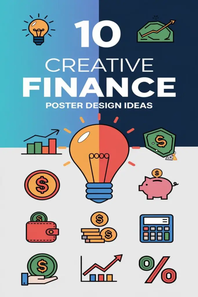
Use Icons for Quick Visual Understanding
Icons are perfect for conveying ideas at a glance. For example, a piggy bank icon can represent savings, while a dollar sign might symbolize income. I like to group related icons together for categories, like using a credit card, shopping bag, and receipt to illustrate spending habits. Consistent icon styles give the design a polished look, and I stick with bold, minimalist icons to keep the design modern and clean. A little spacing and subtle accents, like small pops of color, can make them stand out without overloading the design.
Add Inspirational Financial Quotes
Including motivational quotes about money, wealth, or success can instantly elevate your finance poster. They grab attention and inspire viewers to think differently about their finances.
Use Elegant Fonts for Quotes
Choosing the right font for your quote can make all the difference. I like to use elegant, serif fonts like Baskerville or Times New Roman for a classic and refined look. If you’re aiming for modern vibes, clean sans-serif options like Montserrat or Futura do the job. Keep the font size large enough to stand out and use bold or italicized text sparingly to emphasize key words like “success” or “wealth.” This ensures the quote stays readable while projecting sophistication.
Pair Quotes with Relevant Images
A powerful quote becomes even more impactful when paired with the right visual. I often match quotes about success with images of growth, like stacked coins, plants, or upward arrows, to create a cohesive story. For quotes about financial freedom, calming visuals like open fields or sunny skies work wonders. Using subtle overlays—like semi-transparent backgrounds or gradients—can highlight the text without overpowering the image. This thoughtful pairing draws viewers in and makes your financial message unforgettable.
Create Engaging Call-to-Actions
Adding a strong call-to-action (CTA) can make your finance poster not just seen but acted upon. A good CTA draws attention and motivates viewers to take the next step.
Use Eye-Catching Buttons or Text
I always make sure CTAs stand out by styling them with bold, contrasting colors like red, orange, or bright green. Adding a button-like shape around phrases like “Start Saving Now” or “Join the Workshop” instantly makes the action clear and irresistible. Using actionable, concise language such as “Apply Today” or “Claim Your Free Budget Guide” helps create urgency and drive engagement. To add flair, I like incorporating small icons, like arrows or dollar signs, next to the CTA text for added emphasis.
Position CTAs Strategically
Placing CTAs where they’re impossible to miss is key for grabbing attention. I often position CTAs at the top and center for high visibility or repeat them near the bottom to reinforce the message. If the poster includes key visuals or charts, I’ll align the CTA beside these elements for a natural flow. I avoid overcrowding space by keeping the design clean, ensuring the CTA remains the focal point without distraction.
Leverage Realistic Imagery Depicting Finance
When it comes to finance posters, using realistic imagery can make abstract concepts relatable and engaging. Connecting viewers with visuals they recognize helps simplify financial topics and sparks curiosity.
Incorporate Lifestyle Images
Showcase people managing everyday financial activities to make the poster relatable. For example, use an image of someone shopping smartly with a digital payment app or a family planning their monthly budget at the kitchen table. These scenes highlight how finances intertwine with daily life. I like adding subtle touches, like coffee cups or casual clothing, to create warmth and realism. Pair these images with clear text that directly connects to the depicted scenario for a seamless, relatable message.
Use Money-Related Visuals
Focus on imagery that immediately associates with finance, like coins, bills, or credit cards. For instance, I often use a clean photo of a hand holding a credit card or neatly stacked coins to drive the message home. If the poster’s theme is saving for a goal, a piggy bank image works great. Another idea is showing a close-up of someone typing on a calculator or analyzing charts to emphasize financial planning. Keeping the visuals crisp and modern ensures they resonate, while pairing them with bold typography grounds the message.
Emphasize Personal Finance Themes
Focusing on personal finance themes can make posters relatable, inspiring viewers to take charge of their money. Highlighting real-life scenarios and using clear visuals is key to emphasizing everyday financial topics.
Highlight Savings and Budgeting
Use everyday visuals that people can connect with, like piggy banks, jars filled with coins, or shopping receipts. These symbols instantly bring savings and budgeting to mind. Add bold headings like “Save More Without Stress” or “Budget Smart, Live Better” in vibrant colors for emphasis. Incorporate charts or simple timelines showing how small changes can lead to significant savings over time. Pairing these elements with friendly illustrations or minimalist icons can make budgeting feel less overwhelming and more approachable.
Illustrate Investment Growth Concepts
Include visuals like growing plants, stacks of coins, or upward-pointing graphs to represent investment growth. These symbols make the idea of progress feel tangible. Infographics are a great way to show concepts like compound interest or portfolio diversification. I’d also use bold phrases like “Watch Your Wealth Grow” or “Invest Today, Prosper Tomorrow” in clean, modern fonts. Adding color gradients that move from green to gold can emphasize financial growth visually, while keeping the design professional and inviting.
Experiment with Retro or Vintage Styles
Retro or vintage designs can give finance posters a timeless and stylish appeal. They create a nostalgic vibe that makes financial messages feel unique and memorable.
Use Nostalgic Color Schemes
Choosing nostalgic color palettes instantly sets the retro tone. I like using warm tones like mustard yellow, burnt orange, and olive green, paired with soft neutrals like beige or cream for balance. To amplify authenticity, I often incorporate faded colors or washed-out gradients that mimic vintage prints. For example, a combination of muted teal and rust-orange works beautifully for posters that reference old-school budgeting or saving habits. These colors don’t just stand out—they also evoke a comforting, trust-filled vibe essential for financial topics.
Include Retro-Inspired Fonts
Retro-inspired typography brings character to a poster’s design. I recommend fonts with unique, vintage touches, like serif fonts with exaggerated curves (e.g., Cooper Black) or thick slab serifs like Rockwell. For a fun twist, I sometimes add quirky script fonts reminiscent of mid-century advertisements. Pairing these retro fonts with modern sans-serif options, like Futura, maintains readability while highlighting financial messages in a chic, retro way. The mix of old and new can make even financial terms pop on a nostalgic, stylish poster.
Integrate Geometric Patterns and Shapes
Geometric patterns and shapes can bring structure and modernity to finance poster designs. They make layouts visually engaging while conveying professionalism and clarity when done right.
Use Symmetrical Patterns for Aesthetic Value
I use symmetrical patterns to create balance and a polished look in finance posters. Repeating elements like triangles, hexagons, or circles can frame key information or underline headings. For a financial workshop poster, for instance, a honeycomb pattern around the header adds a sleek, tech-savvy vibe. Keeping these patterns subtle, using muted tones or pastels, ensures the focus stays on the main message.
Add Depth with Overlapping Shapes
Layering shapes adds dimension and makes designs more dynamic. I combine overlapping squares, circles, or polygons to lead the viewer’s eye across the poster. For example, blending translucent shapes with different opacities behind bold text emphasizes key details without adding clutter. Using gradient colors in the overlaps creates a fluid, modern feel that can complement topics like investment growth or financial planning.
Incorporate Brand Colors and Identity
Using your brand’s colors and identity can make finance posters instantly recognizable and cohesive. It’s all about ensuring the design reflects who you are while building trust with your audience.
Ensure Consistency Across Finance Campaigns
I stick to the same color schemes, typography, and logo styles across all finance-related materials. This consistency not only strengthens brand recognition but also creates a professional appearance that viewers associate with reliability. For example, if your brand uses dark green and gold, weave these colors into every poster. I also recommend matching fonts from other marketing materials so everything feels seamless. Repeating these design elements across campaigns keeps your audience aligned with your message.
Use Logo Placement Strategically
I always choose a logo placement that’s both prominent and natural within the design. The top corners or bottom center usually work best depending on the layout. For finance posters, I prefer to place the logo near CTAs to subtly nudge viewers to associate actions like “Open an Account Today” with your brand. It’s a good idea to leave enough white space around the logo so it looks polished, not cramped. By positioning it thoughtfully without overpowering the design, posters stay attractive and professional.
Conclusion
Designing finance posters doesn’t have to be boring or overwhelming. With a little creativity and attention to detail, it’s easy to turn financial concepts into something visually engaging and approachable. Whether it’s through bold typography, clean layouts, or relatable imagery, the possibilities are endless.
I love how small design choices, like color schemes or font pairings, can completely transform a poster’s impact. By combining these elements thoughtfully, you can create designs that not only grab attention but also effectively communicate important financial messages. Happy designing!
Frequently Asked Questions
Why is poster design important for financial topics?
Poster design plays a crucial role in making complex financial topics more engaging and easier to understand. Effective design grabs attention, simplifies information, and makes abstract concepts more relatable, encouraging viewers to take action.
What colors work best for finance posters?
Contrasting colors like navy blue and white, or yellow and black, work best for finance posters. These combinations ensure readability, professionalism, and visual appeal, drawing attention to the key message.
How can bold typography enhance a finance poster?
Bold typography highlights important financial messages, making them stand out. It simplifies complex concepts and ensures that viewers quickly grasp key takeaways.
Why should infographics be used in finance posters?
Infographics help break down data, making financial information more digestible and visually appealing. Charts, graphs, and icons make trends and comparisons clearer for viewers.
How do inspirational quotes add value to finance posters?
Inspirational quotes can grab attention, motivate action, and make financial advice more relatable. Paired with elegant fonts and visuals, quotes create an emotional connection with viewers.
What should a strong call-to-action (CTA) include?
A strong CTA should be concise, actionable, and visually prominent. Use bold colors, button-like shapes, and phrases like “Start Saving Now” to encourage immediate action.
How can realistic imagery improve finance posters?
Realistic imagery, such as people budgeting or using digital payment apps, makes financial concepts relatable. Images like coins or credit cards reinforce the topic while boosting emotional engagement.
What design themes make finance posters feel more approachable?
Personal finance themes, such as saving money or investment growth, make posters relatable. Simple visuals like piggy banks or growing plants paired with infographics keep the content engaging and easy to understand.
Why use retro or vintage styles in finance posters?
Retro styles add timeless charm and a unique appeal. Nostalgic colors and fonts like bold serif styles create a stylish yet professional vibe that captivates the audience.
How can geometric patterns enhance a finance poster’s design?
Geometric patterns add structure, symmetry, and depth to finance posters. Using shapes like triangles or hexagons can guide viewers’ eyes while maintaining a polished and modern aesthetic.
Why is branding important in finance posters?
Incorporating brand colors and logo builds trust and recognition. Consistency in typography, color schemes, and strategic logo placement reinforces a professional and cohesive image.