Notion has completely changed how I organize my life, especially when it comes to managing my finances. But let’s be real—staring at plain, boring templates can get old fast. That’s where aesthetic covers come in. They don’t just make your finance dashboard look more inviting; they actually make budgeting and tracking expenses feel a little less overwhelming.
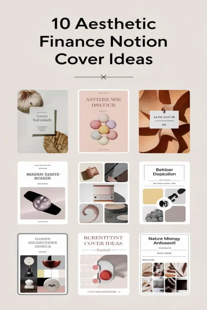
I’ve spent way too much time curating and experimenting with different cover ideas to give my Notion pages a personal touch. Whether you’re into minimalistic vibes, bold colors, or calming designs, there’s something about the right cover that makes the whole process more enjoyable. So, if you’re ready to give your finance setup a glow-up, I’ve got some ideas you’re going to love.
Minimalistic Gradient Covers
I love how minimalistic gradient covers can give my finance dashboard a timeless, refined look. They’re clean but still add a pop of personality without overwhelming the overall aesthetic.
Utilizing Soft Pastel Gradients
Using soft pastel gradients brings a calm, soothing vibe to my finance pages. I’ve found that palettes blending shades like blush pink to lavender or mint to baby blue work beautifully. They make my budget tracker feel less like a chore and more like a creative space. For my monthly expense page, I went with a sunset pastel gradient that shifts subtly between peach and pale yellow—it’s simple but uplifting.
Balancing Neutral Color Tones
Balancing neutral color tones creates a sleek and polished look for my covers. I’ve used gradients that transition between grays and beige or taupe and cream for a sophisticated touch. These shades keep my finance setup elegant and distraction-free, perfect for focusing on serious calculations. One of my favorites is a warm beige to soft gray gradient—it pairs nicely with black text and minimalist icons.
Abstract Art Designs
Abstract art covers are perfect for adding an artistic flair to finance dashboards. They bring a bold, creative touch that keeps your pages visually inspiring.
Incorporating Unique Abstract Shapes
I love using abstract shapes that feel dynamic and modern, like overlapping circles or fragmented patterns. These designs create a sense of movement and energy, making even something as mundane as expense tracking feel more engaging. For my savings tracker, I’ve used covers with swirls and intersecting lines—it keeps the layout fresh without pulling attention away from the content.
Matching Finance-Related Palettes
I try tying my abstract covers to finance-oriented colors like green, gold, or sleek metallic shades. For example, I’ve chosen a green-gradient geometric design for my investments page to echo the sense of growth and prosperity. Warm golds or deep blues also work beautifully for debt planning, creating a luxe yet calming vibe that motivates tackling financial goals head-on.
Vintage-Inspired Themes
Vintage elements can add a nostalgic charm to finance dashboards. I love using these timeless designs to create a cozy and unique atmosphere for my Notion setup.
Using Retro Patterns
I find retro patterns perfect for evoking a sense of nostalgia. Geometric designs, like bold chevrons or repeating circles, bring a mid-century vibe to my finance pages. Floral motifs work well too, especially in muted colors like olive green or faded rust, giving an antique yet refined touch. Polka dots in neutral tones or warm pastels add a playful, vintage aesthetic that pairs beautifully with overlaying text and icons.
Incorporating Classic Typography
Classic fonts can instantly give Notion covers an old-school personality. I often use serif fonts like Times New Roman or Garamond for their traditional and sophisticated feel. Script fonts, such as Edwardian or Vintage Queens, add a handwritten, elegant charm to budgeting and expense pages. Pairing these with sepia-toned backgrounds or aged paper textures completes the vintage look while keeping the layout functional and visually appealing.
Nature-Inspired Covers
When I want my finance pages to feel refreshing and grounded, I turn to nature-inspired covers. They add a calming touch and help me stay motivated while tackling numbers.
Featuring Forests And Greens
I love using lush forest scenes and earthy greens to create a soothing vibe. Covers featuring dense trees, mossy landscapes, or foggy woodlands bring a sense of tranquility to my budgeting process. Sometimes, I choose minimalist designs with leafy patterns or soft green gradients for a clean, natural look. I also pair these with finance-themed icons, like a money tree, to tie everything together.
Using Ocean-Themed Designs
Ocean-themed covers bring a serene, open feel to my finance dashboards. Deep blue waves, sandy shorelines, or underwater coral reefs provide a relaxing aesthetic. I often go for photos of sunrise beaches or use abstract splashes of aqua hues to add vibrancy. Nautical minimalism is another favorite, with anchors, sailboats, or seashell motifs keeping my pages neat yet inspired.
Geometric Patterns
When it comes to designing my Notion finance covers, geometric patterns always feel modern and organized. Their clean lines and structured forms perfectly match the focus and clarity I need for managing my finances.
Combining Symmetry With Simplicity
I love using symmetrical designs to create covers that feel balanced and uncluttered. Repeating triangles, hexagons, or grids in simple arrangements give my dashboards a sleek and professional look. For example, I’ve used a minimalist black-and-white honeycomb pattern to keep my investment tracker sharp yet understated. Adding a small financial icon, like a dollar sign or savings jar, in the center of the design ties it all together without overwhelming the page.
Choosing Subtle Neutral Colors
Neutral tones, like soft grays, whites, and taupes, make geometric patterns even more timeless. I prefer muted palettes that let the geometry shine while keeping the overall aesthetic calming. Once, I created a budget tracker cover with overlapping beige and ivory squares—it felt both elegant and functional. For finance dashboards with multiple sections, I stick to subtle gradations in neutral shades to ensure consistency and avoid visual distractions.
Monochrome Minimalism
I love the clean, timeless appeal of monochrome covers. They bring sophistication and simplicity to my finance dashboards, keeping them focused and clutter-free.
Black And White Patterns
Choosing black and white patterns instantly elevates any Notion cover. I like using classic stripes, polka dots, or even checkerboard designs for a sleek and modern vibe. One of my favorites is a black-on-white grid—it adds structure while keeping the aesthetic minimal. Abstract black brush strokes over a white background are another go-to, creating an artistic yet clean look that’s perfect for my expense tracker.
High-Contrast Designs For Elegance
High-contrast covers pair bold black elements with crisp white spaces for a polished, elegant feel. I created a page with a minimalist black circle in the center of a white background—it’s simple but striking, great for zeroing in on my financial goals. For a touch of drama, black gradients fading into white offer a stunning ombré effect, which fits perfectly for tracking long-term investments.
Inspirational Quote Covers
Sometimes, a motivational quote is all it takes to spark action and keep finance goals on track. I love adding quote-based covers to my finance dashboards for a touch of inspiration and focus.
Using Financial Growth Quotes
I often choose quotes about growth and abundance to remind myself of my financial aspirations. Phrases like “Wealth is the ability to fully experience life” by Henry David Thoreau or “Don’t just make money; make meaning” by Tony Robbins add a sense of purpose to my pages. Pairing these quotes with clean font styles ensures the message remains the focal point. I’ve used a cover with “Small steps lead to big results” in bold text for my savings tracker to feel encouraged each time I log in.
Pairing Typography With Simple Backgrounds
I like to keep things sleek by combining inspirational typography with minimalist backgrounds. Using sans-serif or modern script fonts over soft gradients, solid pastel colors, or textured neutrals ensures the focus stays on the quote. For my debt-repayment tracker, I used a white serif font set against a dusty pink backdrop with the words, “Every dollar has a job.” It’s both motivating and aesthetically pleasing without feeling cluttered.
Modern Professional Designs
When I want my finance dashboards to feel polished yet approachable, I lean toward modern professional designs. They combine clean aesthetics with a touch of sophistication, making budget tracking feel purposeful and stylish.
Using Sleek Lines And Patterns
Incorporating sleek lines and patterns instantly elevates any finance dashboard. I often opt for vertical or horizontal line designs in subtle tones like navy or charcoal, which create a tidy, structured look. For example, a minimalist pinstripe backdrop adds a professional touch to my income tracker without distracting from the data. Grid patterns are another favorite, blending modern style with practicality; I use a soft gray-lined grid cover for my budget planner to keep the vibe sharp and organized.
Adding Metallic Accents For Luxury
Adding metallic accents is my go-to trick for giving dashboards a luxe upgrade. I love subtle gold or silver textures for covers—golden brushstrokes on a white backdrop make my savings tracker feel more aspirational. For my investment logs, I pair metallic copper details with rich brown tones for a sophisticated financial theme. Even something as simple as a rose gold gradient can elevate a dashboard, making even routine expense tracking feel a little glamorous.
Illustrated Finance Concepts
Adding creative illustrations to finance dashboards brings a fun, personalized touch that makes organizing money feel less like a chore. Here’s how I use art-inspired elements to elevate my Notion covers.
Going Creative With Hand-Drawn Icons
I love using quirky, hand-drawn icons to give my pages a playful vibe. Sketch-style coins, piggy banks, or dollar signs make my savings tracker feel unique and approachable. I’ve even used doodles of calculators and receipt rolls for my budgeting dashboard to keep it lighthearted. Pairing these with muted pastel backgrounds keeps the design simple yet artistic. Hand-drawn icons can also match different themes—like a vintage-style coin bag for old-school setups or minimal line drawings for a modern flair.
Featuring Illustrations Of Money And Investments
Illustrations of financial elements, like growing plants sprouting coins, bring an optimistic touch to my investment dashboard. I also use graphics of stacks of money or dollar bills for expense tracking pages, while gold bar illustrations add a luxe feel to wealth management templates. Charts and graphs drawn in whimsical, illustrated styles make my finance progress trackers more exciting. I like pairing vibrant illustrations with clean, neutral backgrounds to balance the page’s energy without overwhelming the dashboard’s purpose.
Personalized Aesthetic Covers
Personalized covers make my finance dashboards feel truly mine. By customizing elements like text and colors, I can create designs that reflect my personality and financial goals.
Adding Custom Initials Or Names
Using initials or my full name adds a personal touch to my dashboard. I love experimenting with elegant font styles, like serif or calligraphy, to create a chic look. Sometimes, I pair my initials with a simple geometric background for a timeless vibe. For example, I’ve used a sleek silver monogram “A.M.” on a muted beige background for my budget tracker, which makes it feel uniquely tailored to me.
Matching Colors To Your Finance Goals
Aligning colors to specific financial goals helps me stay motivated. For my savings tracker, I use green shades to symbolize growth and progress, while my debt repayment page features calming blues to maintain a sense of balance. One favorite is blending soft gold accents for my investments dashboard, evoking success and aspiration. By matching these colors intentionally, my dashboard feels both aesthetically pleasing and goal-focused.
Conclusion
Creating aesthetic finance covers in Notion has been such a game-changer for me. It’s amazing how a little creativity can turn something as mundane as budgeting into a more enjoyable and motivating experience. Whether it’s calming pastels, bold abstract designs, or sleek monochrome patterns, there’s a style out there for everyone.
What I love most is how these covers can reflect my personality and goals while keeping my dashboards organized and inspiring. It’s all about finding what resonates with you and makes financial management feel less like a chore. So go ahead and experiment—you might be surprised by how much a well-designed cover can transform your Notion setup!
Frequently Asked Questions
What is the purpose of aesthetic covers in a Notion finance dashboard?
Aesthetic covers enhance the visual appeal of finance dashboards, making budgeting and expense tracking more engaging. They also help personalize the experience, creating a setup that motivates and inspires users to stay organized.
How can gradient designs improve Notion finance dashboards?
Gradient designs, especially minimalistic or pastel styles, add a calm and timeless look to finance dashboards. They provide a balance of personality and simplicity, helping users feel more relaxed when managing their finances.
What role do abstract art designs play in finance dashboards?
Abstract art designs introduce a bold and creative aesthetic. Dynamic shapes and patterns, like fragmented forms or overlapping circles, add energy, making routine financial tasks visually inspiring.
Why are vintage-inspired themes effective for Notion dashboards?
Vintage themes add a nostalgic and cozy charm through retro patterns, muted colors, and classic fonts. These elements make finance dashboards feel unique and personalized.
How do nature-inspired covers enhance financial organization?
Nature-inspired covers provide a refreshing and grounding vibe. Designs like lush greens or ocean-inspired visuals create a soothing atmosphere, reducing the stress of managing finances.
What are the benefits of geometric patterns for Notion covers?
Geometric patterns offer a modern and organized look. Symmetrical designs, like hexagons or triangles, create balance and structure, making dashboards feel neat and professional.
Why is monochrome minimalism popular for Notion finance dashboards?
Monochrome minimalism brings sophistication and simplicity to dashboards. Clean black-and-white designs offer a timeless and polished aesthetic while maintaining clarity and focus.
How do inspirational quote covers impact financial organization?
Inspirational quote covers motivate users to stay focused on their financial goals. Minimalist designs paired with uplifting quotes help balance functionality with encouragement.
What makes modern professional designs ideal for finance dashboards?
Modern professional designs feature sleek lines, subtle tones, and metallic accents for a polished yet approachable aesthetic. They make finance tracking feel refined and luxurious.
How do creative illustrations make financial management fun?
Creative illustrations, like sketch-style coins or whimsical charts, add a playful, personalized touch. They make financial organization more engaging and less daunting.
How can users customize Notion dashboards to reflect their financial goals?
Users can personalize dashboards by aligning colors, text, and designs with financial goals. For example, they can use green for savings or calming blue for debt repayment, creating a motivating and goal-focused aesthetic.