When it comes to finance branding, design plays a huge role in building trust and credibility. The right background can set the tone, making your brand feel professional, modern, or even approachable. It’s not just about looking good—it’s about creating a visual identity that resonates with your audience.
I’ve noticed that backgrounds often get overlooked, but they’re a powerful tool to communicate stability and innovation in the finance world. Whether it’s subtle patterns, bold gradients, or sleek textures, the right design can make all the difference. Let’s dive into some creative ideas to elevate your finance branding game.
Utilize Geometric Patterns
Geometric patterns add a sense of structure and sophistication to finance branding. They create visual harmony while subtly reinforcing messages of stability and reliability.
Apply Subtle Line Patterns
Using fine, precise lines in your background design can evoke a sense of order and professionalism. I like incorporating patterns like grids, parallel lines, or even wave-like curves to give a modern touch. These work perfectly in corporate presentations, websites, or brochures, as they don’t overwhelm the primary content while maintaining visual appeal.
Implement Overlapping Shapes
Layering geometric shapes, like circles, squares, or triangles, can create depth and interest without feeling chaotic. For finance branding, I often recommend using soft color gradients within these overlapping shapes. It not only highlights innovation but also adds a clean, approachable aesthetic that reassures potential customers.
Incorporate Gradient Backgrounds
Gradient backgrounds can add depth and a modern touch to finance branding. They’re versatile and perfect for balancing creativity with professionalism.
Choose Blue to Green Gradients
I love using blue to green gradients for finance backgrounds because they exude trust and growth. Blue symbolizes security and stability, while green represents prosperity and innovation. For example, blending a navy blue into a fresh green creates a seamless transition that feels both calming and optimistic. It’s a sleek way to visually communicate reliability and success.
Experiment with Gold Accents
Adding gold accents to gradients instantly elevates financial branding. I pair subtle gold highlights with neutral gradients, like beige to white or soft grays, to evoke prestige and wealth. For a bolder look, I sometimes layer gold hues over deep gradients, such as emerald green or royal blue, to make elements stand out. Gold accents provide a touch of elegance, making designs look sophisticated without overpowering the main aesthetic.
Use Minimalistic Textures
Minimalistic textures can make finance branding feel polished and professional without being distracting. I focus on subtle, well-balanced designs that complement the primary content.
Include Soft Grains or Noise
Adding soft grain or noise textures can create a refined, understated background. I use this technique to introduce a hint of dimension, making the design feel grounded and approachable. For example, a light noise effect on a solid blue or gray background can soften the overall look while maintaining a professional tone. This approach works perfectly for finance-related materials, where clarity is key but flat backgrounds might feel too stark.
Add Subtle Paper Textures
Subtle paper textures can evoke a sense of elegance and tangibility. I often incorporate these to give a design a handcrafted, warm quality without breaking the clean, minimal aesthetic. For instance, light parchment or smooth linen textures pair beautifully with neutral or pastel color palettes, reinforcing trust and sophistication. These textures are especially effective for branding elements like digital brochures or website headers, where a subtle nod to traditional materials can elevate the brand’s image.
Opt for Monochromatic Color Schemes
Sticking to a single color palette can create a cohesive and sophisticated look in finance branding. Monochromatic schemes are perfect for conveying trust, professionalism, and simplicity.
Focus on Blue Tones
I always recommend blue for finance branding because it’s universally associated with trust and stability. Using different shades of blue—like navy, sky, or teal—can create a polished yet dynamic background. For example, a lighter blue gradient can highlight innovation, while darker tones showcase authority and reliability. Pairing these shades with subtle textures, like soft lines or gradients, adds depth without straying from the professional feel.
Incorporate Gray-Based Palettes
Gray-based palettes are ideal for a sleek, modern aesthetic. I like how various gray tones, from light silver to charcoal, offer a neutral backdrop that complements other brand elements. These palettes can emphasize structure and balance, especially when paired with minimalist designs. For an elevated look, I suggest combining a light gray with metallic accents like gold or silver to enhance sophistication without overwhelming the design.
Highlight Financial Graphs and Charts
Incorporating financial graphs and charts into your background design can effectively communicate data-driven expertise. It’s a great way to make your brand feel more analytical and credible.
Use Abstract Graphical Elements
Overlay abstract representations of graphs and charts, like scattered data points or vaguely outlined bar graphs, to hint at financial themes. For example, faded stock market candlestick patterns add a subtle yet innovative touch. I like using soft, translucent layers with complex shapes to create a sense of analysis without overwhelming the visuals. Keep the lines clean and thin to maintain elegance while aligning with the overall branding.
Blend Line Charts with Background
Seamlessly integrating line charts into the background can create a dynamic and layered design. I recommend using upward-trending lines made from gradients or soft glows to convey growth and potential. For instance, a faint blue-to-green line chart can harmonize with other visuals while carrying a message of trust and success. Experiment with overlapping multiple lines of varying thickness for depth and movement, but ensure the tones are subtle to avoid overpowering main content.
Add Metallic Finishes
Metallic finishes can instantly elevate finance branding, creating a sense of luxury and trust. Utilizing these finishes in background designs adds a polished and modern touch that’s hard to ignore.
Include Silver and Gold Effects
I love using silver and gold effects because they radiate sophistication and timeless value. Silver tones can symbolize innovation and technology, making them perfect for modern financial firms. On the other hand, gold accents convey wealth and prestige—great for backgrounds aimed at high-net-worth clients. For instance, a subtle gold gradient in a website header or email campaign background can create a sense of exclusivity without overshadowing other design elements.
Explore Brushed Metal Textures
Brushed metal textures are incredible for adding depth and a tactile feel to financial branding. I recommend using them sparingly in elements like card designs, app interfaces, or digital brochures. They work especially well in gray or soft silver tones, which keep the design understated yet impactful. Combining brushed textures with clean typography ensures the background feels contemporary and professional, while still maintaining a premium aesthetic.
Feature Abstract Currency Symbols
Featuring abstract currency symbols in your background designs is a clever way to immediately communicate finance-related themes. These symbols can lend a sense of purpose and reinforce your brand’s connection to the financial world.
Include Dollar or Euro Signs
I like to incorporate dollar ($) or euro (€) signs subtly into background textures. Using oversized, semi-transparent versions of these symbols as a backdrop can add a modern, abstract touch. For example, layering soft gray dollar signs over a blue gradient gives off a professional yet creative vibe, ideal for financial institutions or fintech brands. You could also experiment with gold-toned euro symbols to create an elegant, upscale impression, especially for luxury-focused financial services.
Use Icon-Based Currency Patterns
I often recommend using icon-based currency patterns to make branding more engaging. Think small, repeating icons of yen (¥), pound (£), and other currencies arranged in geometric patterns. These work beautifully when used as soft overlays or subtle textures in muted colors. For digital platforms like apps or websites, I’ve found that alternating line thicknesses within the icons can add depth without being too flashy. This approach keeps the design cohesive while still highlighting the global aspect of modern finance.
Focus on Futuristic Tech Themes
Incorporating futuristic tech visuals into finance branding can signal innovation and forward-thinking. These elements create a connection between technology and financial growth, appealing to tech-savvy audiences.
Infuse Circuit Board Elements
Adding circuit board patterns to backgrounds instantly conveys a tech-forward vibe. I like using subtle, semi-transparent circuits in soft blue or metallic tones to hint at innovation without overpowering the design. These patterns can work beautifully behind key content, such as logos or headlines, creating a fusion of technology and finance. For a modern touch, try animating the circuits with glowing effects, simulating the flow of data and energy.
Highlight Data Visualization
Integrating data-driven visuals in your backgrounds can emphasize analytical power. I suggest incorporating abstract bar graphs, pie charts, or dot matrices in muted colors to create a sleek and engaging design. Fading elements like scatterplots or network diagrams into the background can evoke intelligence and precision without distracting viewers. Using dynamic, moving data lines in digital assets adds a layer of interactivity that reflects adaptability and innovation in finance branding.
Leverage Nature-Inspired Motifs
Nature-inspired designs can bring a refreshing and trustworthy feel to finance branding. They evoke growth, stability, and harmony—qualities your audience values in the financial world.
Add Leaf or Tree Patterning
Use leaf or tree visuals for a sense of sustainable growth. I’ve found that abstract tree branches or leaf patterns, subtly layered as overlays, can symbolize steady financial development and balance. Green tones work well for this, but you can also experiment with muted shades like olive or grey-green for a more sophisticated look. A background with faint tree rings could be a creative nod to the concept of growth over time, making it ideal for platforms promoting long-term investment trusts.
Incorporate Earthy Textures
Try earthy textures to create an approachable, grounded aesthetic. Applying soft wood grains or stone-like patterns can add a natural warmth, balancing the modern edge most finance designs aim for. I often use parchment-inspired textures or subdued sand grain to communicate reliability and longevity. These textures work beautifully when paired with neutral color palettes such as taupe or beige, ensuring the design feels professional yet inviting.
Experiment with Transparent Layers
Transparent layers can add depth and sophistication to finance branding without overwhelming the design. They’re versatile and allow you to create a modern, clean look that resonates with professionalism.
Overlay Subtle Transparencies
I like using semi-transparent overlays to create a polished yet dynamic background. For example, you can layer soft, translucent shapes over solid colors or gradients to add depth and visual interest. These subtle transparencies work well in web headers or brochure designs, allowing essential content to remain the focal point. Try incorporating blue or gray overlays, as they evoke trust and balance, making them ideal for financial themes.
Mix Gradient Transparency
Blending gradient transparencies can create a stylish and forward-thinking design. I recommend combining transparent gradients with muted colors like soft blues or greens to convey adaptability and growth. For instance, a gradient that fades from a deeper shade to a lighter transparent hue can enhance a background by adding dimension without feeling heavy. Use this technique in areas like banners or mobile app screens to achieve a sleek, contemporary look.
Emphasize Clean and Crisp Lines
Clean, precise lines can instantly make finance branding feel professional and organized. These elements communicate clarity and reliability, two qualities every financial brand should emphasize.
Maintain Symmetry in Design
I always aim to create symmetrical designs to promote balance and professionalism. Using mirrored layouts or evenly spaced elements ensures the background feels well-structured and stable, characteristics essential for finance branding. For example, symmetrical grids or dual-pane designs work great for conveying order and trust. Relying on symmetry keeps the visual appeal minimalist while guiding the viewer’s focus effortlessly.
Use Razor-Sharp Dividing Lines
Incorporating sharp, distinct lines can separate sections cleanly and emphasize precision. I like adding thin, metallic or gradient lines between blocks of content to create a polished, high-end feel. For instance, vertical dividers in muted gold or silver tones can add sophistication, while horizontal lines in varying weights reinforce clarity and hierarchy. The key is ensuring these lines remain subtle yet impactful within the context of the overall design.
Showcase High-Contrast Themes
High-contrast designs can make finance branding stand out while reinforcing clarity and professionalism. Playing with opposites like dark and light or bold and subtle creates a powerful visual impact.
Pair Dark and Light Colors
Combining dark and light shades creates a striking effect that grabs attention. I like using deep navy or charcoal with bright white to highlight key information, such as product names or financial data. For digital platforms, a dark background paired with light elements ensures content stands out while maintaining readability. Adding jewel tones like emerald or sapphire can inject sophistication and reflect the value-driven nature of finance brands.
Use Bold Typography for Contrast
Bold typography adds visual weight, making headlines or important messages hard to miss. I often pair strong, sans-serif fonts with lighter, thinner typefaces to emphasize hierarchy while keeping the design clean. Try white or metallic text against dark backdrops to draw focus instantly. Adding oversized numbers or percentages in bold fonts can help showcase growth metrics or financial success, aligning perfectly with branding goals.
Pay Attention to Typography-Driven Backgrounds
Typography-driven backgrounds can create a bold, modern aesthetic while reinforcing clarity in finance branding. By thoughtfully integrating text elements, it’s possible to engage audiences and convey professionalism without overwhelming the design.
Create Text-Based Texture
Using text as a design element adds depth and interest to backgrounds. I like incorporating repeating financial terms or phrases, such as “Stability,” “Growth,” or “Innovation,” in subtle, semi-transparent layers. Adjusting opacity and alignment creates a textured effect that complements the main design without being distracting. Another idea is to use oversized financial words or abbreviations like ROI, CAGR, or EBITDA repeated in patterns, creating a sleek, professional texture.
Highlight Financial Terminologies
Emphasizing key financial terminology in the background elevates your brand’s relevance. For instance, I often suggest featuring words like “Wealth,” “Trust,” or “Strategies” in bold, large typography to subtly reinforce expertise. Pairing these terms with clean typefaces ensures they don’t overpower the design. Additionally, layering financial terms like “Equity” or “Capital” in gradients or metallic tones can add sophistication while aligning the design with finance-centric themes.
Integrate Iconographic Elements
Incorporating icons into your background designs can create visually engaging and thematic branding. They add context while enhancing the connection to the financial sector.
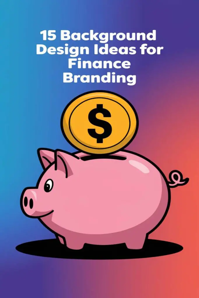
Include Finance-Related Icons
Adding finance-related icons, like coins, piggy banks, calculators, or credit cards, immediately ties the design to your brand’s niche. I recommend using subtle, line-based or minimalist icons to keep the design clean. For example, you could include a faint, oversized coin stack behind key text or a gradient-outlined piggy bank as part of web headers. These icons should be easily recognizable but understated enough to let the main content shine.
Arrange Icons in Repetitive Patterns
Using repetitive patterns made from financial icons creates a cohesive and professional look. I love taking simple icons, like dollar signs or line graphs, and arranging them into geometric grids or diagonal lines for a subtle textured effect. You could also experiment with spacing and transparency, making some icons bolder than others to add depth. Backgrounds like this work exceptionally well for corporate presentations, email templates, or digital ads, keeping the design visually consistent across platforms.
Play with Dynamic Animations
Adding motion to your finance branding can create a modern and engaging experience. It’s a great way to draw attention without overwhelming your audience.
Incorporate Subtle Motion Backgrounds
Integrating gentle motion adds depth and sophistication to designs. I love using slow-moving elements, like drifting gradient flows or soft particle animations, to create a serene yet captivating background. For example, a minimal animation of lines shifting slightly can convey a sense of progress and innovation. Subtle motion keeps the visuals dynamic while maintaining a professional tone.
Use Slow-Fading Transitions
Slow-fading transitions evoke elegance and establish a seamless flow in finance branding. I often recommend incorporating fading effects for elements like background colors or overlapping shapes to add a polished, cohesive feel. For instance, transitioning between muted navy and gray tones can emphasize stability while retaining visual interest. This technique works especially well for websites, presentations, or videos where smooth energy keeps users engaged.
Conclusion
Designing the perfect background for finance branding is all about finding the right balance between professionalism, creativity, and clarity. Small details like textures, gradients, or subtle patterns can make a huge difference in how a brand is perceived.
By focusing on elements that convey trust, stability, and innovation, you can create visuals that resonate with your audience and elevate your brand’s identity. Don’t be afraid to experiment with different ideas to find what feels authentic and impactful for your message.
A thoughtful background isn’t just a design choice—it’s a powerful tool to strengthen your brand’s connection with its audience.
Frequently Asked Questions
Why is background design important in finance branding?
Background design is important in finance branding because it influences perceptions of trust, credibility, and professionalism. A thoughtful design can convey stability, innovation, and approachability, making a brand more appealing to its audience.
How can geometric patterns improve finance branding?
Geometric patterns add structure and sophistication to finance branding. They evoke order and reliability, reinforcing messages of stability while delivering a modern aesthetic.
What is the benefit of using gradient backgrounds?
Gradient backgrounds create visual depth and a contemporary look. Blue-to-green gradients symbolize trust and growth, while maintaining a professional and calming effect in finance branding.
Why should financial brands use metallic finishes?
Metallic finishes, like silver and gold, convey luxury, trust, and prestige. These can be especially appealing to high-net-worth clients, enhancing the brand’s sophistication and professionalism.
How can currency symbols enhance finance branding?
Using abstract or subtle currency symbols like $, € or ¥ in background designs reinforces financial themes. These elements add a modern, global touch while maintaining cohesion with other design elements.
Why are minimalistic textures effective for finance branding?
Minimalistic textures, like soft grains or paper textures, add dimension while maintaining a subtle, polished look. These textures communicate professionalism without distracting from the content.
Is typography useful in finance branding backgrounds?
Yes, typography-driven backgrounds can create modern, bold aesthetics. Using financial terms or phrases subtly as design elements reinforces the brand’s message while ensuring visual clarity.
What role do high-contrast themes play in finance branding?
High-contrast themes help financial branding stand out and ensure key information is easily readable. Pairing dark and light tones creates striking designs that emphasize professionalism and precision.
Can nature-inspired motifs work in finance branding?
Yes, nature-inspired motifs, like leaf or wood textures, symbolize growth, stability, and sustainability. These elements bring warmth and reliability to finance branding while balancing modern aesthetics.
How can animations be used in finance branding?
Animations, such as soft gradient flows or particle motions, add depth and modernity to finance branding. They create engaging experiences while maintaining a professional tone across platforms.
Why are clean lines and symmetry important in finance branding?
Clean lines and symmetry communicate professionalism, organization, and balance. These elements promote precision and stability, enhancing the overall trustworthiness of financial branding.
How can iconography improve finance branding?
Finance-related icons, like calculators or piggy banks, add relevance and context. Subtle, repetitive icon patterns create a cohesive design, reinforcing financial themes in a clean and professional way.