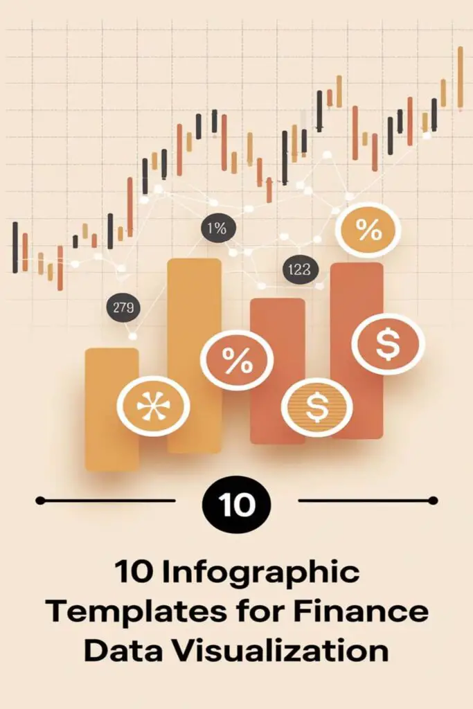
When it comes to finance, numbers can feel overwhelming and, let’s be honest, a little boring. But what if I told you there’s a way to make all that data not only easier to understand but also visually appealing? That’s where infographic templates come in. They’re a total game-changer for turning complex financial stats into something people actually want to look at.
I’ve found that the right infographic can simplify even the most intimidating spreadsheets, turning raw data into clear, engaging visuals. Whether you’re presenting to a team, pitching to clients, or just trying to make sense of your own numbers, having a go-to template can save you time and effort. It’s all about working smarter, not harder, right?
Line Chart Tem
plate for Financial Trends
Line charts are perfect for visualizing financial trends with clarity. I love how they make even the most complex data easy to digest.
Highlight Revenue Growth Over Time
Showcasing revenue growth becomes simple with a line chart template. You can map yearly, quarterly, or even monthly growth to identify patterns. For instance, if monthly data reveals your highest revenue spikes in December, you’ll know to prepare for that season better. It’s a great way to visualize trends without sorting through endless rows in a spreadsheet.
Track Stock Market Changes
Tracking stock market changes can feel overwhelming, but a line chart helps make sense of all the numbers. You can plot daily stock prices or compare multiple assets like tech and healthcare companies. For example, using two separate lines to track major indices can reveal market relationships at a glance. It’s a lifesaver when you’re monitoring investments or explaining trends to others.
Bar Chart Template for Comparing Financial Data
Bar charts are perfect for highlighting differences in financial metrics. I use them to turn dense datasets into visuals that instantly reveal patterns and trends.
Visualize Financial Performance by Region
Bar charts make it easy to compare financial performance across regions. For example, I can plot revenue from North America, Europe, and Asia side by side. This helps me spot which markets are thriving and which ones need attention. A stacked bar chart, breaking down metrics like sales versus expenses, adds more clarity.
Compare Annual Budgets Across Departments
I rely on bar charts to compare departmental budgets at a glance. By lining up budgets for marketing, sales, and operations, I can quickly see which department accounts for the largest share. Side-by-side comparisons also make justifying expense allocations much easier during presentations or meetings.
Pie Chart Template for Expense Distribution
When it comes to cutting through the noise in financial data, pie charts are my go-to for illustrating expense distribution. They make it simple to split costs into digestible segments, offering a quick snapshot of where the money’s going.
Showcase Budget Allocations
I love using pie charts to showcase budget allocations because they clearly represent percentages. Whether I’m dividing a company’s annual budget into categories like salaries, marketing, and operations or breaking down my personal expenses such as rent, groceries, and leisure, the visual impact is undeniable. It’s easy to see if one area is taking up too much of the pie, which helps in decision-making or budget readjustments during meetings or personal planning.
Break Down Marketing Costs
Whenever I need to explain marketing expenditures, pie charts are perfect for breaking down costs into categories like social media ads, content creation, influencer partnerships, and event sponsorships. For example, when I present to stakeholders, this format helps me highlight which campaigns are drawing the most resources and whether adjustments are needed to optimize spending. The clarity they provide turns complex financial data into actionable insights.
Scatter Plot Template for Investment Analysis
A scatter plot template is perfect for digging into investment data. It helps uncover relationships between financial variables, making decision-making easier.
Correlate Asset Performance
Use a scatter plot to visualize how different assets perform in relation to each other. For example, you can compare stock prices with trading volumes to see if higher activity leads to price fluctuations. Plotting this data reveals trends or outliers, like a sudden spike in volume tied to news events. It’s also great for comparing multiple investments’ performances, such as tracking bonds versus equities over time.
Analyze Risk vs. Return
Scatter plots are ideal for evaluating the risk-return tradeoff. By plotting returns on the y-axis and risk (like standard deviation) on the x-axis, you can pinpoint which assets offer higher returns for acceptable risk levels. For instance, a high-risk tech startup might cluster differently than stable dividend stocks, offering clear insight into portfolio balance. It’s an easy way to assess if you’re maximizing gains while managing exposure.
Heat Map Template for Financial Indicators
Heat maps are great for quickly spotting financial patterns and drawing attention to key metrics. I love how they use color gradients to make complex data more intuitive, saving me tons of time.
Identify High-Performing Markets
Heat maps help highlight top-performing regions at a glance. I just apply a gradient scale to metrics like revenue or profit margins. For example, markets with higher sales stand out in bold colors like green, while underperforming ones fade into lighter shades. This makes spotting regions like Europe outperforming Asia or areas where growth is lagging so much easier.
Pinpoint Areas of Financial Risk
I use heat maps to locate vulnerabilities, whether it’s tracking cost overruns or poor investment returns. By assigning colors to risk levels—red for high-risk zones, yellow for moderate, and green for low—I can immediately identify which departments or projects need closer monitoring. This visual cue system simplifies risk management and ensures nothing slips through the cracks.
Pictograph Template for Easy Interpretation
When you want simplicity and clarity, pictograph templates are a fantastic choice. They combine data with visuals like icons, making financial information more relatable and engaging.
Represent Data with Icons
Pictographs use icons to represent quantities, making data easier to grasp at a glance. For example, I can use a dollar sign icon to show every $1,000 in revenue or stack piggy bank icons to symbolize savings growth over months. This template transforms abstract numbers into tangible visuals that resonate with audiences. It’s especially great for comparing metrics like customer segments or market shares since icons make relationships visually clear without overwhelming detail.
Visualize Profits and Losses
Pictographs are perfect for illustrating profits and losses in a simple yet impactful way. For instance, I can use green upward arrows to represent profits and red downward arrows for losses, giving a quick snapshot of a business’s performance. When presenting year-over-year comparisons or monthly updates, these visuals help my audience follow the story effortlessly. It’s a great way to keep financial updates engaging and straightforward, whether I’m sharing results with my team or clients.
Timeline Template for Financial Milestones
A timeline template is perfect for mapping out financial milestones in a clear, linear format. It’s ideal for showcasing progress over time or laying out key events and achievements. Let me break it down.
Track Key Investment Dates
I use timeline templates to track important investment moments. For example, I can plot when I purchased stocks, made major deposits, or experienced market crashes. These templates make it easy to monitor how my portfolio evolved over time. By adding annotations like percentages or short notes, I can quickly understand the events that impacted my financial growth.
Showcase Corporate Financial History
When it comes to presenting a company’s financial story, timeline templates are unbeatable. I can include key events like funding rounds, mergers, IPOs, or major milestones like hitting $1M in revenue. With a timeline, I showcase growth and achievements in a way that’s both professional and visually compelling. This makes it much easier for clients or stakeholders to grasp the big picture without digging into dense reports.
Funnel Chart Template for Revenue Conversion
A funnel chart is perfect for visualizing how prospects move through different stages of the sales pipeline. It’s a simple way to pinpoint where customers drop off and focus on improving conversions.
Illustrate Sales Pipeline Performance
Funnel charts clearly show the flow of leads through various stages, like awareness, interest, decision, and purchase. For example, I can visualize how many website visitors become qualified leads, then how many of those leads turn into paying customers. This template helps me quickly identify bottlenecks, such as a significant drop-off between stages, so I can find solutions like improving outreach or follow-ups.
Analyze Customer Purchase Behavior
Funnel charts also reveal patterns in customer behavior during the purchasing process. I use them to track metrics like click-through rates, abandoned carts, and completed transactions. For instance, I can see if most customers drop off at the checkout stage, signaling that payment processes might need simplifying. By understanding behaviors at each stage, I make smarter decisions to optimize customer experiences and grow revenue.
Stacked Column Chart Template for Debt Analysis
Stacked column charts are game-changing when it comes to visualizing debt-related data. They make it easy to analyze multiple components simultaneously, revealing detailed insights at a glance.
Compare Loan Repayments Over Time
I use stacked column charts to track loan repayments over time for better financial planning. For example, you can visualize the monthly payments of multiple loans—like a mortgage, car loan, and student loan—stacked together to see how much you’re repaying in total each month. This setup makes it simple to spot trends, like when payments drop off after clearing a loan, or to find months where payments may overlap. It’s a great way to balance budgets and plan for future expenses effectively.
Break Down Debt-to-Income Ratios
Breaking down debt-to-income ratios becomes much clearer with this template. I like how you can show each debt type—a credit card, personal loan, or mortgage—as separate segments on the column while stacking them against income on the y-axis. This layout highlights the proportion of income being used to pay off debts and helps identify areas of concern. For instance, if credit card debt is growing versus a stable income, it’s a sign to adjust spending. It’s a fantastic tool for mapping out strategies to improve financial health.
Doughnut Chart Template for Budget Visualization
Doughnut charts are perfect for summarizing financial data into visually compelling insights. I use them to break down complex budgets into bite-sized, understandable visuals.
Illustrate Spending Categories
I rely on doughnut charts to showcase spending across various categories. They’re great for personal or corporate budgets, whether dividing expenses like rent, groceries, and entertainment or departmental allocations like marketing, R&D, and operations. The chart’s hollow center lets me add key data like total expenses, making it even more informative. It’s my go-to for quickly identifying categories where costs can be trimmed or optimized.
Display Portfolio Diversification
Using doughnut charts, I highlight portfolio diversification effortlessly. I can segment investments into stocks, bonds, real estate, and more, ensuring a clear visual of asset distribution. It’s especially useful for pinpointing under- or over-weighted sectors within my portfolio. Plus, the chart’s design makes it easy to present this data to clients, simplifying what might otherwise seem like an overwhelming financial breakdown.
Conclusion
Visualizing financial data doesn’t have to be a headache. With the right infographic templates, you can turn overwhelming numbers into clear, engaging visuals that actually make sense. Whether you’re tracking trends, analyzing investments, or presenting budgets, these tools save time and make your data more impactful.
From line charts to doughnut charts, each template has its own strengths for different financial needs. The key is finding the one that fits your goals and helps you communicate your insights effectively. With these templates in your toolkit, tackling financial data feels a lot less intimidating and way more productive.
Frequently Asked Questions
What are infographic templates, and how do they help with financial data?
Infographic templates are pre-designed visual tools that make complex financial data easier to understand and more engaging. They simplify overwhelming numbers and statistics by turning them into clear and compelling visuals, saving time and effort while enhancing communication.
How are line charts useful for financial analysis?
Line charts are ideal for tracking financial trends over time, such as revenue growth or stock price changes. They help visualize patterns, like seasonal spikes, and provide clear insights for decision-making or presentations.
When should I use bar charts for financial data?
Bar charts are perfect for comparing financial metrics, such as revenue differences across regions or departments. They reveal patterns and trends at a glance and are useful for showcasing data like sales versus expenses or budget comparisons.
What makes pie charts effective for showcasing expenses?
Pie charts are great for visualizing expense distribution. They break down budgets into percentages, making it easy to see how money is allocated and identify areas for adjustments, whether for personal or business expenses.
How do scatter plots help with investment analysis?
Scatter plots reveal relationships between variables such as stock prices and trading volumes. They help identify trends, assess risk-return tradeoffs, and optimize portfolio decisions by mapping risk versus reward.
What is the purpose of using heat maps for financial data?
Heat maps use color gradients to highlight patterns or key financial metrics like profit margins or risks. They make it easy to spot high-performing regions or areas needing attention, aiding in effective data visualization and decision-making.
How can pictographs simplify financial reports?
Pictographs use icons to represent quantities, making data quick to interpret. For example, icons can visually indicate profits, losses, or revenue, keeping financial updates engaging and easy to understand.
What are timeline templates, and why are they useful for finances?
Timeline templates map out financial milestones in a linear format, helping track events like investment dates or funding rounds. They are ideal for presenting a company’s financial history in a professional, concise way.
How do funnel charts optimize sales processes?
Funnel charts track the journey of leads through sales stages, such as awareness to purchase. They help identify drop-off points, enabling teams to improve conversions and refine customer experiences.
What insights can stacked column charts provide for debt analysis?
Stacked column charts display various components of debt, such as loan repayments and debt-to-income ratios, over time. They help users spot trends, concerns, and areas to improve financial health.
Why are doughnut charts suitable for budget visualization?
Doughnut charts effectively showcase spending categories and asset distributions. They break down complex budgets into digestible visuals, making it easier to optimize costs and present financial data clearly.