When it comes to finance, people often think of numbers and spreadsheets—not exactly the most exciting visuals. But who says finance banners have to be boring? A well-designed banner can grab attention, build trust, and make even the most complex financial concepts feel approachable.
I’ve always believed that a little creativity can go a long way, especially in industries like finance where design often takes a backseat. Whether you’re promoting a financial service, an investment app, or just trying to simplify a message, the right banner design can make all the difference.
Use Minimalist Design Aesthetics
Minimalism can make financial banners visually appealing without overwhelming viewers. It’s all about keeping things intentional, clean, and professional.
Focus on Clean Lines and Simple Layouts
I always recommend using straight, clean lines to create a sense of structure and balance. For example, dividing sections with thin lines or borders works great for guiding the viewer’s eye. Stick to grids and simple layouts to avoid clutter. A banner with one focal point, such as a bold headline or simple icon, can make a powerful statement.
Choose Subtle Color Palettes Related to Finance
Muted blues, greens, and grays are perfect for finance banners since they convey trust and stability. I like to pair these tones with neutral colors like white or beige to maintain a polished look. For example, a deep navy background with light gray typography feels professional without being too bold. Avoid harsh, bright colors to keep the design calm and credible.
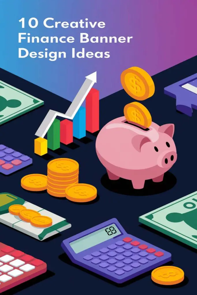
Incorporate Financial Icons and Graphics
Icons and graphics can make financial banners pop while reinforcing your messaging. They’re a simple way to visually represent complex ideas without overwhelming the viewer.
Include Dollar Symbols, Coins, or Charts
I like using classic financial symbols like dollar signs, coins, or bar charts to instantly communicate the theme of money or economics. For example, a bold green dollar sign paired with a clean layout can scream financial growth without needing extra words. Coins or golden hues add a sense of value and wealth, while charts—whether bar, pie, or line—are perfect for depicting financial trends, market stats, or savings goals.
Use Graphs and Growth Arrows Strategically
Graphs and arrows are great for showing progression or success in a banner. I often add upward-pointing arrows in vibrant colors to highlight growth or investments doing well. Graphs, especially line or bar ones, give a quick snapshot of data-driven results, making them perfect for banking or investment ads. Just keep them minimal, ensuring they’re easy to read at first glance without cluttering up the design.
Add Engaging Call-to-Action (CTA) Text
The right CTA text can turn a banner from static to dynamic. It should guide your audience and inspire them to take action.
Highlight Offers or Discounts
Include attention-grabbing offers directly in the CTA. Phrases like “Save 25% Today” or “Limited-Time Free Trial” work wonders by creating urgency. If you’re running a promotion, make it the centerpiece. For example, “Unlock $500 in Investment Credits” instantly tells users what’s in it for them while keeping the focus on savings or value.
Encourage Clicks with Actionable Phrases
Use words that nudge users toward the next step. CTAs like “Start Building Wealth Now” or “Get Your Free Report” build excitement and convey clear benefits. Adding power words like “discover”, “unlock”, or “invest” can make CTAs more engaging. For instance, “Unlock Your Financial Future” promises something valuable and actionable at the same time.
Implement Eye-Catching Color Schemes
Choosing the right color scheme can transform a finance banner from bland to brilliant. Colors influence emotions, so using them smartly builds trust and grabs attention.
Use Blue for Trust and Professionalism
I always pick blue when I want to convey trust, stability, and professionalism. It’s a go-to for finance banners because it instantly makes viewers feel secure. Light blues can give a fresh and approachable vibe, while darker blues exude confidence and authority. Pairing blue with subtle neutrals, like white or gray, keeps the design polished and balanced, making it ideal for banking, investment services, or any finance-related content.
Combine Complementary Colors for Visual Appeal
Mixing complementary colors adds energy and elegance to a banner. I like combining navy with orange or teal with gold for a striking, yet harmonious look. These pairs create contrast and draw attention without looking overwhelming. Experimenting with muted tones of complementary colors can keep the design classy while still catching the eye. For example, pairing deep green with a soft coral can highlight key elements like CTAs or special offers effectively.
Showcase Financial Success Stories
Highlighting real-life achievements can make a financial banner more relatable and inspiring. Showcasing success stories motivates prospects and builds trust with your target audience.
Feature Before-and-After Metrics
Display powerful before-and-after stats to emphasize the transformation. For example, “Increased Savings: $1,000 to $10,000 in 12 Months” or “Debt Reduced by 60% in 6 Months” grabs attention instantly. Use bold fonts and contrasting colors to make these numbers pop. Simple graphs, like progress bars or line charts, can visually narrate the client’s journey for maximum impact. By showing clear improvements, I can make financial services feel tangible and achievable.
Use Client Testimonials in the Design
Include client success quotes directly in the banner. Phrases like “I paid off my mortgage 5 years early!” or “Cut my expenses by $500/month with their strategy” humanize the message. Pair testimonials with photos, ensuring they look authentic and friendly. Using stars or rating graphics next to the quote strengthens credibility. I also love adding subtle callouts like “Verified Results” to further build trust and authority while keeping the design minimal.
Highlight Security and Trust Elements
When it comes to financial banners, showcasing security and trust is a must. These elements not only reassure your audience but also make your services stand out in a competitive market.
Include Security Logos or Badge Icons
Adding security-focused visuals instantly builds confidence. I like using well-known logos like SSL certificates, payment processor badges (e.g., Visa, MasterCard), or trust-seals from security companies like Norton or McAfee. Place these icons near your call-to-action or payment-related messages to ensure they’re highly visible. If your service is insured or regulated, include certification icons to further reinforce credibility.
Design Around Data Protection Themes
Highlighting data protection through design can make your banner more trustworthy. I prefer incorporating graphics like padlocks, shield icons, or digital security patterns to communicate safety. Subtle design details, like encrypted text styles or tech-inspired backgrounds, also work great to emphasize protection. Pair these with phrases like “Your Data Is Safe With Us” or “100% Secure Transactions” in bold typography to align your visuals with the message.
Emphasize the Benefits of Financial Services
When designing finance banners, it’s crucial to focus on what makes the services valuable to potential clients. Highlighting tangible benefits helps build interest and trust in financial offerings.
Showcase Features Like Low Interest Rates
Pointing out low interest rates can grab attention right away. Use bold numbers or percentages, like “2.9% APR,” to make rates visually stand out. Pair them with action-driven phrases like “Limited-Time Offer” or “Exclusive Deal” to create urgency. Adding a short tagline, such as “Save More on Your Loans,” makes the benefit clear and appealing. Simple icons, like a downward arrow next to the rate, can reinforce the idea of cost savings.
Highlight Core Services With Bold Text
Listing key services in bold immediately communicates what’s offered. Use headers like “Personalized Investment Plans” or “Flexible Loan Options” to make services the focal point. Pair bold text with short descriptive phrases, like “Tailored to Fit Your Needs,” for added clarity. Breaking core services into sections with contrasting colors or subtle dividers maintains readability. Be sure to keep the language simple and inviting to ensure accessibility for a wide audience.
Use Dynamic Animations for Appeal
Adding dynamic animations to finance banners makes them eye-catching and modern without overwhelming the viewer. When used thoughtfully, animations can guide attention, emphasize key information, and leave a lasting impression.
Focus on Subtle Movement for Professionalism
Incorporating subtle movements ensures animations enhance professionalism rather than distract. Smooth transitions like a fading chart or a sliding growth arrow can communicate progress and sophistication. For instance, I like using animated bar graphs that gradually fill to display financial trends—it keeps the design clean while catching the eye. Avoid flashy effects like rapid blinking, as they can feel out of place in finance.
Highlight Important Content Through Animated Text
Using animated text draws attention to essential information within the banner. Animated phrases like “Save 20% on Fees!” can slide in or subtly bounce to emphasize urgency or value. Personally, I find that applying effects like text fading in or color transitions effectively highlights CTAs without overwhelming the overall design. Keep the animation speed consistent with the banner’s tone to maintain trust and clarity.
Design for Mobile Responsiveness
Making sure finance banners work perfectly on mobile devices is essential in today’s digital world. Since users often browse on smaller screens, optimizing every design element is vital.
Use Scalable Fonts and Images
Picking responsive fonts and scalable images makes a huge difference. I stick to typography that adjusts seamlessly on different screen sizes, ensuring text stays sharp and readable. For images, I use vector graphics or high-resolution assets that maintain clarity when resized, preventing blurry visuals. Whether it’s a growing trend arrow or a bold CTA like “Invest Now,” everything has to look crisp on mobile.
Ensure Fast Loading Times on Mobile Devices
Keeping banners lightweight speeds up mobile load times, which is key for user retention. I compress assets like images and icons without losing quality and avoid clunky animations or large file sizes. By using tools to test load speeds and prioritizing essentials, I make sure banners catch attention quickly without lagging.
Customize for Target Audience
Tailoring your banner design to resonate with your audience can make all the difference. From new-age entrepreneurs to seasoned corporate professionals, aligning your style with their preferences boosts engagement and trust.
Appeal to Young Entrepreneurs with Modern Styles
Design edgy banners with bold typography and vibrant colors to catch their eye. Think neon accents or gradient backgrounds paired with clean layouts to look fresh and innovative. Incorporate startup-focused themes like rocket icons or minimalist growth charts to reflect their aspirations. Highlight phrases like “Scale Your Startup Today” or “Fuel Growth with Smart Investments” to speak their language.
Use Traditional Designs for Corporate Professionals
Choose banners with polished designs and neutral tones to appeal to this audience. Use classic fonts like serif or sans-serif to convey professionalism and expertise. Represent stability and structure with understated visuals like bar charts, pie graphs, or financial balance sheets. Include tailored CTAs such as “Optimize Your Portfolio” or “Secure Low-Risk Solutions” to match their goals, keeping the design clear and reliable.
Conclusion
Designing a finance banner doesn’t have to be boring or overly complicated. With the right mix of creativity and strategy, you can craft banners that grab attention, build trust, and inspire action. Whether it’s through clean layouts, engaging CTAs, or dynamic animations, every element plays a role in delivering your message effectively.
The key is to balance professionalism with creativity while keeping your audience’s needs in mind. A well-designed banner isn’t just visually appealing—it’s a powerful tool for communication in the finance world. So go ahead and experiment with these ideas to create designs that truly stand out.
Frequently Asked Questions
Why is creative design important in financial banners?
Creative design helps capture attention, build trust, and simplify complex financial concepts. It transforms dull visuals into engaging, professional tools that effectively communicate messages, making financial services more relatable and impactful.
What design style is best for financial banners?
Minimalist design is ideal for financial banners as it uses clean lines, simple layouts, and subtle color palettes to create a professional, polished look. Focus on balance and a single focal point for maximum effectiveness.
What colors work best for financial banners?
Muted blues, greens, and grays are excellent choices, as they convey trust, stability, and professionalism. Adding complementary colors, like navy with orange or deep green with coral, helps highlight key features or CTAs.
How can financial banners highlight success?
Showcase financial success stories with before-and-after metrics, simple graphs, bold fonts, and contrasting colors. Pair these elements with authentic client testimonials and photos for credibility and inspiration.
What are some effective CTAs for financial banners?
Engaging CTAs include action-driven phrases like “Start Building Wealth Now” or “Unlock $500 in Investment Credits.” Highlight offers or benefits to create urgency using power words like “discover” or “unlock.”
How can security be emphasized in financial banners?
Use security icons like padlocks and SSL badges, along with reassuring phrases like “Your Data Is Safe With Us.” These elements build trust and differentiate financial services in a competitive market.
Should animations be used in financial banners?
Yes, but keep them subtle and purposeful. Use movements like fading charts or sliding text to emphasize key information without overwhelming the viewer. Ensure animations remain professional and enhance clarity.
How can banner designs appeal to different audiences?
Customize banners based on the target audience. For young entrepreneurs, use bold typography, vibrant colors, and dynamic CTAs. For corporate professionals, opt for neutral tones, classic fonts, and polished designs.
Why is mobile responsiveness important for financial banners?
Mobile responsiveness ensures banners look clear and appealing on all devices. Scalable fonts, optimized images, and fast loading times are crucial to retaining user interest and delivering an excellent experience.
How can banners highlight financial service benefits effectively?
Use bold text and clear language to list benefits like low interest rates or investment bonuses. Pair them with compelling visuals and action-driven CTAs to create urgency, spark interest, and build trust.