Apple is a multinational company originating in America. It was founded by Steve Jobs, Steve Wozniak, and Ronald Wayne back in 1976. It has developed to be one of the most successful and widespread companies in the world. It is known worldwide for its prestigious iPhones and multiple other appliances like the MacBook, Airpods, the Apple Watch, etc. It is the largest technology giant in the world in terms of revenue (approximately $275 billion as of 2020). It has also been ranked as the world’s most valuable brand since the beginning of 2021. In this article, we will see the Apple Logo Meaning.
The Apple logo is currently a monochrome, black apple with a bite taken off of it. It started differently and has been changed five times ever since. When asked the meaning of the logo, Steve Jobs mentioned that an Apple was chosen as the logo (as well as the name of the company) because he liked Apple. He got the idea upon visiting an apple farm while he was on a “fruitarian” diet. This article shall give a reader a deeper understanding of Apple’s logo.
History of Apple
Early Days
The company was founded by Steve Jobs, Steve Wozniak, and Ronald Wayne (however, Wayne sold his share of the company to the two other founders for $800, just 12 days after Apple was founded) on April 1, 1976, in Steve Jobs’ garage. It started as a company that sold only computers. The first product ever built and sold by Apple was the Apple I.
Steve Wozniack was entirely responsible for designing and building it. The company got incorporated on January 3, 1977, and came to be known as Apple Computer, Inc. Apple II was also invented by Wozniak on April 16, 1977, and sales for these two products began to increase exponentially.
Apple IPO
On December 12, 1980, Apple went public and sold 4.6 million shares at a nominal value of $22 per share. This move generated over $100 million, which was more capital earned from a single initial public offering since Ford Motor Company in 1956. Three hundred millionaires were created by the end of the day the company went public.
1984 saw the launch of the iconic Macintosh, which was the first computer ever to be sold without a programing language. Although the initial sales of the Macintosh were good, the sales began to slump due to slow speeds and a high price. Sales improved in 1985 when the “LaserWriter” and “Pagemaker” were introduced. This is known to be responsible for the boom of the desktop publishing market. However, the company generally hit a snag and was in a slump for six years between 1991 and 1997.
They could not make profits and were on the brink of bankruptcy when Steve Jobs was brought back into the company. Upon being brought back as an advisor, the company started seeing profits once again. The company made multiple acquisitions and had good business strategies, which helped them make profits. The acquisitions resulted in the establishment of successful ventures such as iTunes, iMovies, and many others.
The shift of Focus to Phones
In 2007, it was announced that Apple Computer Inc. would be called Apple Inc. from then onwards due to the shift in the company’s emphasis from computers to consumer products. The same day, the first-ever iPhone and Apple TV were announced. In the next few years, Apple saw great success with the release of the iPhone, iPod touch, and the iPad.
In 2011, Steve Jobs passed away due to complications with his health. This marked the end of an era for Apple. Since then, Apple has gone on to make multiple iPhones, introduced the Airpods and Apple Watch, and did a lot of other things which have brought it immense profitability.
History of the Logo
Newton (1976- 1977)
The logo of the company began with a rough start. Since Steve Wozniak and Steve Jobs were fans of The Beatles, they wanted the logo to resemble that of Apple Records, which The Beatles owned. The Beatles ended up suing the company, for which Apple had to pay damages to Apple Records. Following this incident, the third co-founder, Ronald Wayne, came up with the first official logo in 1976.
The logo is a slightly complex one to comprehend, with Isaac Newton sitting under the apple which was about to fall on him, leading him to discover gravity. The reason for this logo was because Wayne drew inspiration from Newton’s discovery of the law of gravity. Not only did it lack simplicity which is what symbols are meant for, but it also lacked Steve Jobs’ favor. This led to the logo being changed within the next few months.
Rainbow (1977- 1998)
Steve Jobs believed that the Newton logo lacked simplicity and modernity and did not accurately represent the company’s philosophy. These thoughts are what propelled him to change the logo. After collaborating with Job Janoff, a corporate logo designer from Regis McKenna, he produced a logo of his liking. This marked the birth of the iconic bitten apple.
It was reported that Janoff cut multiple apples in half to try and get the logo right. However, the first version of the bitten apple logo had rainbow colors on it. This version remained the company’s logo from 1977 to 1998. The logo was a clean and balanced image colored from green at the top to yellow at the bottom. These colors in the logo are said to have represented diversity, knowledge, inspiration, and creativity. Jobs insisted on the rainbow colors as he felt that they would give a more human feel to the company. It also represented the fact that the Apple II could generate graphics in color.
Janof provided Jobs with multiple options of logos with the apple slightly bitten off. This particularly struck a chord with Jobs as the rest of the logos are a testament to. The logo being designed with a bite is to diversify the apple from it being confused with a cherry.
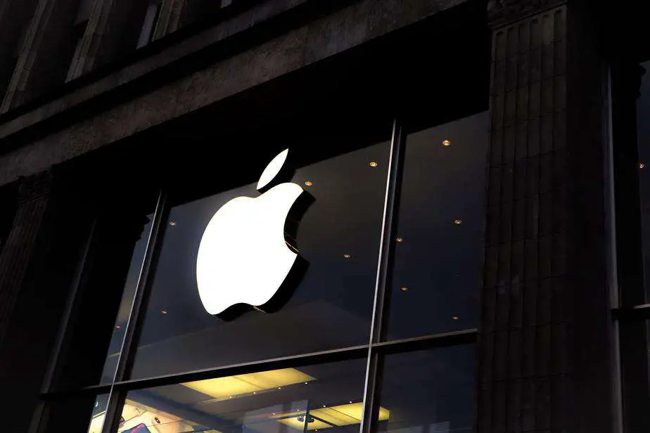
Monochrome (1999- till date)
Although the particular themes did vary over the years, the logo remained monochrome since 1999. The shape is nearly identical to the rainbow-themed bitten apple, and the color was black. From 1998 to 2003, the aqua-themed version of the logo was used, while the glass-themed version was used between 2007 and 2013. There was a change from the rainbow colors because Jobs wanted to redefine the company’s brand image.
He believes that the company had to look to the future. The idea was to create a brand image that corresponded with luxury. This was fulfilled in the coming years, with an apple product having a sense of prestige attached to it.
The first monochrome logo was aqua-themed and had a couple of blue shades, some translucency, and a three-dimensional effect. The theme quickly changed to the plain black one between 1998 and 2000. The logo subsequently shrunk in thickness and had a more elaborate feel to it, along with the return of the aqua colors. The difference from the old aqua version was that this version had more of a silver tinge to it and was more translucent. In 2007, in a minor redesign of the model, the transparency was dropped, leaving the plain silver color intact.
The effect of depth was utilized in this version. The final decision was to return to the two-dimensional, monochrome, black logo from the 2000s. White and grey versions of the same monochrome logo have been used. This has made the logo very versatile and has allowed the application of the logo on devices, storefronts, and websites.
Meaning and Interpretation of the Logo
The logo became official only after the official release of the iMac. It has become a symbol of style, prestige and is synonymous with excellence and quality. Even though the reason quoted for the usage of the bitten apple was to distinguish it from other fruits, it is pretty evident that it directly correlates to the “bite of knowledge” taken from the apple.
This is therefore suggestive of the human race’s hunger for knowledge being satisfied by Apple products. Another symbolism exists, which is the fact that the word “bite” symbolically puns with “byte,” which is the unit of calculation for digital data.
To further understand the interpretation related to Adam biting the apple, you must know that it was not Janoff’s intention to link the two concepts. It is merely an interpretation of the logo and how deeply seated, it is. The Garden of Eden, from which Eve is enticed to eat the Forbidden Fruit, has been pictorially depicted to bear apples, even though it is nowhere mentioned in the Bible to be an apple.
The linking of the bitten apple to the logo is thus apt as the forbidden fruit was known to provide the gift of wisdom and knowledge, both of which can be obtained from Apple products. In general, the fruit apple has been used to depict knowledge, immortality, and abundance. It has evidently been a significant venture for Apple to adopt this logo as they have harnessed the iconography that has surrounded the fruit, apple. The fact that the logo is a bitten Apple has increased their prospects of this linkage.
Logo Impact
The logo has developed an ideal brand image for Apple. At the time it came out, it was a display of its unique (at least at that time) ability to display colors. It is now a symbol that was aimed at younger audiences. The logo, in general, has been a good indicator of the company’s worth and abilities. Apple executives decided in 1984 not to use writing under the logo as they believed that the logo had acquired enough fame to represent the company itself.
This decision was made with the release of Apple’s Macintosh. It was a smart move by the company as it had a tremendous impact, with the Apple symbol being monopolized by the company. The logo has been consistent and has earned a lot of trusts; this is why the only aspect that has changed about the logo in 40 years is the color themes.
Conclusion
Apple as a company has made it very far in the technology industry. Their success is attributed to Steve Jobs and his dedicated team of professionals who have brought the company this far. As far as the logo is concerned, there is no doubt that the Apple logo is one of the most distinctly recognized logos worldwide. The logo is used as stickers, keychains, appliances, and so many more things.
The sense of prestige that a person gets from using an Apple product is unmatched in the industry. The company often backs their high price up with much better features than those in the market. The development of the company’s logo is a testament to the versatility and the brand image that Apple has made in the world. With the multiple interpretations of the logo coupled with the success of the company, it is understandable why it is the most valuable brand in the world.
The recognizable nature of the logo is probably unmatched, save for a few companies such as Google or Amazon.
Frequently Asked Questions
- Who are the people primarily responsible for creating Apple’s rainbow-themed logo?
Steve Jobs wanted to change the Newton under an apple tree logo, and so he hired Job Janoff, a corporate logo maker, to help him create a logo for Apple.
- What was the reason quoted for the use of an actual apple in the logo?
Steve Jobs happened to be on a fruitarian diet when he intended to change the logo. After visiting an apple farm, he decided that he wanted to use the fruit as the company’s logo.
- What has changed about the log since the rainbow themed logo was adopted?
The logo has remained the same except for the change in themes. After the rainbow theme, the monochrome theme was adopted, and there have been variations within that bracket ever since.