There’s something magical about a well-designed 3D gift icon—it’s eye-catching, playful, and instantly recognizable. Whether it’s for an app, a website, or a digital project, the right icon can make all the difference in grabbing attention and conveying the perfect message. But creating one that’s both visually stunning and functional? That’s where the fun begins.
I’ve always loved how 3D design lets you bring objects to life with depth, texture, and personality. A gift icon, in particular, has so much potential to charm users with its vibrant colors, sleek shapes, and tiny details. It’s not just about making something pretty; it’s about crafting a design that feels polished and purposeful.
If you’ve ever wondered how to nail that perfect balance between creativity and usability, you’re in the right place. Let’s dive into the steps for designing a 3D gift icon that truly stands out.
Understand the Basics of 3D Design
Understanding the fundamentals of 3D design lays the groundwork for crafting a visually striking 3D gift icon. Let’s dive into the essential components that make up this creative process.
Learn About 3D Modeling Software
Choosing the right 3D modeling software can make or break your design process. Tools like Blender, Maya, and Cinema 4D are popular options, each with its strengths. For beginners, I’d recommend Blender—it’s free and packed with powerful features. If you’re going for professional-grade results, tools like Maya offer advanced capabilities for detail-rich designs. Take time to familiarize yourself with the navigation, tools, and shortcuts in your selected software. It’ll save you hours during the actual modeling phase.
Explore Key Elements of Icon Design
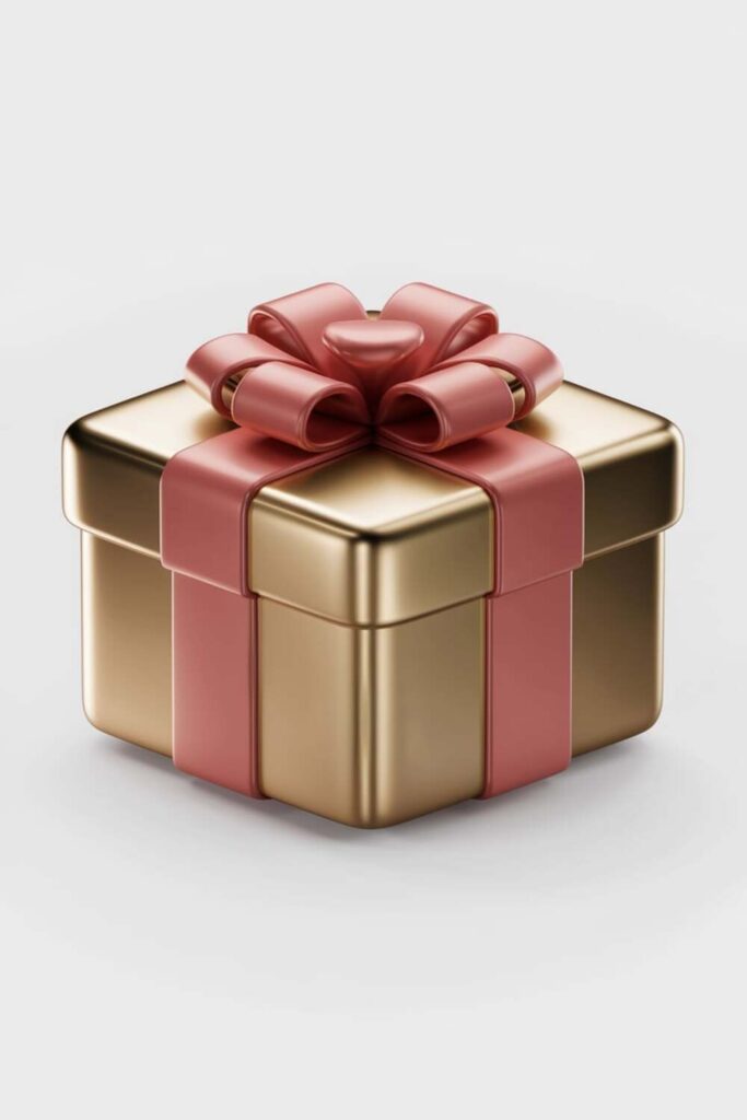
Successful icons balance simplicity and detail. In 3D, elements like shape, texture, and color become even more crucial. Start by sketching the gift icon concept—a simple box with a bow is a classic foundation. Focus on smooth proportions, ensuring the design is clean and visually appealing at various sizes. For textures, experiment with glossy wraps or matte finishes to add depth and realism. Finally, stick to vibrant but harmonious colors, like a red box with a gold ribbon, to grab attention while maintaining elegance.
Choose the Right Tools for 3D Icon Design
Having the right tools is key to creating a professional-grade 3D gift icon. From software choices to accessories, each tool shapes the final result.
Compare Popular 3D Design Software
I always start by picking software that fits the project’s needs and my skill level. Blender is my go-to for beginners—it’s free and packed with features like sculpting, rendering, and animation. For more advanced or large-scale projects, I lean towards Maya or Cinema 4D because of their robust modeling tools and smoother workflows.
Some people prefer ZBrush for precise details or simpler platforms like Tinkercad when working with basic forms. Regardless of the option, the goal is to choose software that feels intuitive and supports 3D rendering, customizable textures, and lighting features.
Select Complementary Design Accessories
Once I’ve got my primary software, I look into accessories that speed up and enhance the design process. A graphics tablet, like a Wacom, helps me add intricate details to textures or shapes. 3D mice, such as the SpaceMouse, make navigating the scene seamless, especially when adjusting small elements like ribbons or bows.
For color-picking and palette creation, I rely on external tools like Adobe Color to ensure my gift icon maintains a cohesive look. Accessories aren’t just extras—they’re game-changers for improving precision and efficiency.
Sketch the Initial Concept
Before diving into 3D software, I always start with a basic idea on paper or a digital canvas. This step helps me plan the design and visualize how the gift icon will come together.
Create Rough 2D Sketches
I grab a pencil and sketch a few rough 2D drafts of the gift icon. For me, it’s essential to explore different shapes, like square boxes, rounded edges, or unique ribbon styles. I focus on capturing the overall structure, experimenting with proportions and designs that look balanced. These sketches don’t have to be perfect—they’re just blueprints to guide my design process later. If drawing by hand isn’t your thing, digital apps like Procreate or Adobe Fresco work great for quick sketches.
Focus on Icon Simplicity and Clarity
I aim to keep the design simple and clutter-free. A gift icon should be instantly recognizable at any size, whether it’s a tiny app button or a bold marketing asset. I prioritize easy-to-read shapes and minimal details, like clean lines and a tidy ribbon, while ensuring enough visual interest to catch the eye. Overloading the design might confuse users, so I make it a point to highlight key features, like the box shape and bow, with clean outlines or distinctive accents.
Model the 3D Gift Icon
Once the initial concept is ready, it’s time to bring the 3D gift icon to life. I’ll focus on building the structure and adding the charming details that make the design stand out.
Build the Base Shape of the Gift Box
Start by creating a simple cube to serve as the base for the gift box. I usually adjust the dimensions slightly to make it more realistic, like a rectangular box if needed. Using your 3D modeling software, smooth out the edges to avoid sharp, unnatural lines—rounded corners add a soft, inviting look. Don’t forget to maintain proper proportions to ensure the box doesn’t feel too bulky or flimsy.
Next, apply a basic material to the box, like a solid color or texture placeholder, so it’s easier to visualize the design. For a polished finish, I play with the box height and width until it feels balanced. Tools like Blender’s Subdivision Surface modifier or Maya’s beveling tools can help refine this base structure.
Add Decorative Details Like Bows and Ribbons
Now comes the fun part—adding decorations! I typically start with the bow, modeling it as a separate element. Using torus shapes or custom curves, I create loops for the bow and tweak their size for symmetry. Don’t worry about perfection at this stage; small irregularities can make it look more organic.
Ribbons are essential too. I trace their paths across the box using curves or edge extrusions, depending on the software. For a clean look, I make the ribbons slightly raised above the box surface. Adding thin creases or folds to the ribbons using tools like Blender’s sculpting brushes or ZBrush’s detailing options can make them more lifelike.
Once the elements are in place, I experiment with layering—overlapping parts, like crossing ribbons under a bow—and adjusting thicknesses to create depth. Subtle tweaks here really help the icon feel dynamic and cohesive.
Apply Colors and Textures
Colors and textures bring your 3D gift icon to life, creating visual appeal and adding depth. Here’s how I approach them for a polished finish:
Choose a Color Palette That Pops
I start with a vibrant yet harmonious color palette to make the gift icon stand out. Bold combinations like red and gold or pastel duos like pink and mint work well, depending on the theme. Tools like Adobe Color make it easy to experiment with different schemes. To avoid overpowering the design, I limit the palette to three or four main colors and use lighter tones for highlights and darker shades for shadows. For example, if I use purple for the gift box, I might add gold for the ribbon and a subtle gradient on the edges to enhance depth.
Use Textures to Add Realism
I use textures to give the icon a tactile, believable quality. Smooth, glossy surfaces work great for modern designs, while matte or fabric-like textures can make the icon feel cozy and relatable. To create realistic effects, I sometimes layer simple textures like brushed metal, satin, or wood grain over the base material. For instance, adding a light satin texture to the bow can make it look soft and upscale. I also use normal and bump maps to create subtle depth, like stitching on the ribbon or grooves in the box. Keeping it balanced ensures the textures enhance the design without overwhelming it.
Optimize Lighting and Shadows
Lighting and shadows can make or break a 3D design. They add depth, realism, and visual appeal to your gift icon, so getting them right is crucial.
Set Up Lighting for a Balanced Look
I start by positioning light sources to create a balanced and natural look. A three-point lighting setup is my go-to—key light adds focus from the front, fill light softens harsh shadows from the opposite side, and backlight creates a subtle glow around the icon. For a festive vibe, I might adjust the temperature of the lights, using warmer tones to enhance the gift box’s charm. Tools like Blender’s area lights or Cinema 4D’s physical render settings make fine-tuning the intensity and direction easier.
Use Shadows to Highlight Depth and Dimensions
Shadows bring out the structure of the icon, making elements like the bow and ribbons stand out. I ensure the shadows are soft yet visible by tweaking the shadow softness and blur settings in my software. Ambient occlusion is another trick I use to simulate realistic shadowing in tucked-away areas, like under the ribbon edges or the bow loops. This technique enhances depth and adds a lifelike feel to the design without making it look too harsh.
Render and Export the Design
After finalizing your 3D gift icon, it’s time to render it into a polished visual and prepare it for export. This step ensures that your hard work shines on any platform.
Adjust Rendering Settings for High Quality
I always adjust the rendering settings to get crisp, professional results. Use a high resolution, like 1080p or 4K, to ensure sharp output. Set the sampling rate higher if possible; for instance, 128 samples or above reduce noise and make colors more vivid. Enable features like ambient occlusion and bloom effects to enhance realism and highlight details. If your software supports it, use ray tracing for accurate lighting and reflections. Finally, preview the render to catch and fix any issues before exporting.
Save the Icon in Compatible File Formats
I make sure to save the icon in formats suitable for the intended purpose. For web or app use, I typically go with PNG for its transparent background support. If you’re creating vector-based renders, SVGs can be great for scalability without losing quality. For animations or presentations, format the output as MP4 or GIF. Keep an editable project file saved, like a .blend in Blender, so you can revisit and tweak the design as needed.
Conclusion
Designing the perfect 3D gift icon is such a rewarding process. It’s all about blending creativity with the right tools and techniques to create something that’s both functional and visually stunning. Whether you’re sketching out ideas, experimenting with textures, or fine-tuning the lighting, every step adds a layer of personality to your design.
Don’t forget to have fun with it and let your style shine through. The best icons are the ones that feel unique and thoughtfully crafted. With some patience and practice, you’ll be creating standout 3D gift icons that truly pop.
Frequently Asked Questions
What is a 3D gift icon, and why is it important?
A 3D gift icon is a visually appealing design element crafted in three dimensions to represent a gift, typically a box with decorations like bows and ribbons. It is important because it grabs attention, conveys messages effectively across digital platforms, and adds a professional and creative touch to any design project.
What tools are recommended for designing a 3D gift icon?
For beginners, Blender is highly recommended as it’s free and feature-rich. Advanced users might prefer Maya, Cinema 4D, or ZBrush for more professional and detailed work. Accessories like graphics tablets and 3D mice can enhance precision, while tools like Adobe Color help maintain a cohesive design.
Why is simplicity important in 3D gift icon design?
Simplicity ensures the gift icon remains visually recognizable at any size, especially when used in digital platforms like apps or websites. Overcomplicating the design with excessive details can make it cluttered and lose its clarity and effectiveness as an eye-catching visual element.
How can colors and textures enhance a 3D gift icon?
Colors and textures bring the 3D design to life by adding depth and realism. A harmonious color palette (3-4 main colors) and thoughtful textures, like glossy or matte finishes, help the design look visually appealing while maintaining balance and avoiding an overwhelming appearance.
What role does lighting play in 3D icon design?
Lighting adds depth and dimension to the design. Using a three-point lighting system creates a balanced look, while techniques like ambient occlusion and subtle shadows emphasize intricate details and make the icon appear more lifelike and professional.
How do I start designing a 3D gift icon?
Begin with a rough sketch, either on paper or a digital canvas, to visualize the concept. Focus on proportions, balance, and simplicity. Once finalized, move to 3D modeling by crafting the base shape (e.g., a cube for the gift box) and refining it with details like bows or ribbons.
What software features are essential for 3D modeling?
Features like subdivision surface modifiers, beveling tools, and texture mapping capabilities are crucial. These tools help refine shapes, add smoothness, and create realistic textures, which make your 3D gift icon visually polished and detailed.
How can I save my 3D gift icon for different uses?
Save your 3D gift icon in high-quality formats like PNG for web graphics or SVG for scalable designs. Always maintain an editable project file to make future changes. For professional results, render at 1080p or 4K resolution with detailed settings like ray tracing.
Can I use a 3D gift icon in various digital projects?
Yes! A 3D gift icon is versatile and can be used in app interfaces, websites, social media posts, promotional materials, and more. Its creative and polished design adds a festive or celebratory touch to any digital project.
How long does it take to design a 3D gift icon?
The time frame depends on your skill level and the design complexity. For beginners, it may take several hours to a day to create a basic icon, while experienced designers might complete a polished icon in just a few hours.